


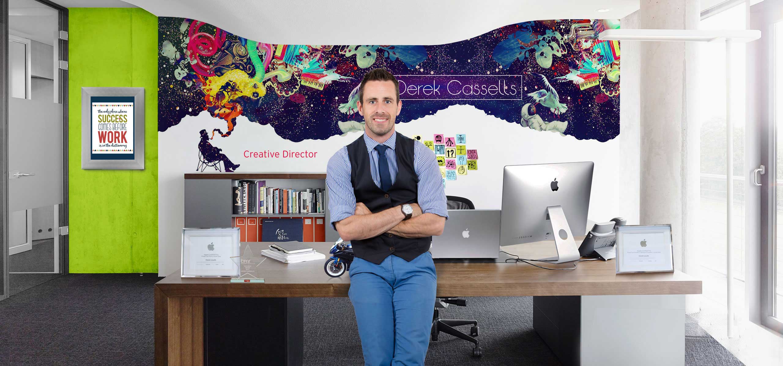

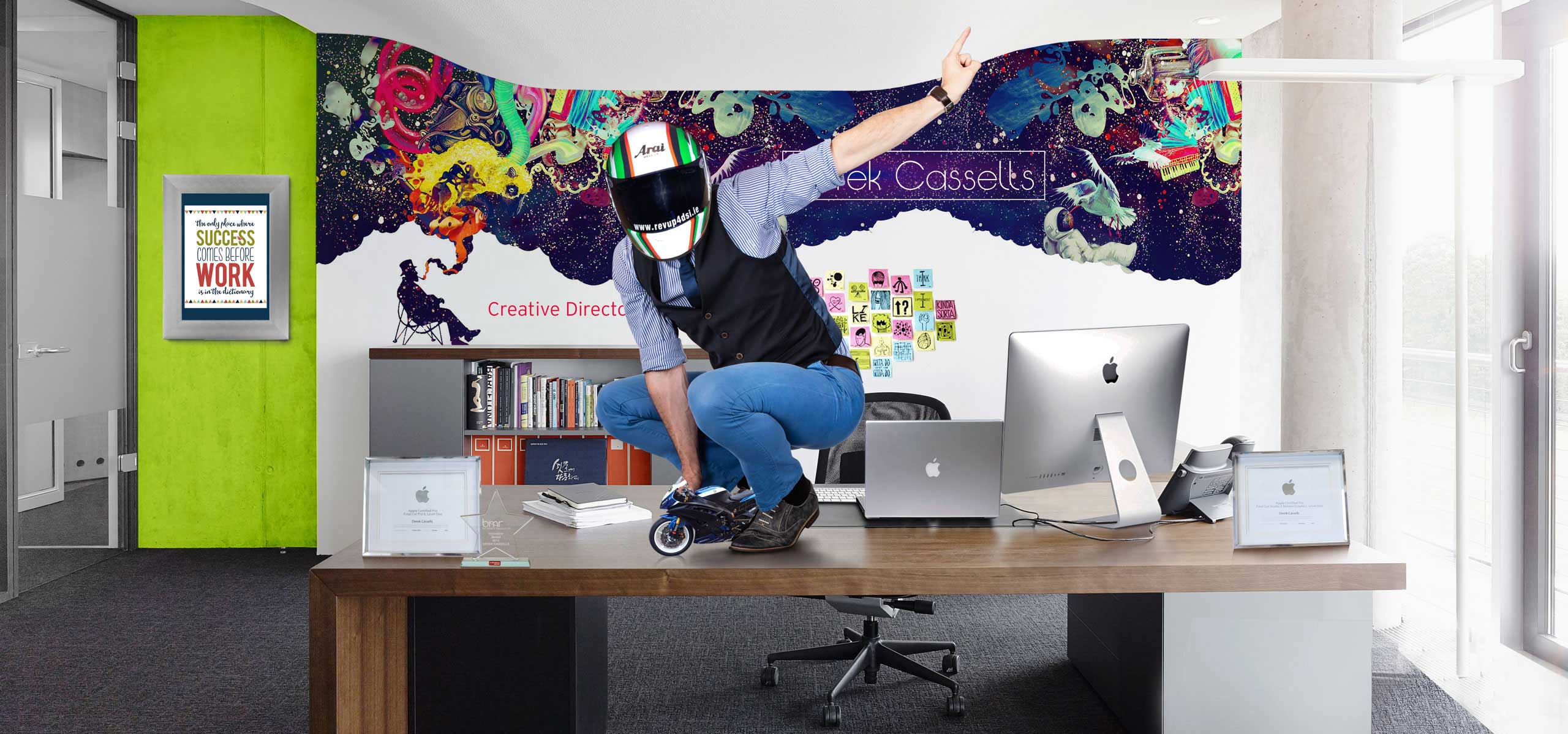
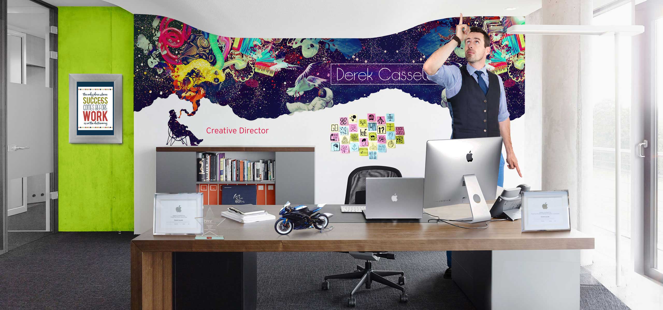

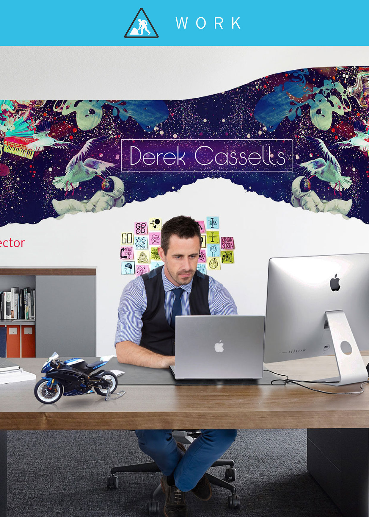

Creative Director available for employment, freelance and
contract work
Lets get to work!
Whether its TV media, print creative, Web, UI design, product design or photography you
gravitate toward, there should be something for everyone here! I am passionate about my work,
for me, good branding and good advertising begins with a great concept, which is I believe I am
at my most competent. I discovered a quote from a man named Arthur Schopenhauer while trawling
through research for a design project, that has subsequently become my mantra for design over the years;
“the task is not so much to see what no one yet has seen, but to think what nobody yet has thought about that which everybody sees.”

Simply mouse over and click any of the images to view the extended portfolio
of creative's I have done for each brand or product. I am confident there
is something there for everyone’s palette so get clicking!


If its added skills you’re after, then look no further, have a glance
over a small selection of my photography, user interface design,
or product design, just some of my added skills!


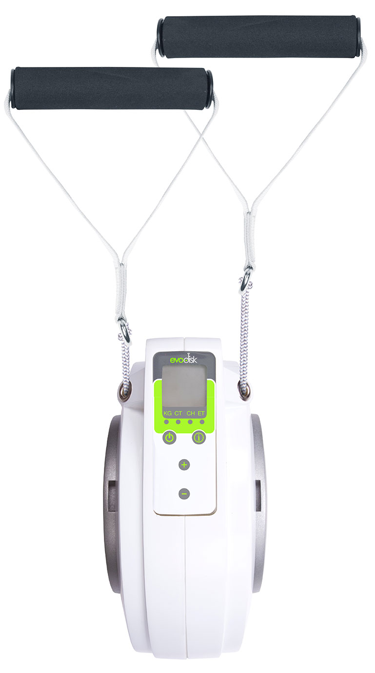
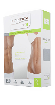
Evodisk was a novel start up product designed to deliver a wide variety of exercises and
work outs all in one simple, compact product. The product brief included global appeal
so the product need to be designed with multinational markets in mind. As a result, we
cited simplicity as the key in designing a clean, fresh, modern easy to use revolution in
home DIY exercising.
My role in this project included branding, product design, trade film, package design,
instructional material and photography. Though this product was initially easy to use,
it’s huge variety of exercises and uses rendered it challenging for the consumer. As
a result, I decided that simplicity would be key in any design, be it product or branding.
In light of this, my main focus was to distinguish each element and characteristic clearly
to aid in consumer ease of use and improved consumer experience.
Branding and logo creation
I created the name ‘Evodisk’ based on the function and form of the product. I used an abbreviation of the the word ‘evolution’ as I felt that this products diversity was evolving home exercise whilst still retaining a compact, easy to store form. Having looked at the mechanical function of the product, we quickly realised that it would be disk shaped in form, so after I decided that ‘Evodisk’ held great possibilities as a brand name.
I didn't stop there, I began to do some market research, benchmarking and mapping
trends within the health and fitness space, paying particular attention to both home use
and gym use products. I didn’t want to rule gym use out as I felt there was potential for
licencing the product globally for gym use so wanted to factor this into my branding and
logo design.
I chose a very rounded typeface as a base for the logo design as I wanted to reflect the form
of the product. I think it is incredibly important that the logo represents all the characteristics
of a brand, the key is consistency across all touch points of design, so I opted for this ‘rounded’
typeface to reflect the character of the products form. I also wanted the product shape to feature
in the logo, this creates a clear relationship between the two, and anything that tells the story
better for the consumer is beneficial.
As with any good brand and logo design, colour was a huge factor in the creation of the brand
and logo. I felt that the product was extremely economic in terms of function, so I opted for a
very organic palette, using monochrome base colours with a beautiful lime green feature colour.
Product design
As I previously suggested, the mechanics and function of this product largely predicated the form for this product. As a result, I decided that the focus for the product design, again, considering the fact that such an amount of multiple functional uses, should be to keep the product simple, minimalist, and inspired by the components as apposed to designed around the components.
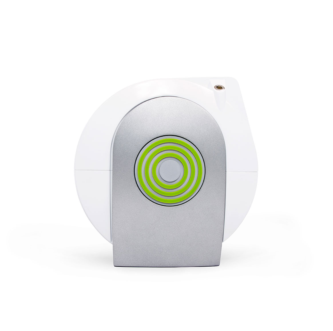
Working closely with the polymer engineer, I decided that we would use colour and texture to
help accentuate the components such as the side pods and disk shape. I decided that contrast
should be key with this product, so we opted to finish the disk in gloss white, giving it that
modern, fresh, health and wellbeing look and feel, leaving the side pods in silver, finished in a
course grey texture. The circular pod grips needed function as well as form, so we decided these
would be best finished in the organic lime green, using a dense rubberised soft touch finish.
The LCD screen selected for the product was an off the shelf unit so we were very restricted in
options for integration into the product design. However, there was still an option to make the
facing more at home in it’s surroundings, so I set about designing a PVC LCD facing that integrated
the colour palette, character and form design that was reticent throughout the rest of the product
design. The result you can see below, a beautiful, minimalist, easy to use product that could integrate
itself into any modern household or gym.

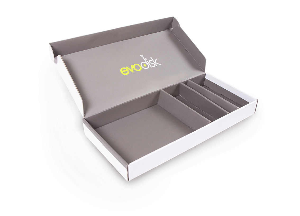
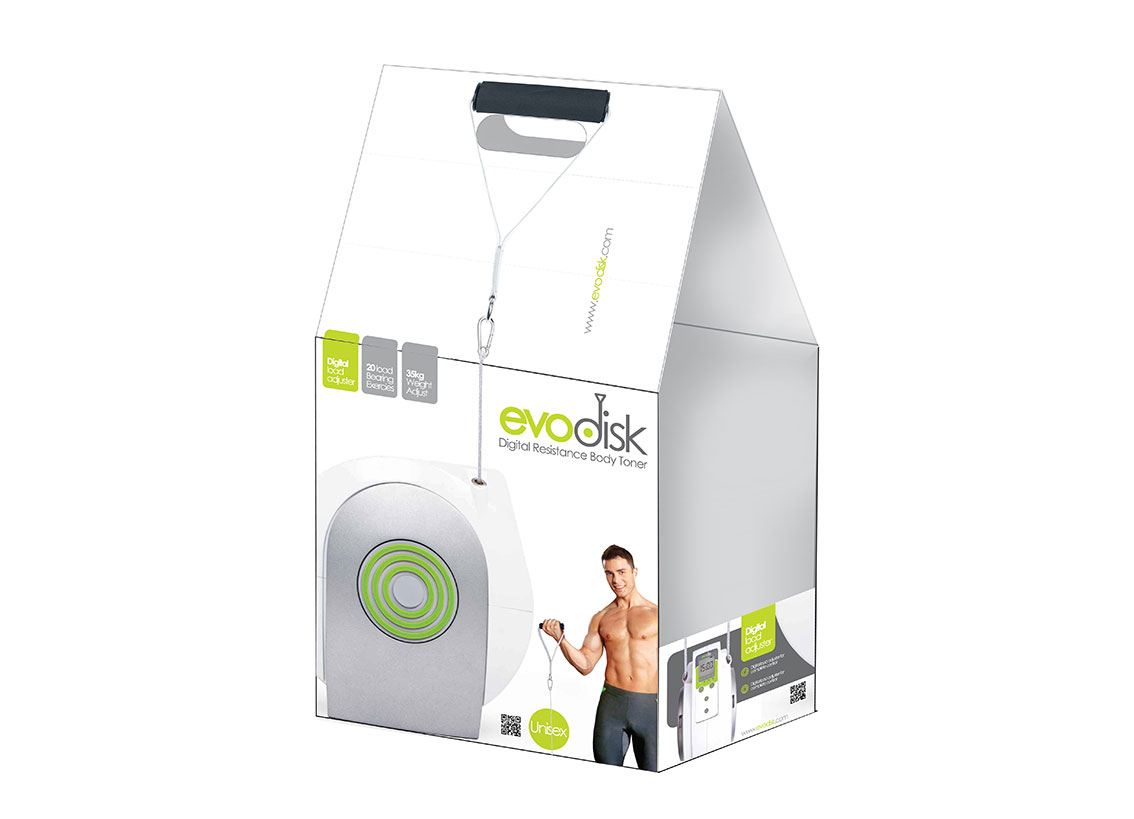
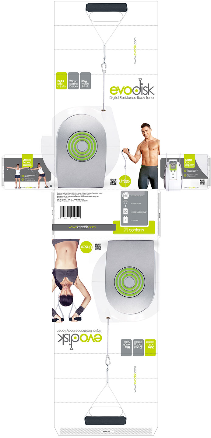
Commercial package design
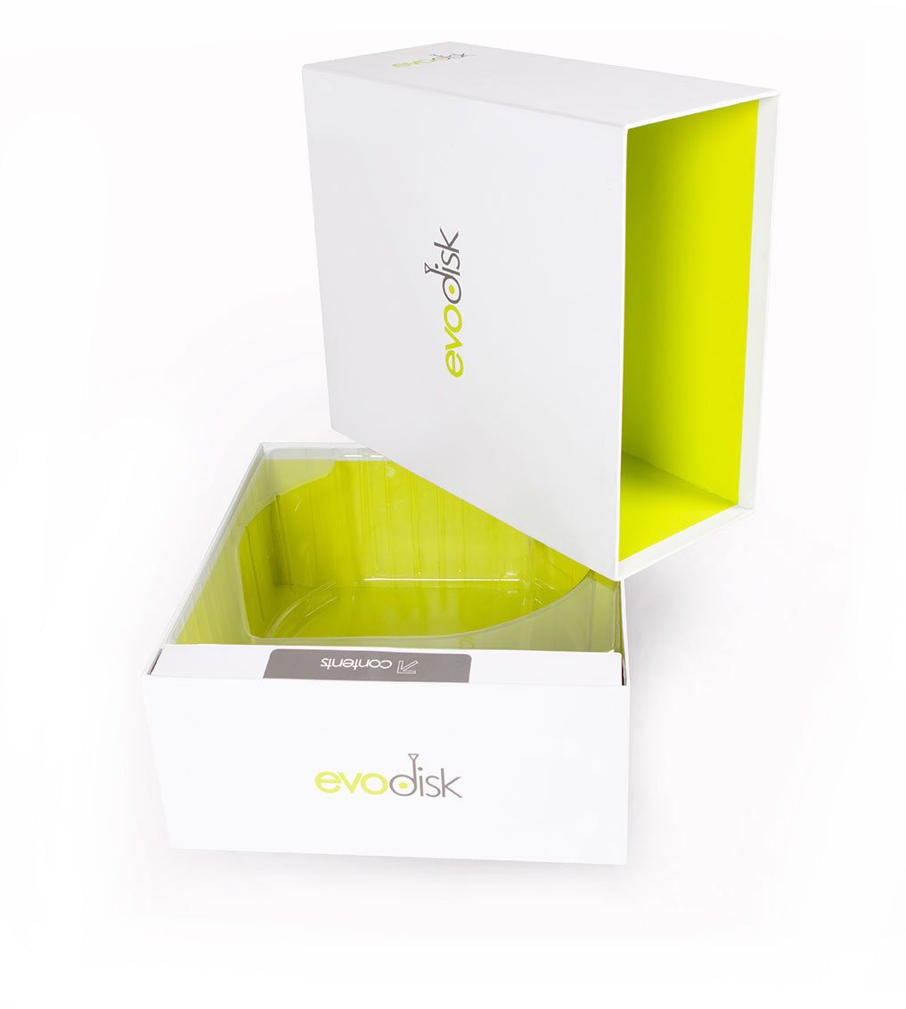
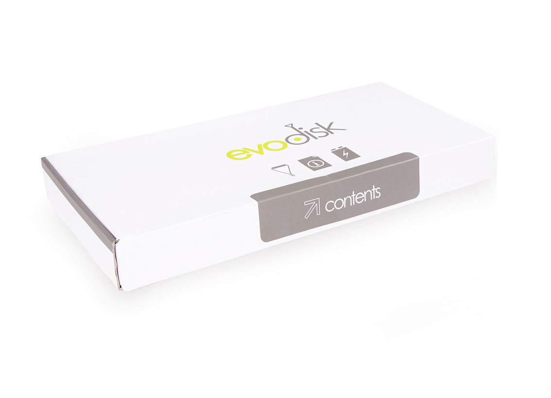
When I design commercial packaging, I have two main goals in mind, communicate the brand, and to take the consumer through a journey into the pack, unveiling the product and and contents in order of priority, being insistent on an optimal out of box experience. Both of these factors can be effected by budget, but a clever designer can be creative around budget, that is where the challenge lies!
Evodisk was no exception, the pack size required to house the product was quite large, so the spec was incredibly
important in keeping on budget. As a result, I designed a 2 colour rigid box with 2 colour branding presented in a
novel ‘carry sleeve’ that opened out to double up as a carry bag. Designing the sleeve to have a double function
added cost, but as this was consumer goods, I felt the extra cost, while still on budget, was justified as the extra
brand exposure from public use was so valuable to the brand.
I also utilised every facing both internal and external to display the brand at no added cost. While I wanted the
pack to be compact and economic in terms of free space, minimising shipping cost, I also wanted the pack to feel
spacious. It was this drive to create an organic, spacious feel to the box that inspired my choice of colour use
and in particular material use to secure the product. I chose white as the external colour with that beautiful lime
green brand colour filling out the internal structure, while the product sat in a nice clean, clear injection moulded
PVC tray aligned to a white branded contents pack appropriately labelled for ease of navigation.
Not only did the clear tray achieve the spacious atmosphere I wanted, but it allowed the branding on the lime
green internal print become visible to the consumer. Materials were careful selected based on delivering a premium
look and feel product for optimal user experience, the results of which you can see below.
Click to enlarge any of the thumbnails.


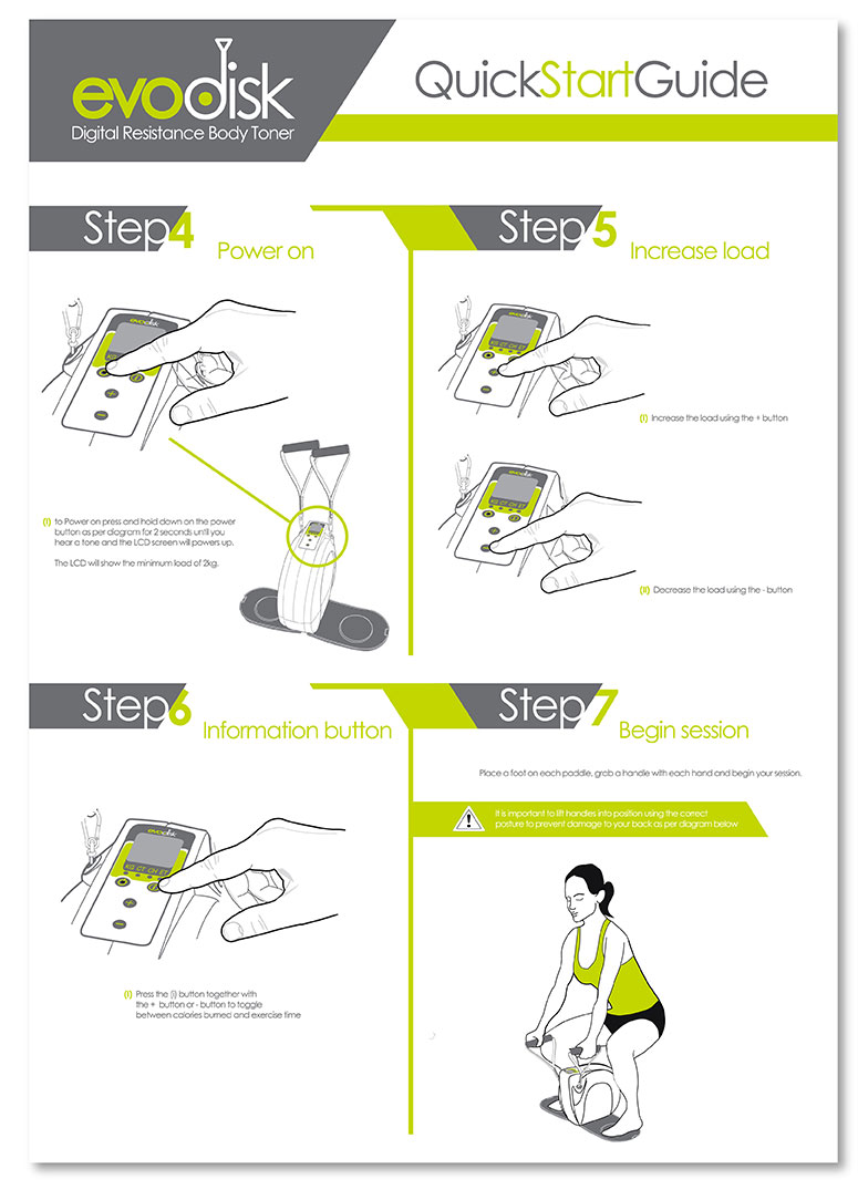
Instructional material
User friendly Quick Start Guide to guide the consumer through the set up process. Quick Start Guides, or QSG’s play an intricate part in the user experience of the consumer, ensuring that their set up of the product is a positive experience whether its online or through printed media. In most cases, a consumer will only look through a manual if they have no other option of resolving their issue, so its exceptionally important that the QSG contains the right information for the user. I spent a lot of time working and re-working this guide based on consumer feedback as I do with any instructional material I design. I created, tested and developed this guide based on user feedback from controlled testing, but the end result is worth the work and ensures that the consumer comes away with an easy set up, and a positive perception of the brand.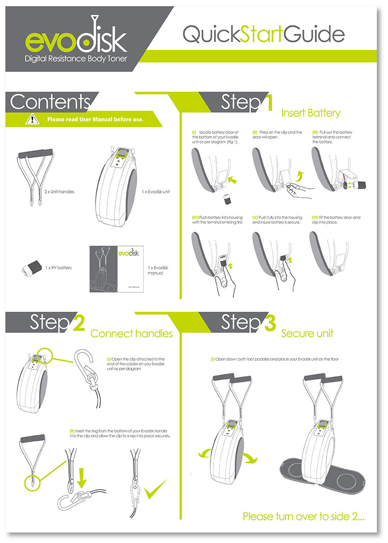
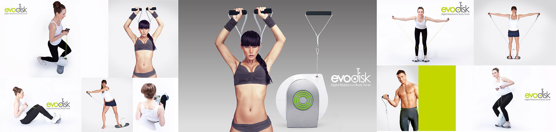
Photography
Below is a selection of some of the photography I created for Evodisk, including studio product use shots, packaging shots and market support and advertising support images.Click to enlarge any of the thumbnails.

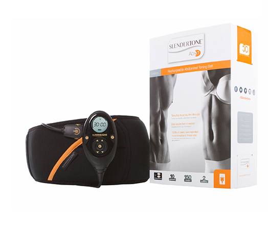
I have done an extensive range of work with Slendertone International. My main objective with the brand
was to encourage a transition from the perception of quick fix product, to that of a successful addition to
any fitness regime or body shape training. I wanted the creative's to Appear more confident, and reach out
to the emotion of the consumer. Simply click on a project to view the creative.
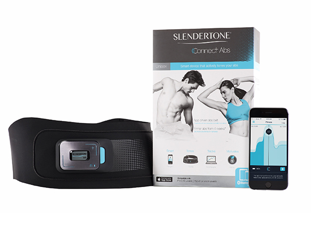
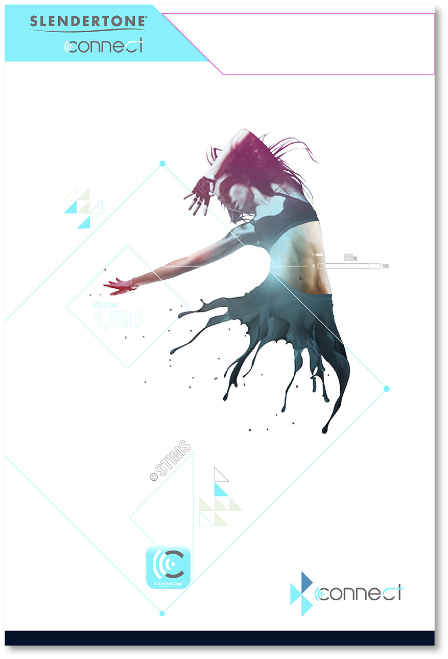
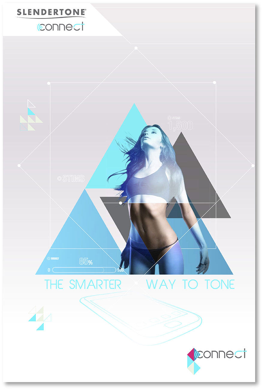
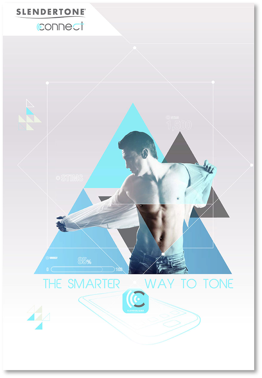
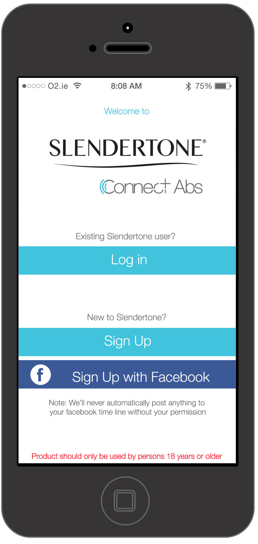
Slendertone Connect

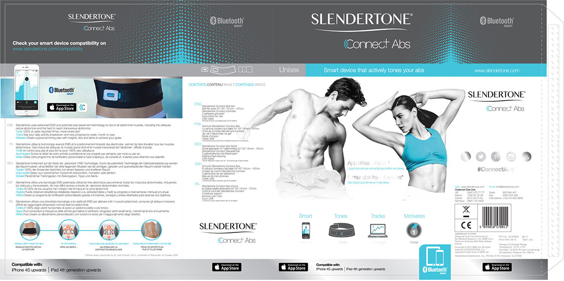
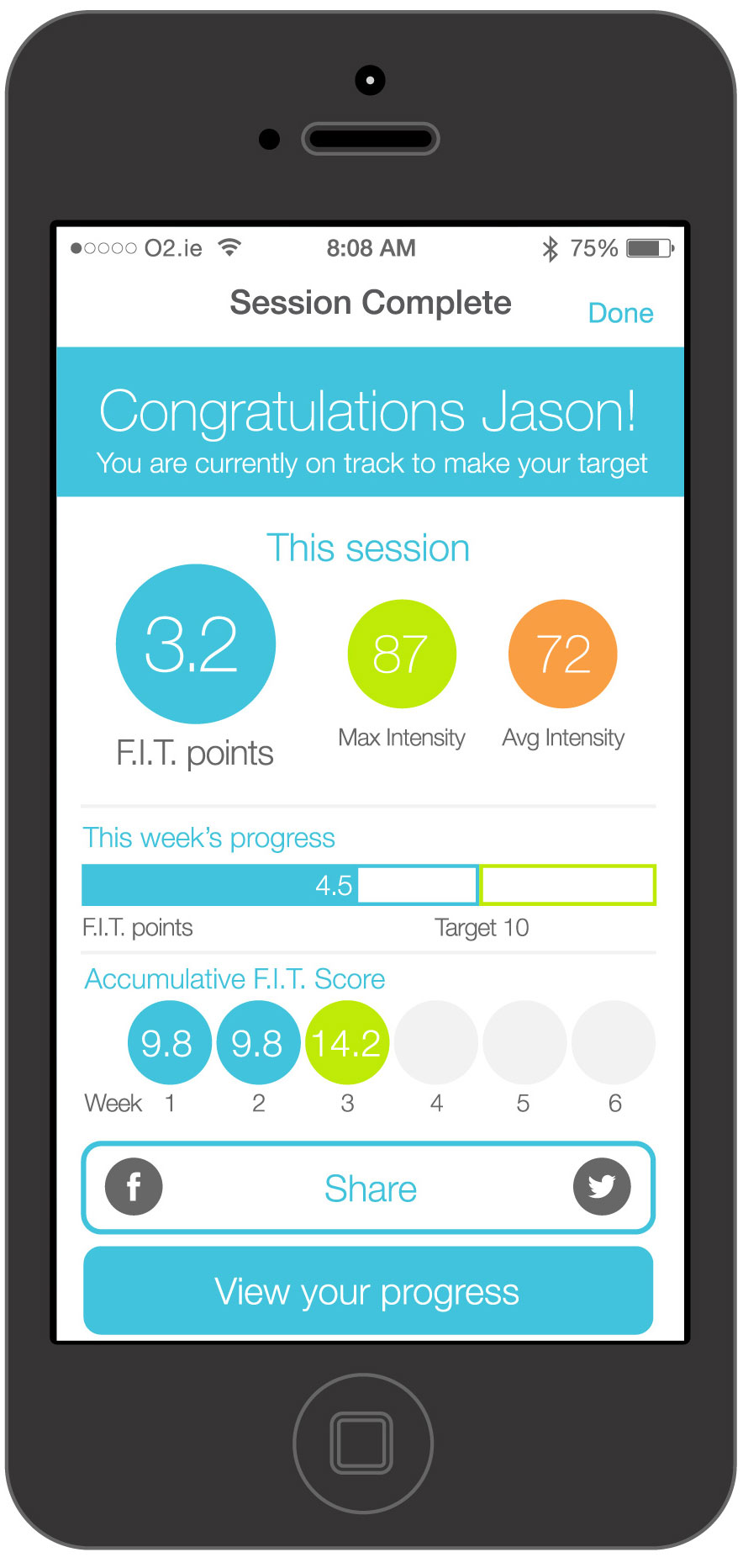
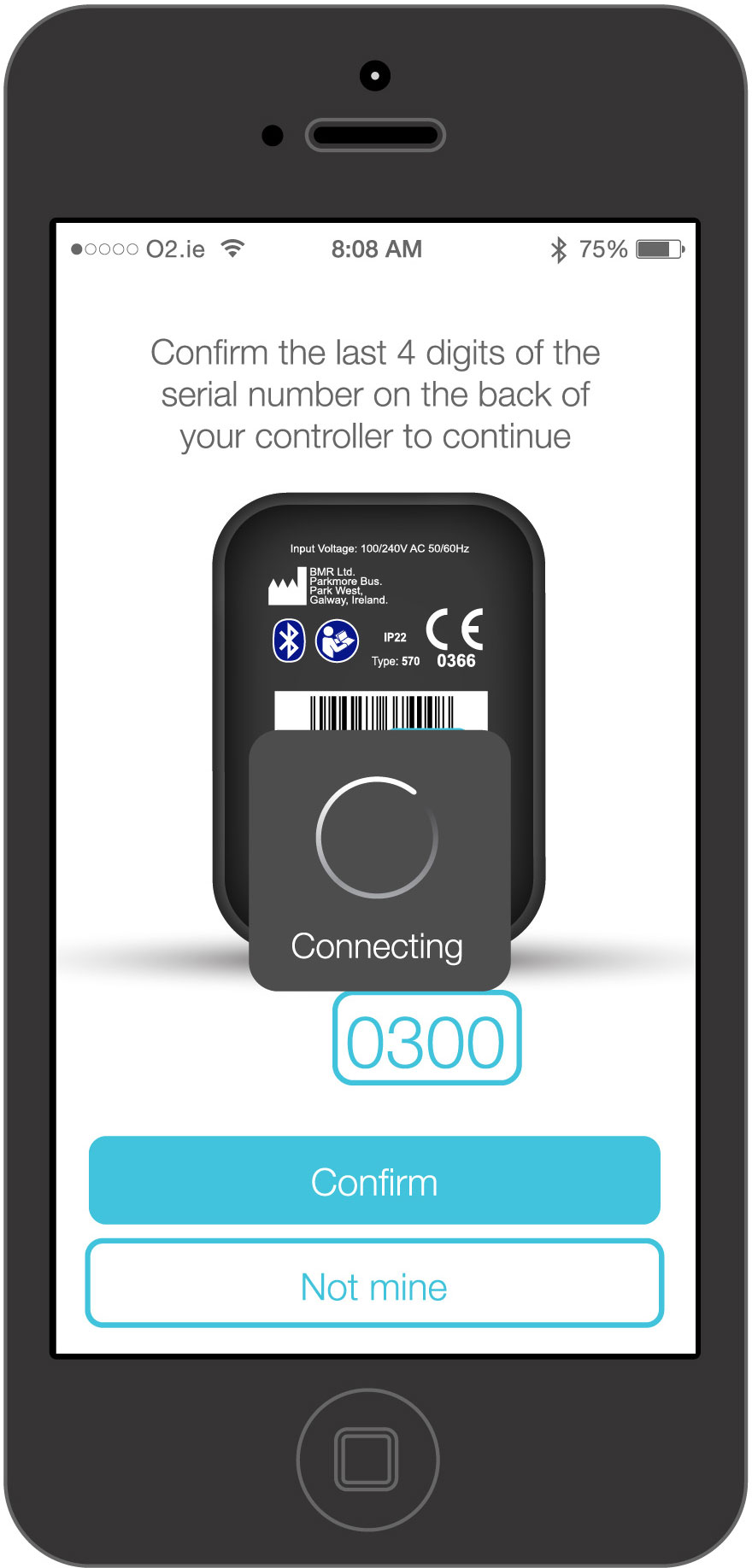
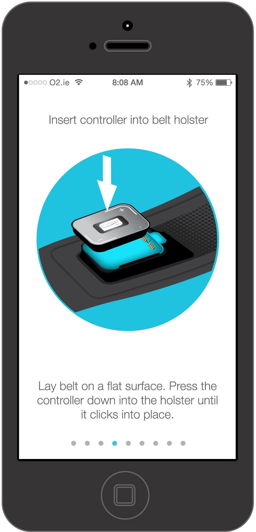
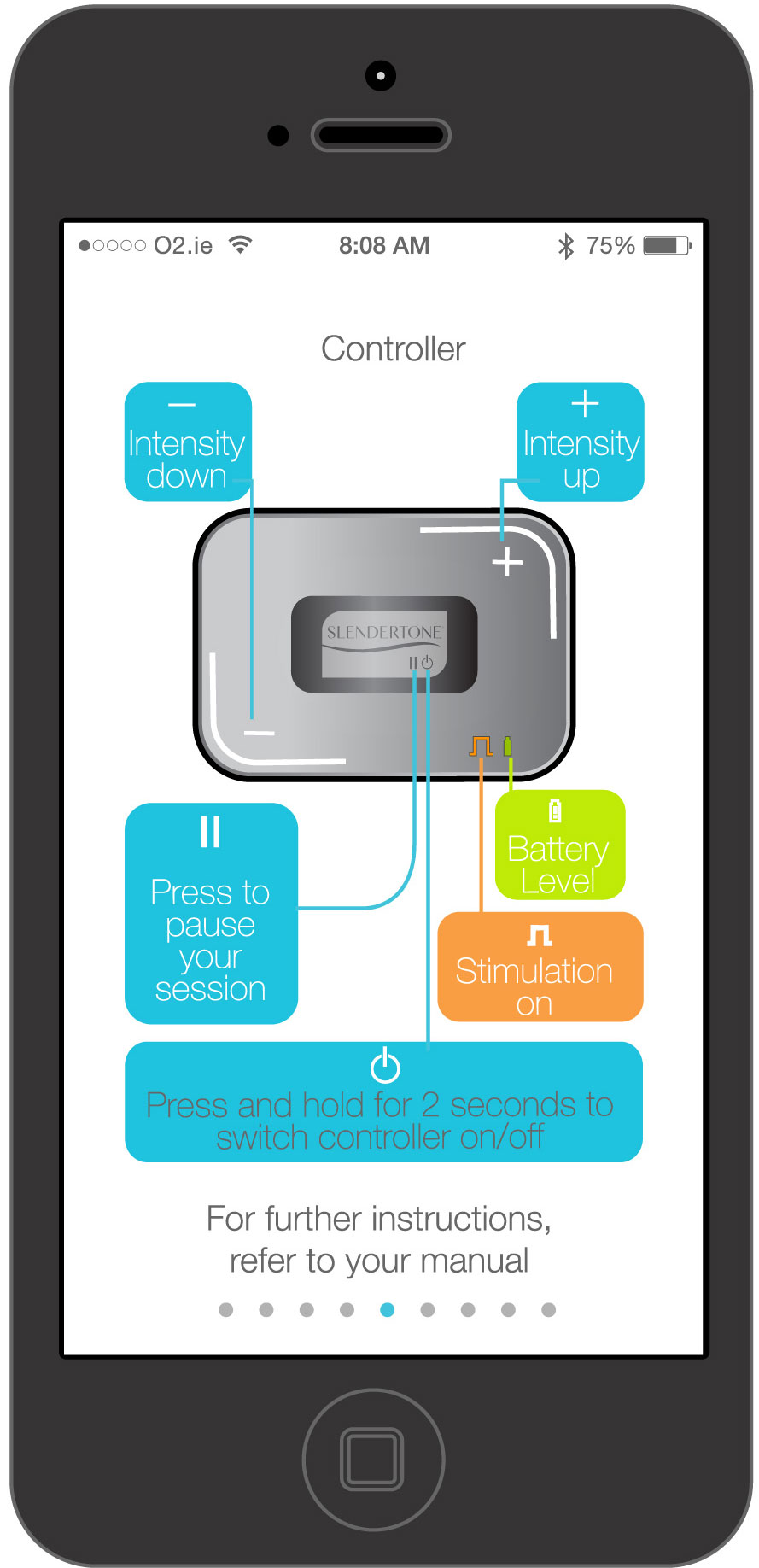
Slendertone Connect Abs is a new to market Ab toning product powered by a smart phone App.
The objective here was to communicate the extended eco system of the product that serves the
consumer in a more holistic fashion than Slendertone has historically done. My involvement in
this project was from inception to completion of all TV and digital media, Web Portal, App wire frames
and supply of App screen user interface design, market support creative's, product design and
market support photography.
Branding and logo creation
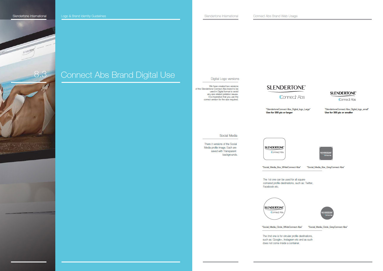
As part of a wider re brand project for Slendertone, I was tasked with creating the brand logo for Connect. While the nature of the word ‘Connect’ held powerful suggestion in itself, I was conscious of its common nature, so I wanted to be sure that I included enough graphical element to give Slendertone full ownership while making sure to avoid impeding on its simplicity. The graphical element was extremely important, not only did it have to give more visual representation of the product, but it had to avoid being characteristically misunderstood in terms of similar products in the connected device space.
I used Helvetica Neue 35 thin as a basis for the type face in keeping with the wider Slendertone re brand,
but updated the kerning and tracking to help the typeface character work better together and ‘fit’ with
the graphical element. The graphical element was based on the concept of connectivity and wireless
technology, using the connect azul blue as the accent colour. A lot of work was done on making the
typeface more bespoke, paying particular attention to making the typeface look more ‘connected' as a whole
while still preserving optimal aesthetic through careful kerning and tracking. Below you can see the final
versions with and without the Slendertone brand shape.
TV and digital media
Unfortunately, not all of the creative's are live, The 30”, 20”, 10” and UK viral will all air in Q1 o f 2016. As a result, I cannot share these online at this time, "however, below you will find the Launch, product set up, behind the scenes and French viral which will" give you a taste of the look and feel and tone of voice of this campaign.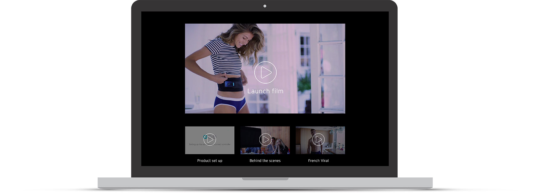
Online Web Portal
Much of the data generated within the App by the user, is collected and fed back to the user via the online web portal. Here you can see feedback on progress, compare with other users get nutrition and exercise tips, order new toning pads and view your profile which outlines badges earned and other stats generated by the user data from the toning App.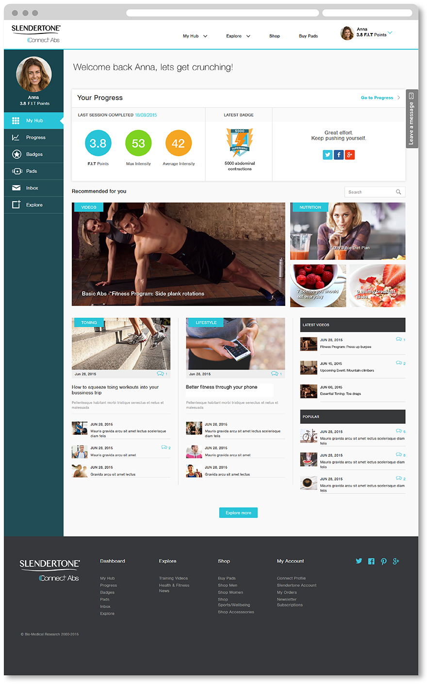
CRM Email support
below you can see my creative's for the CRM Email support for Connect. These Email's will be populated with much of the content generated for the web portal.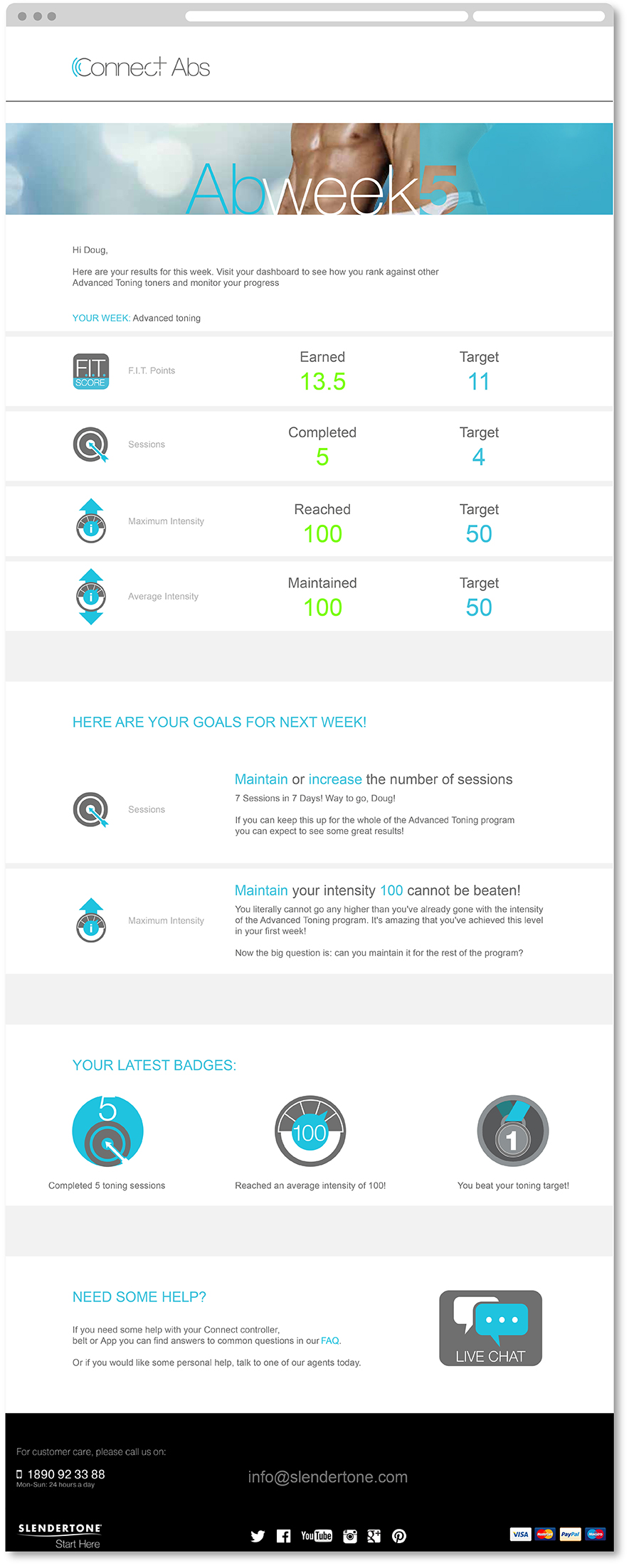
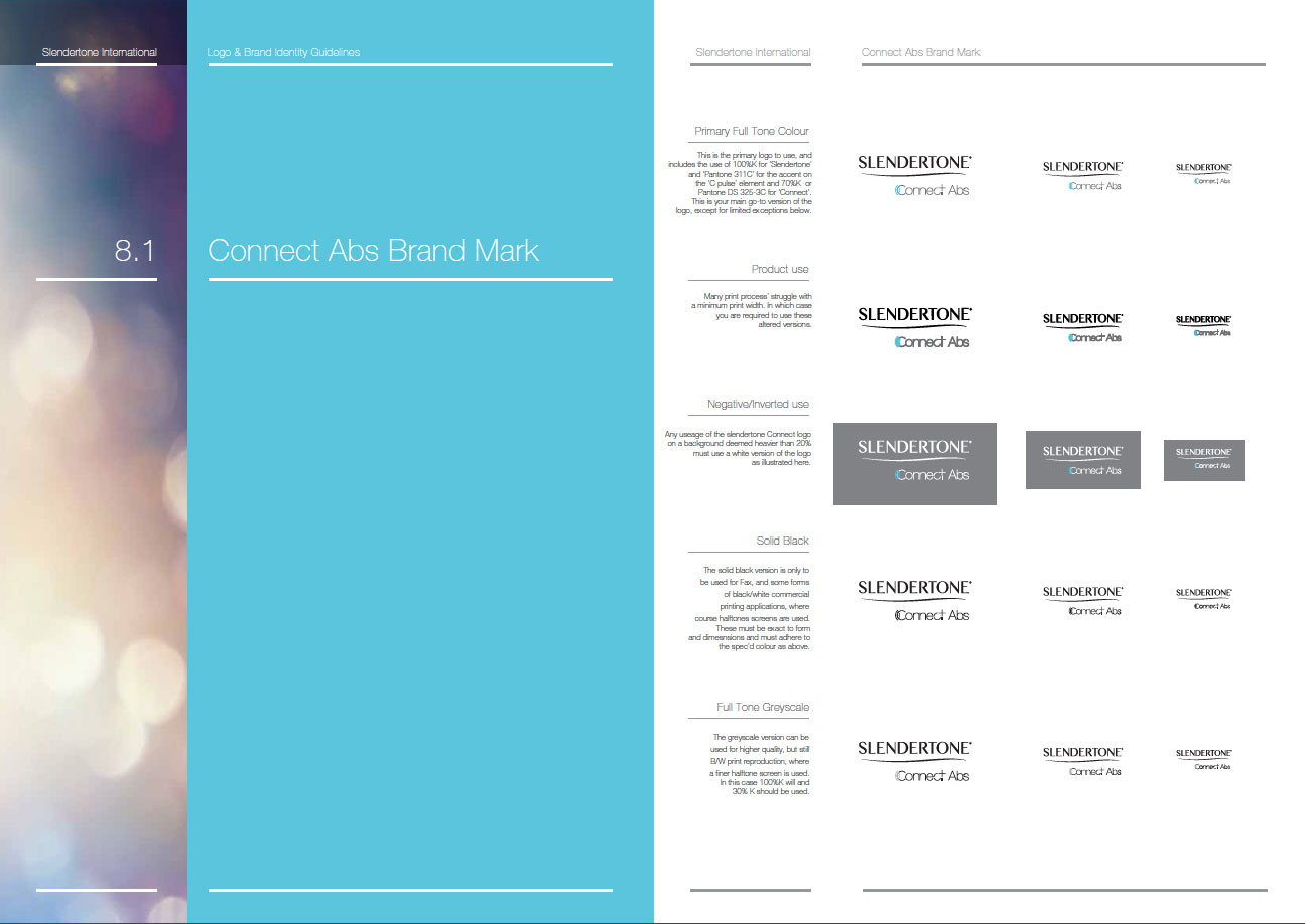
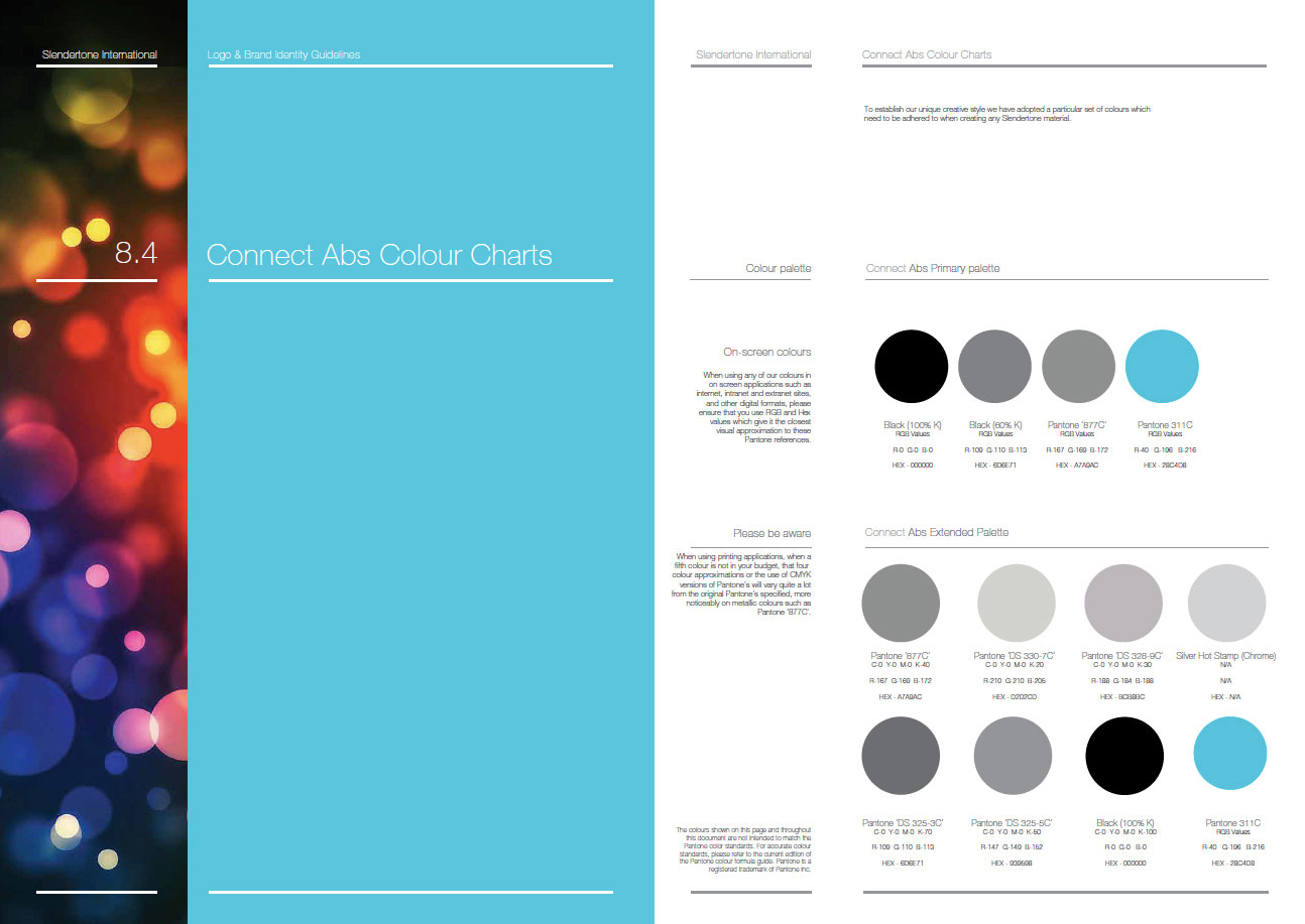
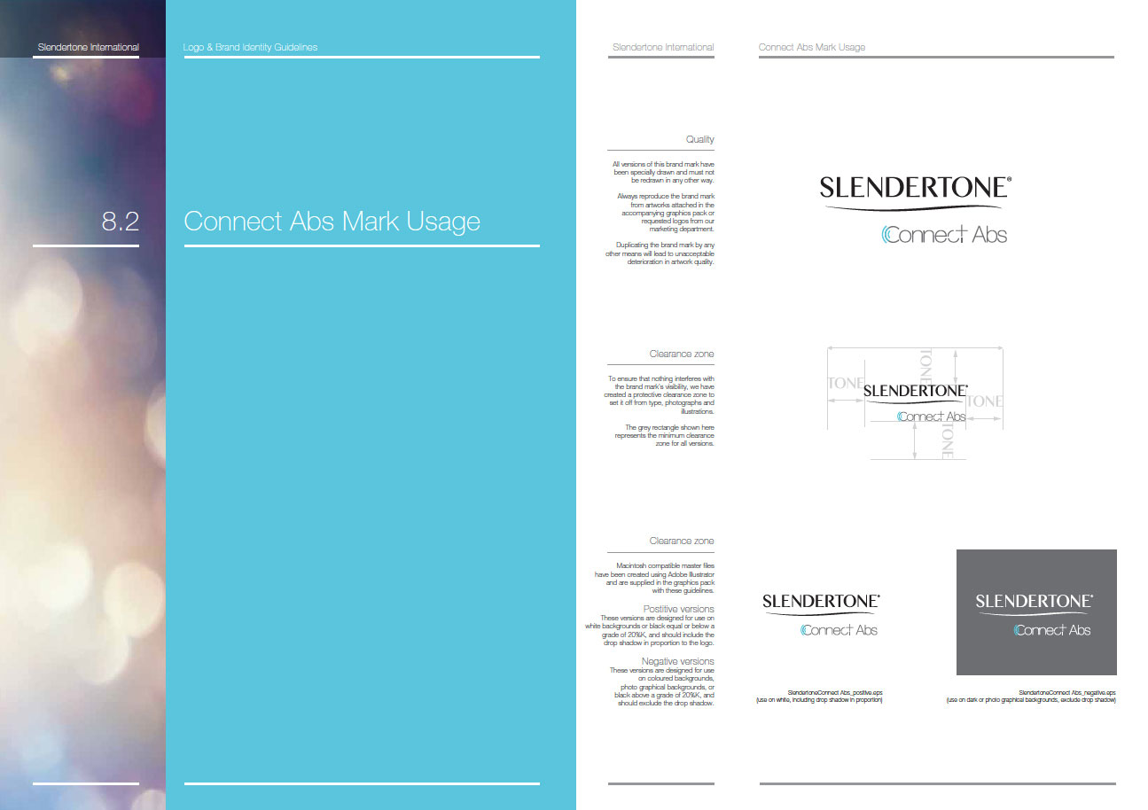
Brand guidelines
Full brand guidelines developed for this product, including logo versions, safe areas, social media usage, colour palettes, tone of voice, photography treatment, do’s and don’ts and typography.Click to enlarge any of the thumbnails.
Commercial package design
Full pack design, including structure design, material spec, internal structure with inserts and dividers, storage pouch, instruction manual, and outer sleeve artwork design and material spec.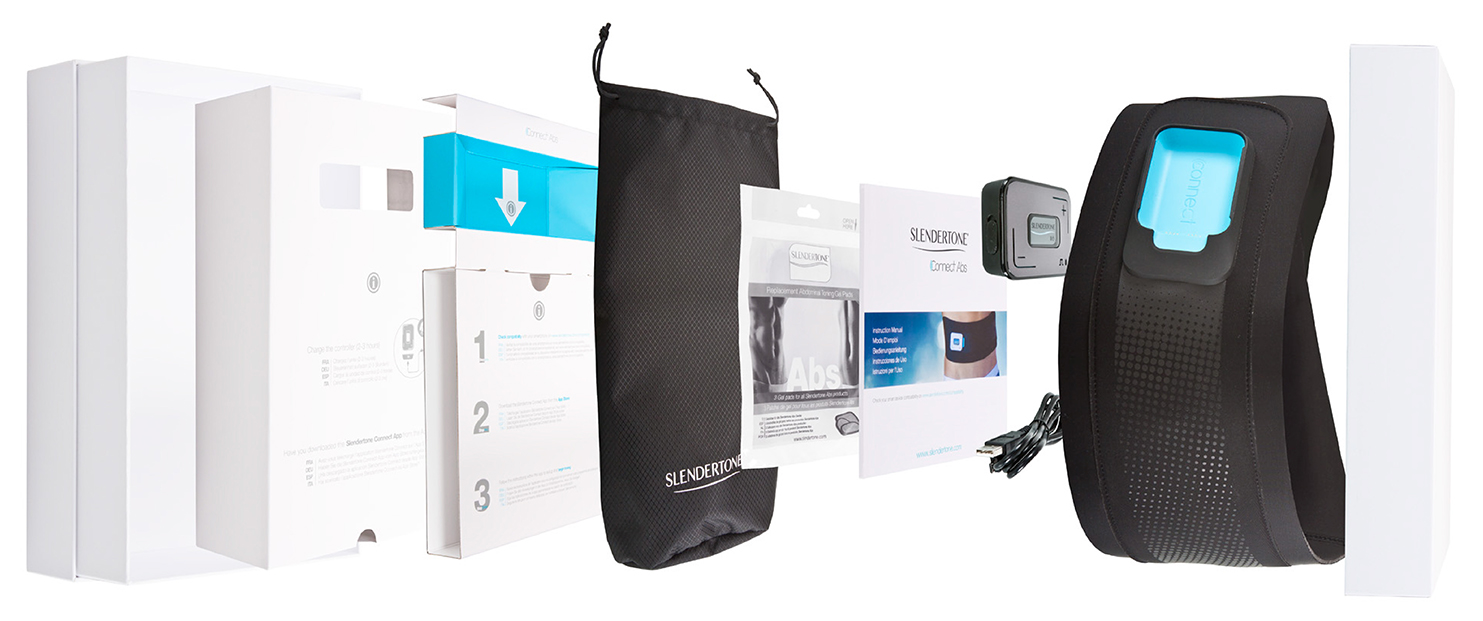
Click to enlarge any of the thumbnails.
Product design
I worked very closely with in house garment designers and polymer engineers to ensure that the premium feel of this product was not lost and that the aesthetic integrity held up. The challenge with this particular product was to spec material that was both on budget but that did not compromise the premium nature, but also using material that merged seamlessly with each other in terms of belt material and unit finish. To help this I decided that a matt finish grey print on the belt material would merge both finishes together effectively and would add another tactile element to the product that could solidify its unity.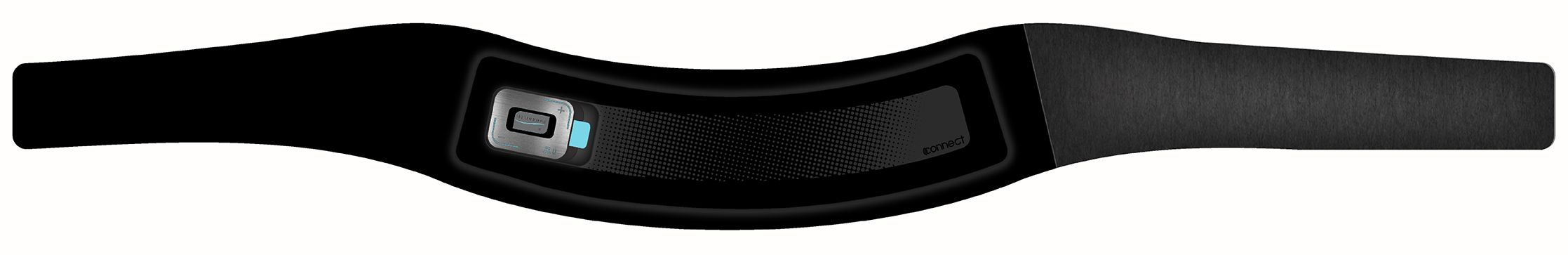
User Experience Design
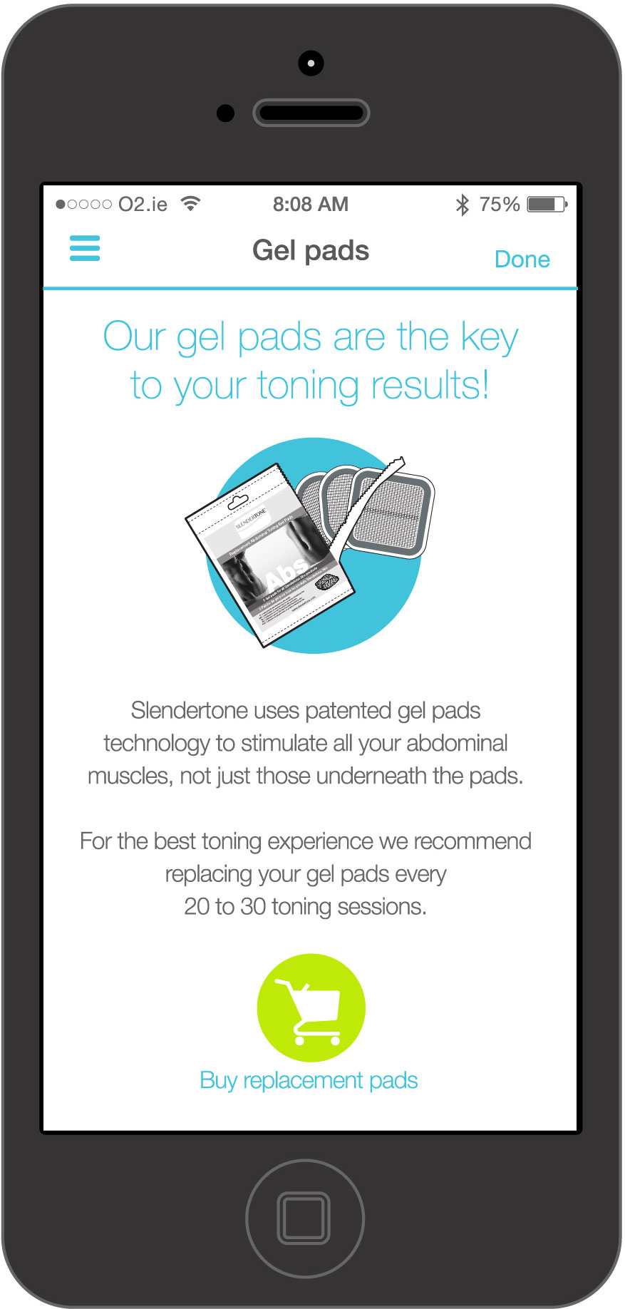
below you can just find some of the App screens I designed for the Slendertone connect App. The App can be downloaded from the App Store under the title ‘Slendertone Connect’ if you would like a full tour. I designed these screens with simplicity in mind, keeping background clutter to a minimum, using nice clean vibrant colours and keeping the complexity of UI to a minimum to better improve the UX. As this product required account creation and unit bonding that had to be cleared by FDA due to being classed as medical device,I worked extremely closely with developers to ensure that the user experience was optimal.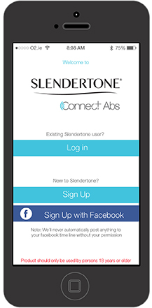
Photography
Much of the material you have just seen required multiple photography shoots, both commercial and product. Product photography was shot in our in house studio in Galway, while commercial shoots we directed on location in London and Cape town. Click on any of the thumbnails below to view the images full screen!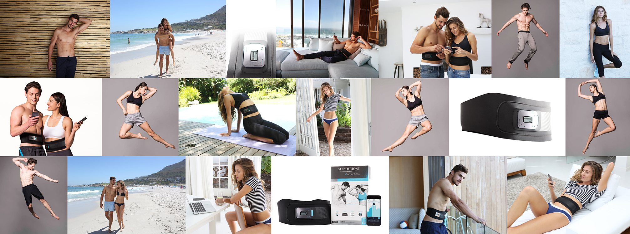
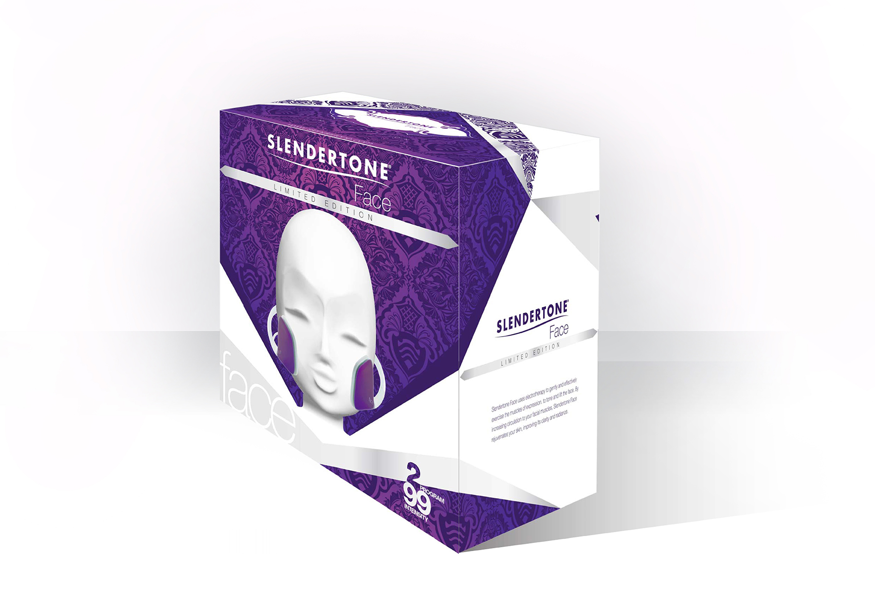
Slendertone Face by Philip Treacy

Slendertone Face by Philip Treacy was a limited edition of an Existing Face product. My involvement in
this project was from inception to completion of all branding, market support creative's, product design,
package design and market support photography.
Branding and logo creation
Having consulted with Philip in his London office and taken a tour of the facility, including a review of his works and creations, I set about creating a logo that reflected what I felt were the characteristics most synonymous with Philip’s style of creation. I quickly established a colour palette based on Philip’s creations and decide that a cerise pink would be the most prominent colour for brand and product creation, with a lime green plsying second fiddle to the colour palette.
I didn’t want to stray too much form the Slendertone style, but wanted to feature the elegance of the Phillip
Treacy brand as heavily as possible within the logo design. I decided to use Philip's most common type face
and simple integrate it into our existing Slendertone logo, using colour to set it out from the whole structure
of the logo without overpowering the hierarchy. I also developed a more fitting version of the logo for the
paddles of the product in order to utilise the space available more effectively. The results can be seen below.
Product design
Philip instigated the initial product design, which was integral to the end result reflecting that of the Galway man’s style. Upon reviewing Philip's initial designs, I consulted closely with our polymer designers to establish just how we could translate the initial Sketch into a practical usable version of the existing face product. We also looked at how we could integrate the colour and branding in a way that was synonymous with Philip's works, citing gradient fade as a clear characteristic. The result was a cleaner aesthetic of Philip's sketch that still held all of his characteristics and was easily recognisable as an adaptation of Philip's work, but was still a fully functional Slendertone Face product.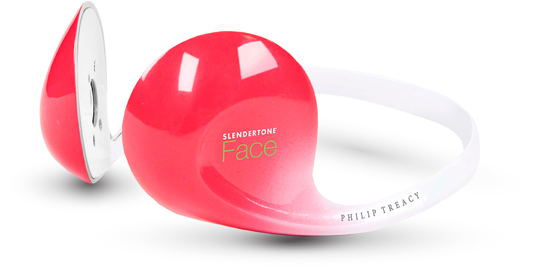
Commercial package design
Given the creative nature of this partnership, I really wanted to reflect a fashion creative without impeding on the product design that had synchronised Philip's style with Slendertones function. Ultimately, I felt that the creation had to reflect an object of sculpture that could easily live in an exhibition space. It had to be minimalist in order not to overpower the character and aesthetic of the product. In light of this, I elected to display the product on an elegant mannequin style head sculpture, using neutral silver, grey and white colours to allow the product to exist as the hero. We housed the mannequin sculpture in he base of the existing face box and cased it all in a beautiful gloss clear finish Perspex injection moulded lid to protect the contents.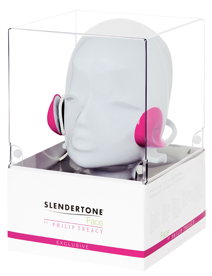
Digital Media creative
As a means of PR to celebrate the partnership, we decided to create a digital media production to communicate the process and the journey undertaken to create such a beautiful product. The video production below is the end result of the successful partnership which result in a featured space in the ‘Beauty Rooms’ of Harrods London.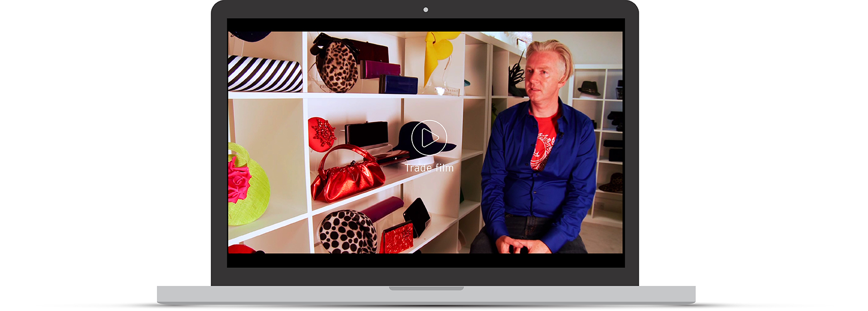
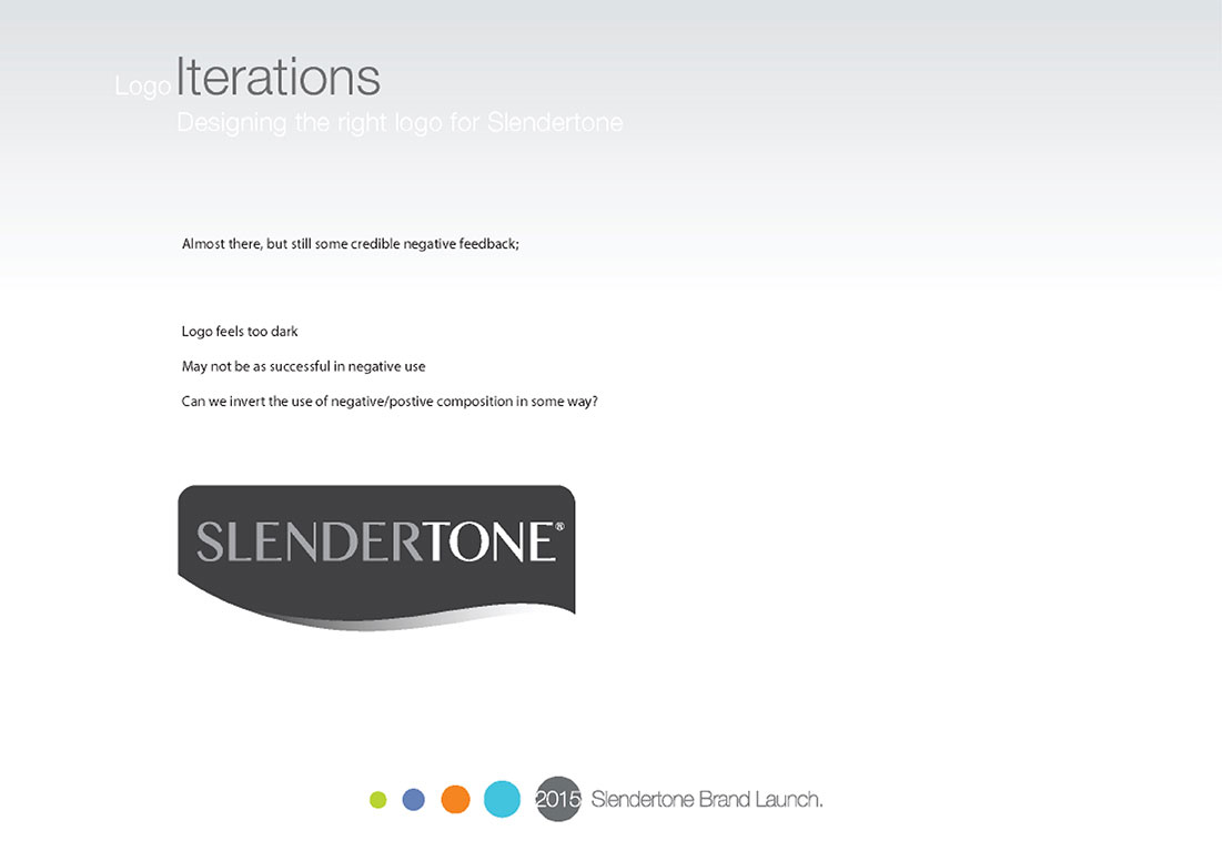
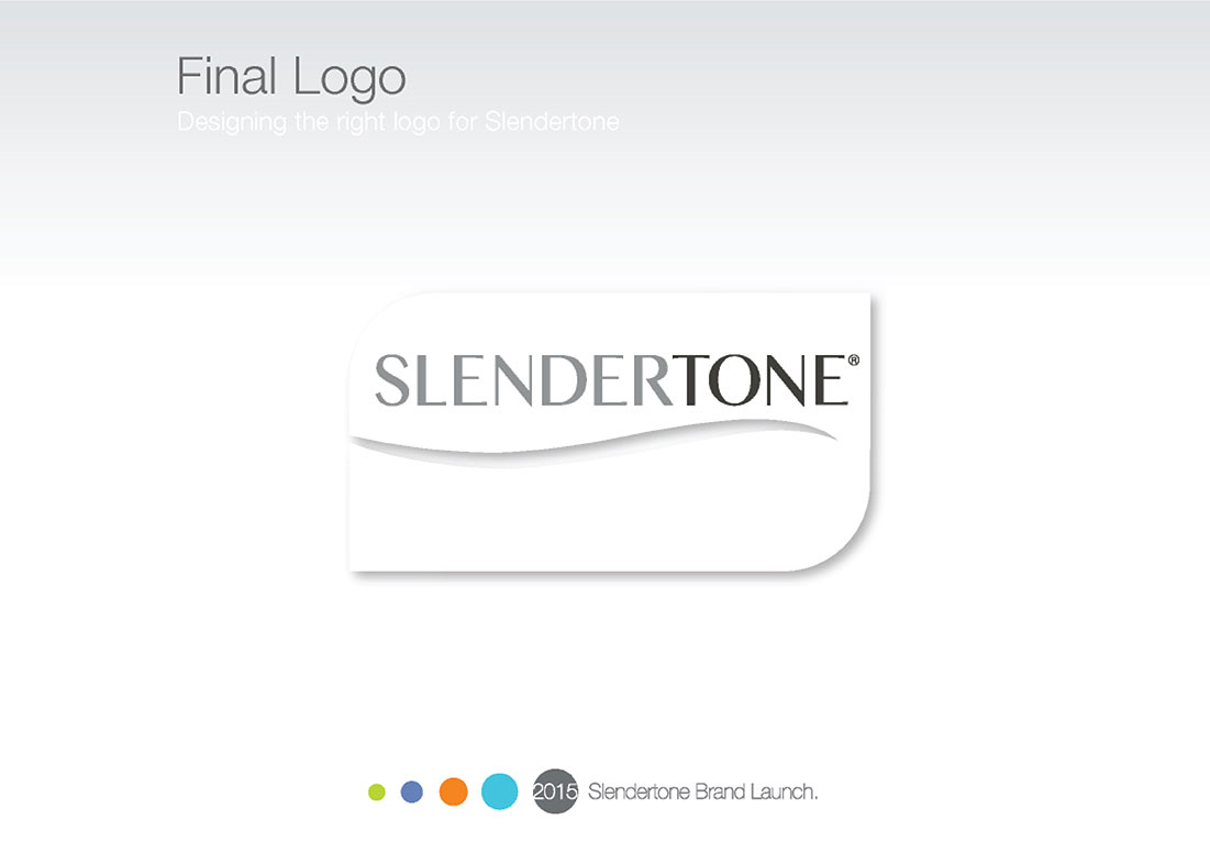
Slendertone re brand and product naming

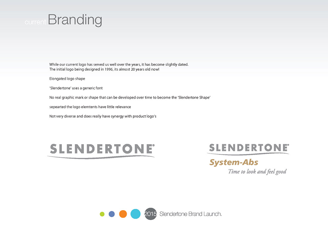
The Slendertone re brand and product rename project was as a result of a complete review of an existing
brand that had not changed for almost two decades. Once we made the decision to re brand we reviewed
the entire Slendertone range, quickly establishing that the whole range was confusing and disconnected,
largely due to ranges and product being designed in isolation. So we set about achieving a new, modern
fresh look for Slendertone that included a simple, unified modern range that connected with the consumer.
Branding and logo creation
I really wanted to design a logo that had longevity for Slendertone, so I began by researching the market to establish the most current brands that were setting the bar in terms of brand recognition and brand ‘marks’. I also wanted to map their evolution over time to forecast future iterations using their visual characteristic changes. I quickly recognised a common trend based around owning a shape for a brand, a simplistic, minimalist aesthetic that the consumer can easily build a relationship with over time, a shape that can represent the brand with or without the brand name.
Not only did I feel that Slendertone needed to own its own shape, or ‘brand stamp’ as I began to label it, I also felt it
was time that Slendertone became more protected from a trade mark point of view, and more unique in its execution
of brand and logo elements. I wanted every part of the logo to tell the story of Slendertone, from the shape, to the
typeface and the execution of the typeface in terms of tone and placement. As a result, I began to design a bespoke
typeface for Slendertone, a typeface that reaffirmed the product by utilising many different weights throughout the
typeface. I also split the brand name using variance in shade to help accentuate the words ‘Slender’ and ‘Tone’.
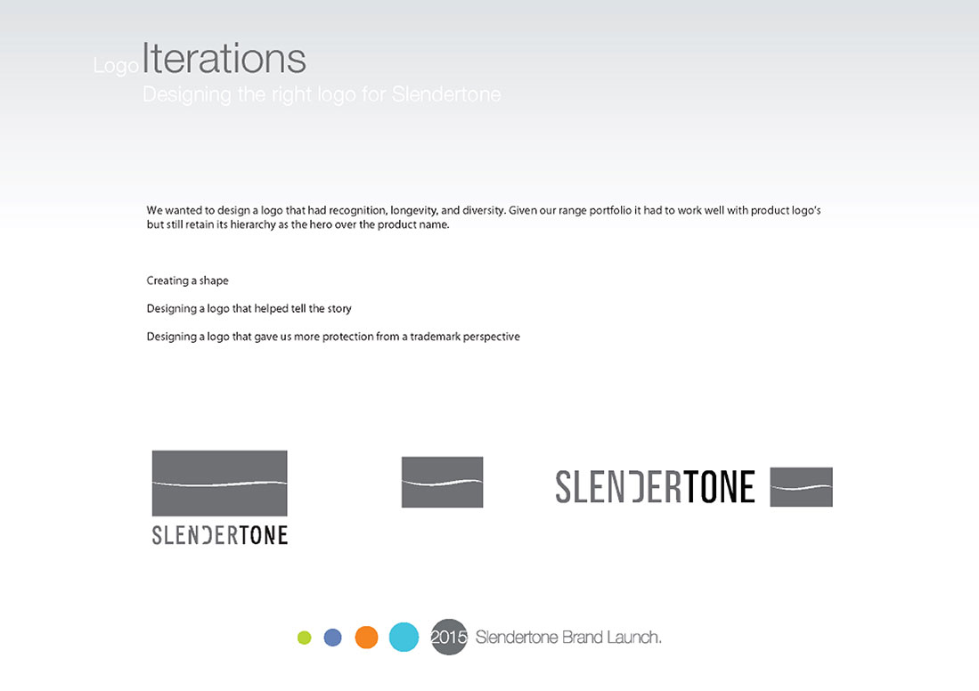
My next focus was the shape, the ‘brand stamp’ that Slendertone will build on in the 5 year plan. As part of the brief,
in order to address the current product logo and brand logo issues in terms of being synchronised, I wanted the shape to
facilitate the product logo in a much more unified fashion while still retaining brand hierarchy. As an extension of that
brief, I wanted the shape to frame and celebrate the ‘Slendertone swish’, so I was aware that it was an aggressive
brief and my biggest challenge was going to be creating a logo that addressed all the elements but still had enough
aesthetic balance to be a beautiful logo, especially considering its target market and product placement.
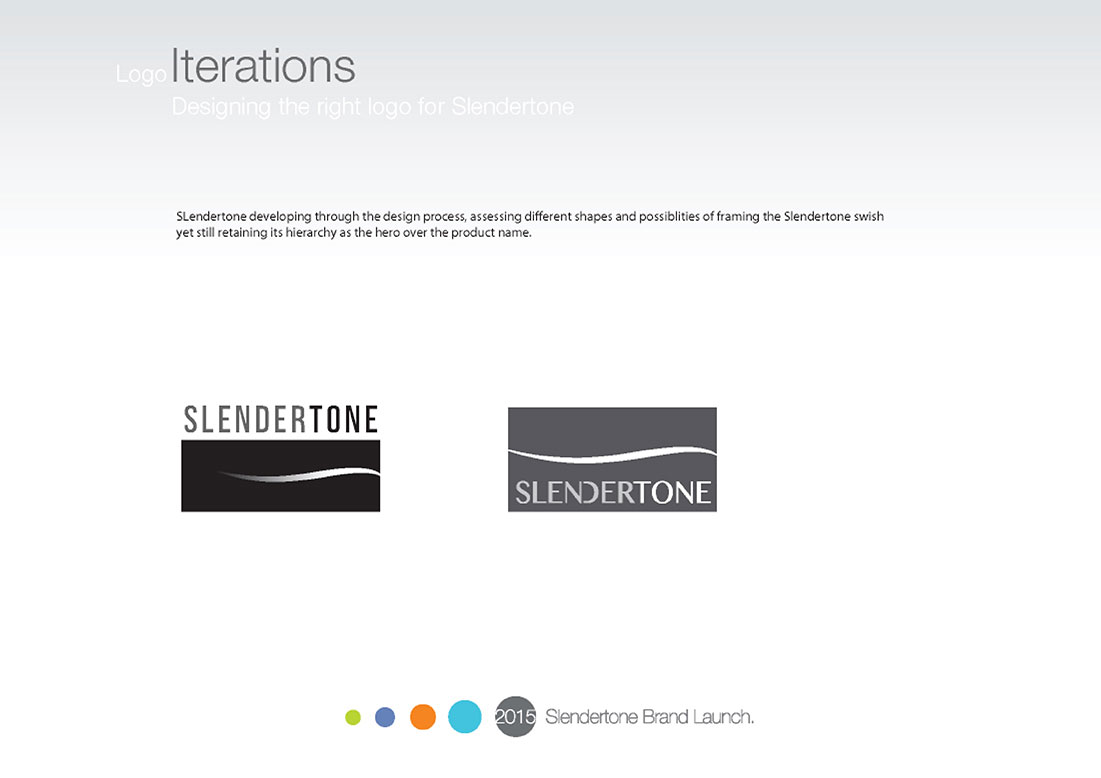
The final proposed logo was part of a 5 year phase plan, starting with the use of the typeface with no tonal differentiation,
ending with a full introduction of the ‘brand stamp’ and updated “Slender’ and ‘Tone’ tone weights. It was agreed that this
would be the most effective Approach of introducing the new brand to market as it would leverage current brand recognition
as we transition toward the new shape. click on any of the thumbnails below to see the abbreviated journey
of the Slendertone re brand project.
Click to enlarge any of the presentation thumbnails.


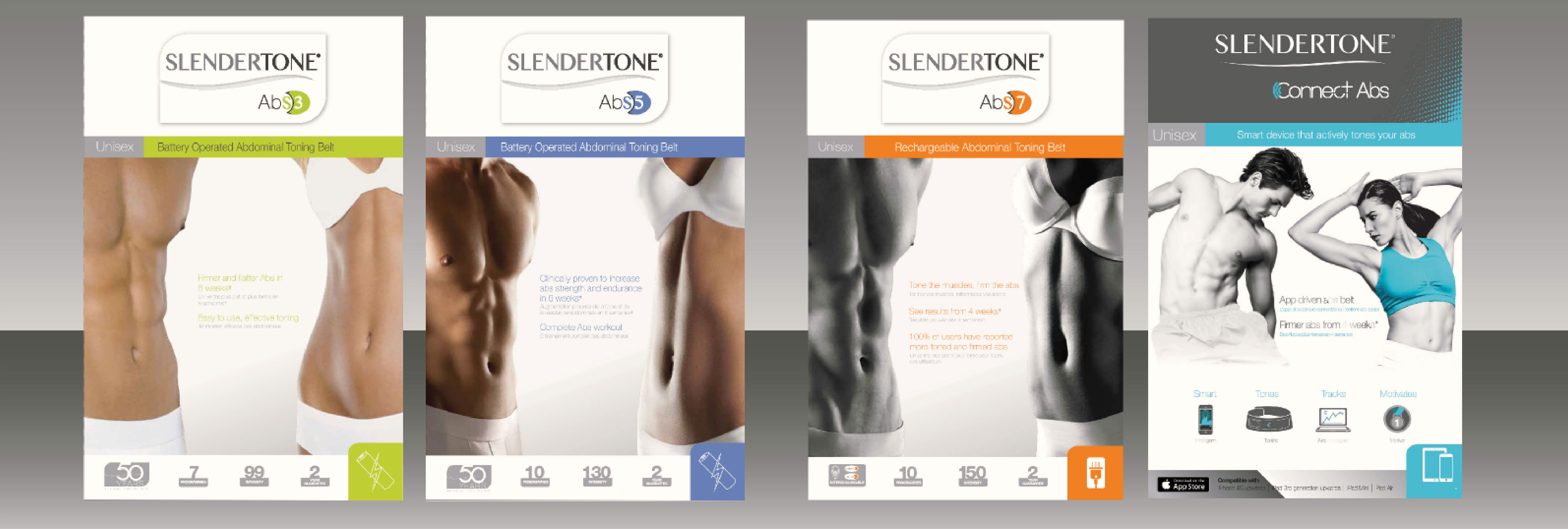
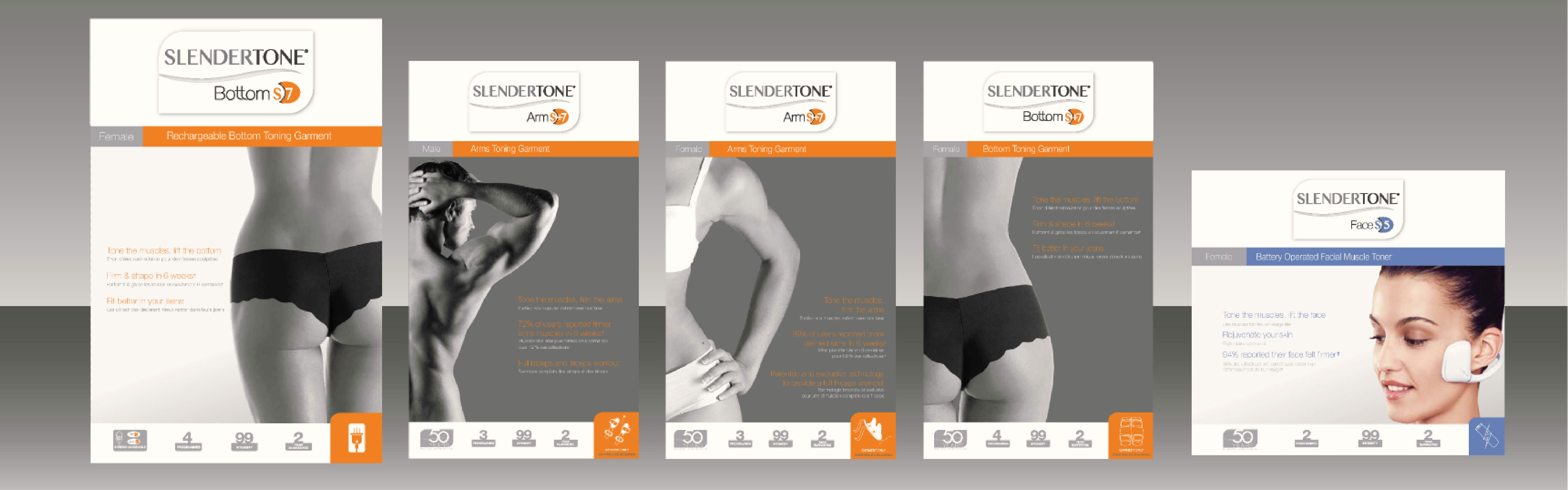
Product naming
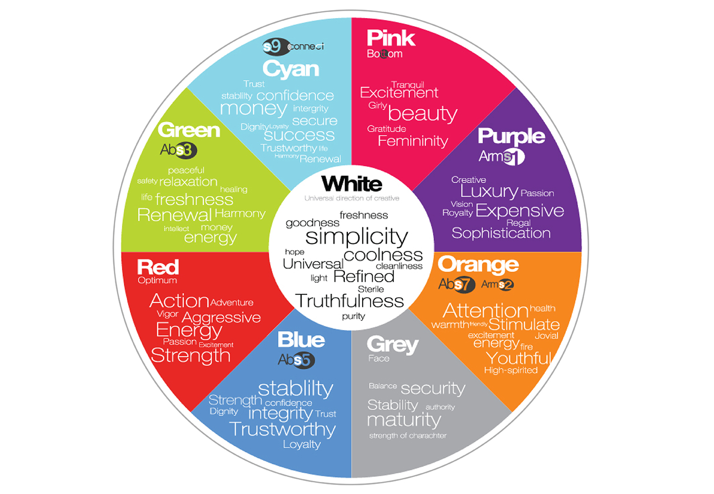
As part of the re brand project, I assessed the entire Slendertone range, citing the range as being disjointed and confusing, both from a product naming perspective and from a product creative perspective. Working closely with the Slendertone marketing department, I researched market trends in terms of product naming and quickly established a numerical led hierarchy among product naming in the market. It was a clear decision, a numerical solution would not only be easy for the consumer to understand, clearly indicating entry level to premium, but most importantly the consumer could relate to it considering their conditioning by the current market place.
Once I had established a naming solution for the complete Slendertone range, I began researching colour
psychology, focusing on emotional relationships with specific colours, and how I could support the hierarchy
of numerical naming using a hierarchy of colour using visual psychology. Below you can see the colour chart
I created for Slendertone using my findings from my research. This is a particular area I felt many brands overlook,
but colours fill our lives, and are far more relevant than we give them credit for, thankfully our consumer research
proved my decision to be well justified.
A full report on my brand and product naming is available on request.
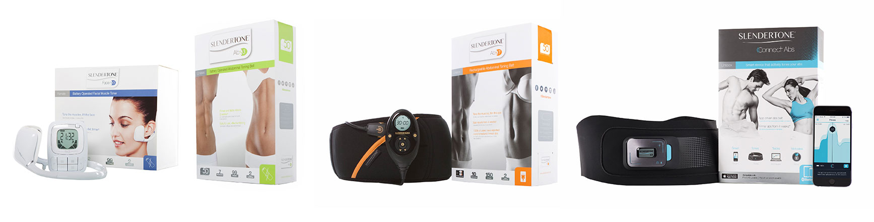
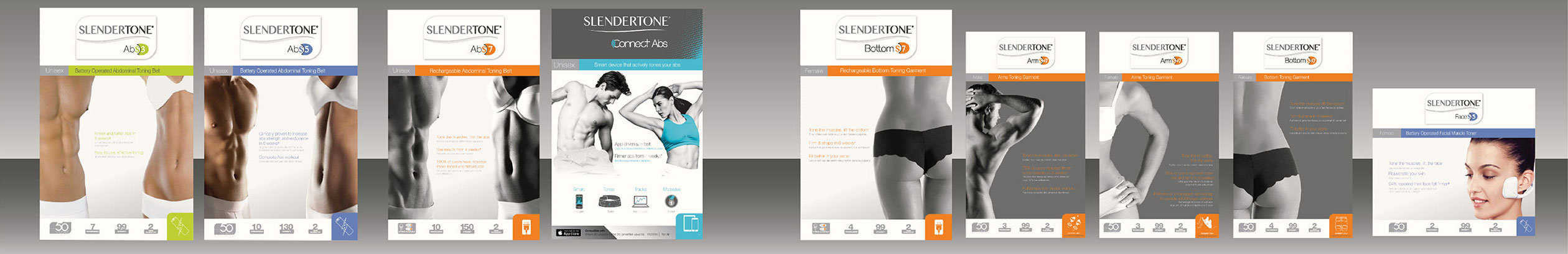
Slendertone Core range
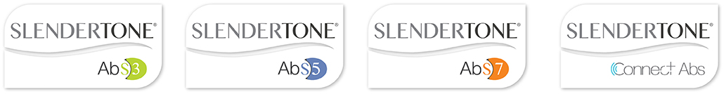
Slendertone Extended range
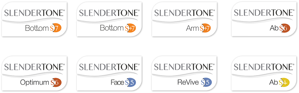
Colour psychology
Commercial package design
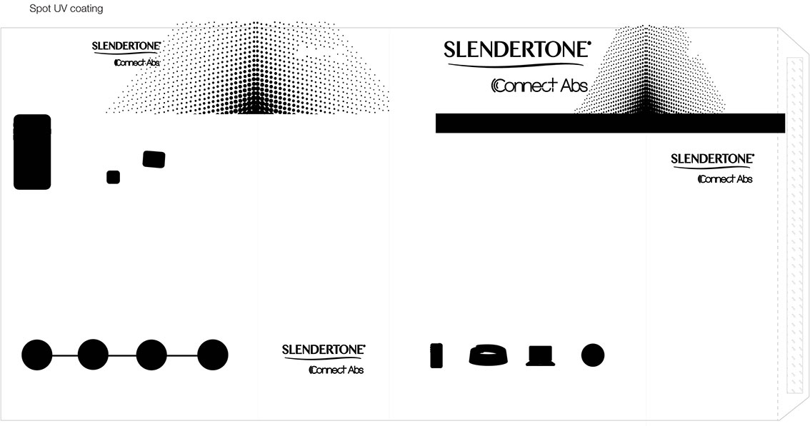
I decided that the complete Slendertone range needed a packaging redesign as part of the re brand and product naming. Having established the new direction as largely monochrome with colour identifiers, I began to focus on how I could help aid the visual hierarchy on the pack range design. I decided that we would lead entry level with colour key images, with flat print and no spot features and lead to using monochrome imagery and some nice tactile additions such as hot stamping and spot UV.
The brief was predicated by a hierarchy in budget, so I decided that this w ould be best reflected in the construction of the
packs, using corrugate boxes for entry level, rigid box with single corrugate insert for better, and rigid box with multiple
corrugate inserts for best, paying particular focus to user experience and the user ‘journey’ into the pack. All pack
construction was designed based on a chassis model design that could be interchangeable between products using a post
pack out sleeve process in a bit to simplify production and increase M.Q.O. to reduce total unit cost while retaining a
premium look and feel. The result, a fresh, modern, simplified range that utilised a much improved user experience
without any cost implications to the existing over all packaging budget.

Internal brand launch
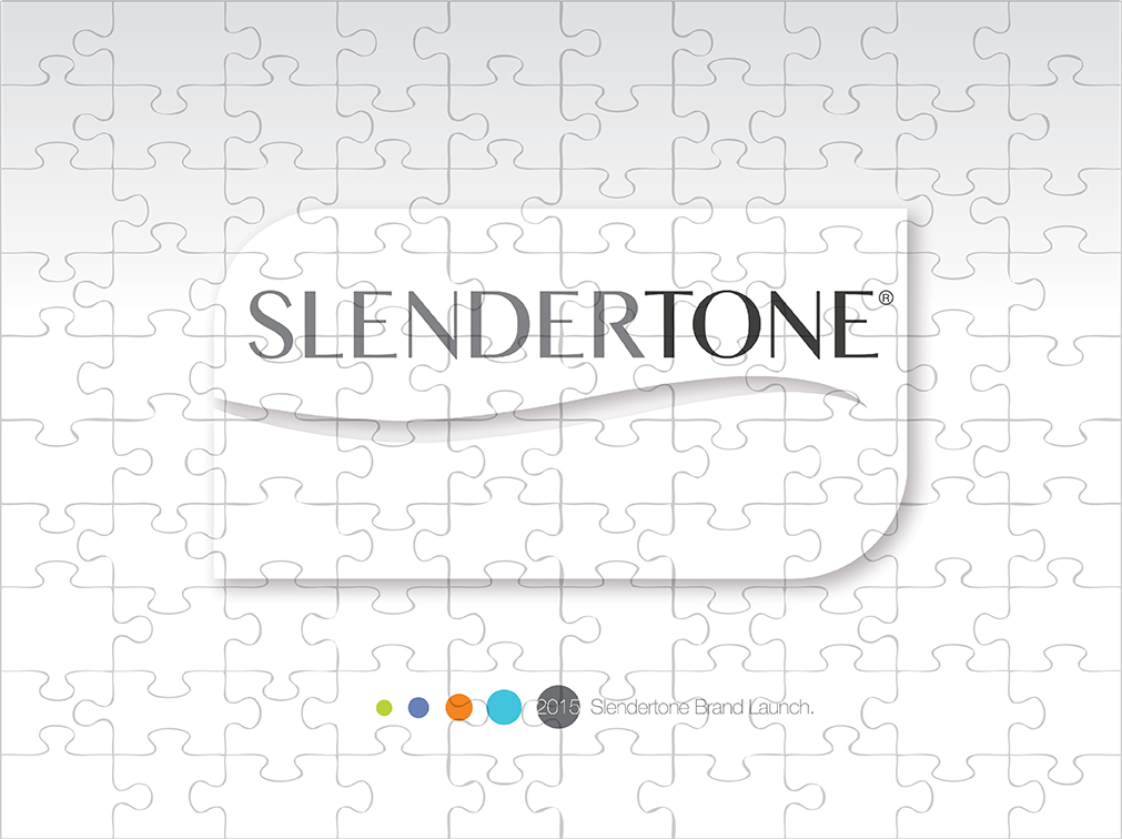
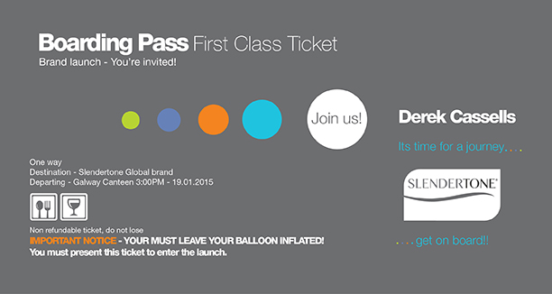
The first step to any successful brand launch to market is to ensure that all internal staff feel integrated and understand their value as part of the launch. A new brand launch is a titanic undertaking and every staff member plays an equal part of ensuring it is a success. Subsequently, a decision was made to stage an internal brand launch coordinated between all Global offices,as I really wanted all staff to feel like they were part of one organisation. It takes a whole company to build a brand so to communicate this, I designed a Slendertone jigsaw made up of 100 pieces, the exact number of staff at Slendertone International.
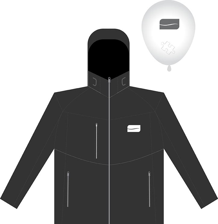
Each member of staff was issued with new business branded cards with the new Slendertone logo,
a helium balloon with their Slendertone jigsaw piece inside, and a boarding pass inviting them to ‘Get On board’ and
come to the Slendertone brand launch. At the launch each member pierced their balloon to reveal their jigsaw piece which
they then signed and placed in the Slendertone jigsaw. Once each piece of the jigsaw was placed, the jigsaw became a
complete Slendertone logo which was subsequently framed and put on display in the headquarters reception.
This, as well as some Slendertone merchandise helped to generate investment and pride in the new brand and
injected an investment of energy into making the launch globally a success.
Launch Invitation
Launch Merchandise
Launch Teaser
Brand Guidelines
Full brand guidelines developed for this product, including logo versions, safe areas, social media usage, colour palettes, tone of voice, photography treatment, do’s and don’ts and typography.Click to enlarge any of the thumbnails.
Brand roll out
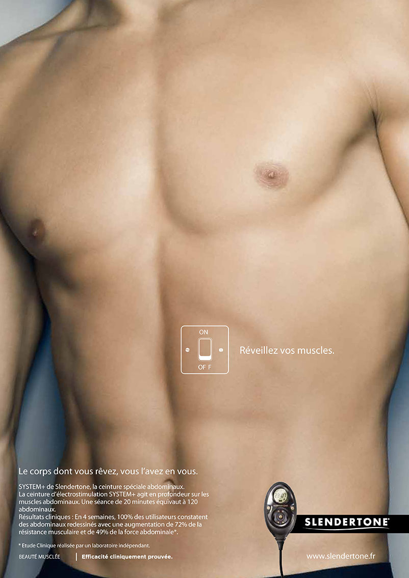
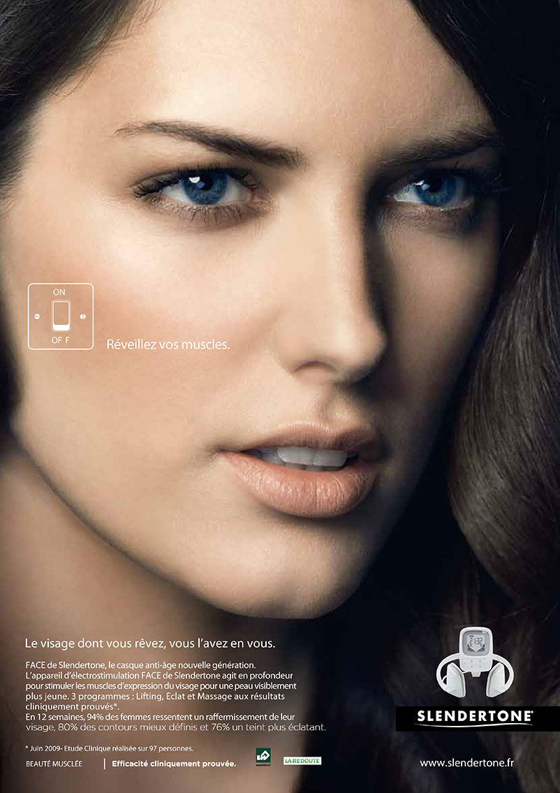
Slendertone France - ‘Awaken your muscles’

The Slendertone France ‘Réveillez vos muscles’ campaign was possibly the first Slendertone campaign where
we made a conscious decision to reach out to the emotional rather than advertise the benefits or statistics of
the product. We needed something a little tongue in cheek, yet still retain a very ‘Chic’ look and feel in order
to engage the French audience. Its a simple story of confidence, so the message was straight forward for the
consumer, wear the product, get the type of body that will create attention. The creative was then closed off
with the tagline ‘Réveillez vos muscles’ which loosely translates to ‘Awaken your muscles’.
TV commercial creative's
Its no secret that this was a fun shoot to be a part of, which directly translates into the humour portrayed in the TV creative. The beautiful cinematography and Photography made for some beautiful minimalist chic style creative's, the images doing all the communicating with the text taking a very secondary role in the creative, an image speaks a thousand words, and sometimes its best left to achieve this without any typographical intrusion.
Print creative's
Extended print creative's rolled out to press advertising and public advertising throughout Paris on the metro, billboard and various bus shelter ad posts around Paris and greater France area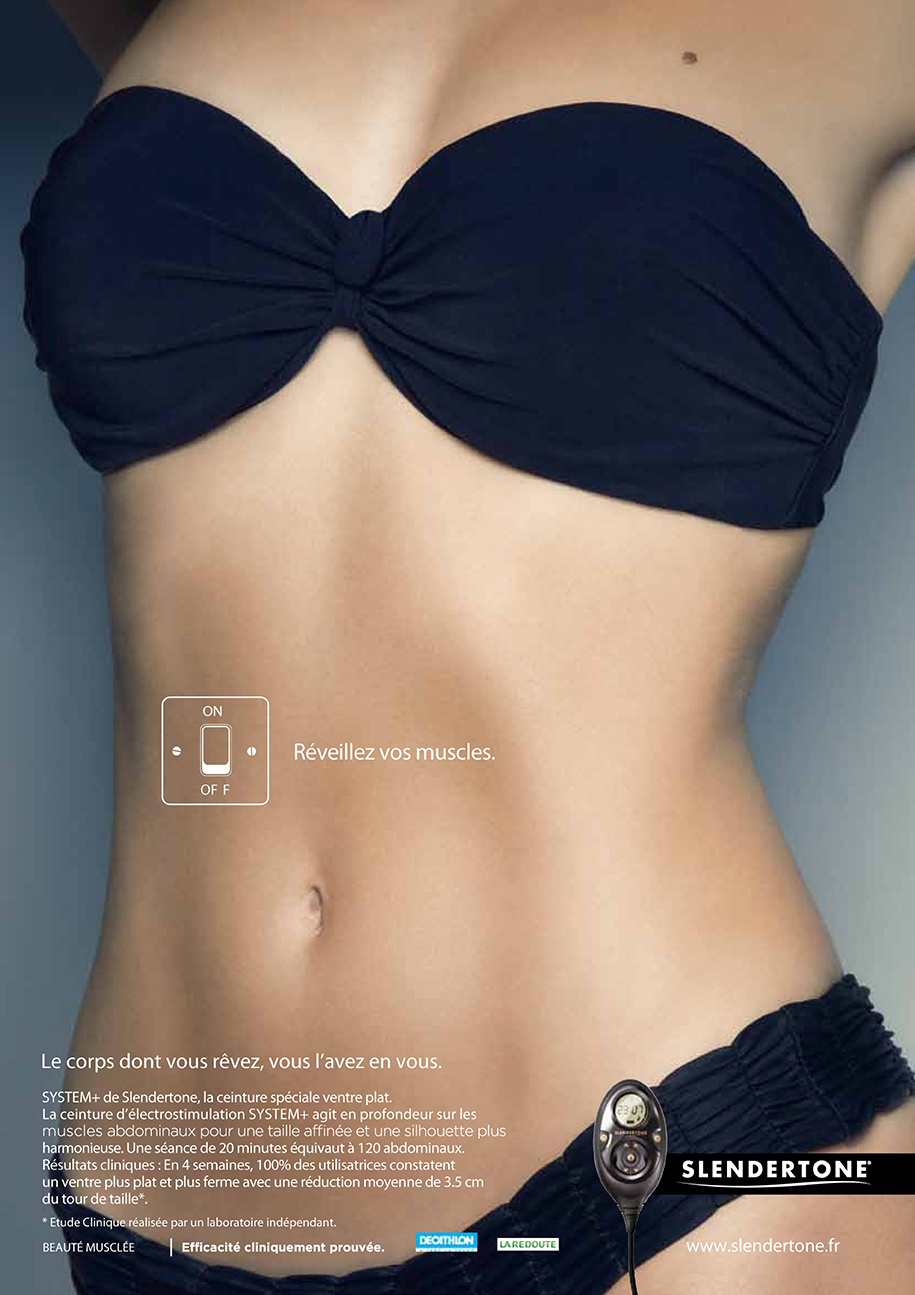
Click to enlarge any of the thumbnails.

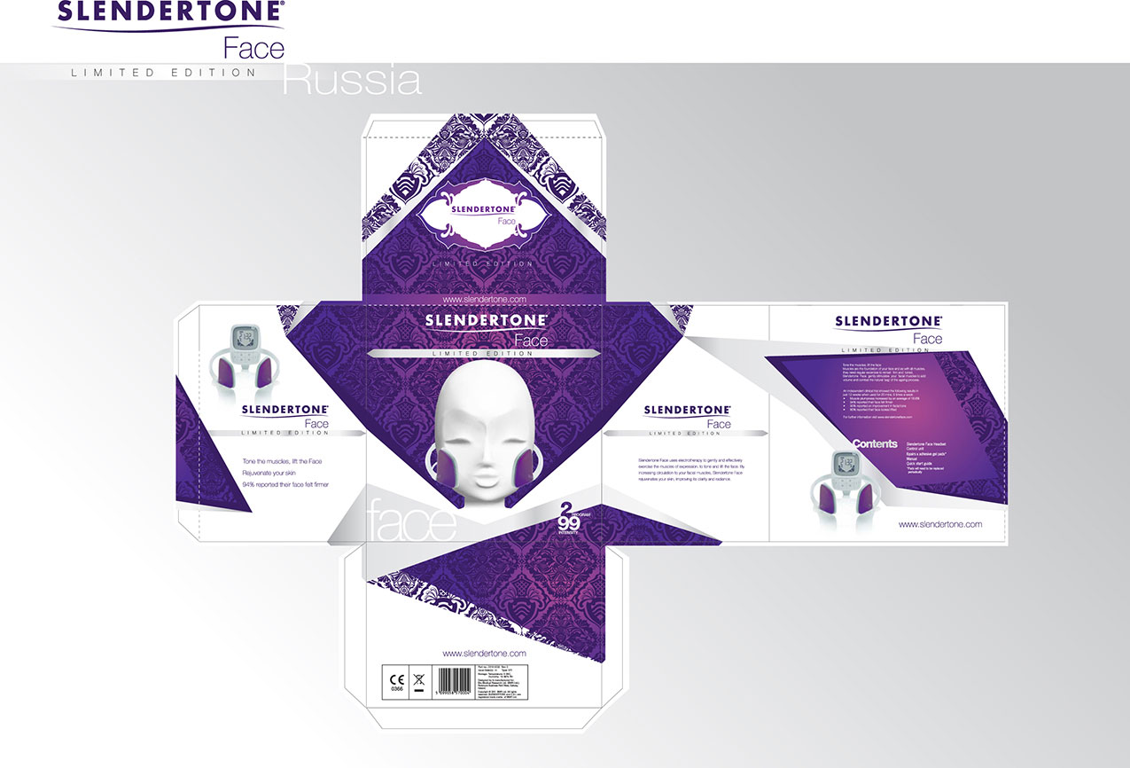
Slendertone Frace - Russian Limited Edition

Slendertone Face Russian Special Edition was quite a loose brief, outlining the need to have a bespoke sleeve custom designed for
the Russian market as a one off limited edition. Unable to change any of the structure of the pack, a full wrap sleeve was the only
option as I was directed to use the existing European Face Packaging to keep costs to a minimum.
Commercial Pack Design
As this was a full wrap sleeve, I wanted the design to break around the top, side, bottom and rear facings in order to take focus off the wrap. Furthermore, I used an angular design of shapes, textures and finishes to create intrigue and add the opulent and palatial style that the Russian market requires. While researching the Russian market, I stumbled upon Russian Imperial Eggs which largely became my inspiration for the design. I loved their decorative nature, culture, and heritage in Russian History, and I felt that the similarities of unwrapping or opening something of such beauty to reveal something of importance was a nice predicate to set for my creative.
I paid particular focus to this need for Russian trend, not only utilising materials that evoked opulent and palatial style, but also
ensuring that all the creative bared characteristics of that palatial style. I felt that the original mannequin face we had used for the
special edition Philip Treacy Face (See Slendertone Philip Treacy project) was a great place to start as it held an elegance that I felt
could easily facilitate more detailed surrounding yet still represent the product use effectively.
I wanted the sleeve to be very tactile and engaging, so I used very plush material. Hot stamping, silver printing, metallic purples
and spot gloss purples created a contrast in Appearance and touch that added greatly to the experience of handling this pack,
while the ornate vector pattern that would be printed in the gloss darker purple finish on what would be a white matt soft touch
sleeve kept the palatial feeling I was after, reflecting that of my intended Imperial Egg inspiration.
Click to enlarge any of the thumbnails.


My role in this project included design, layout, video, photography creative direction
and brand control delivering a final, engaging on brand concept that reflected the youthful
vibrant nature of iradio, delivering content in a new layout using smart iPads and phones
to utilize the conditioning of the demographic for iRadio
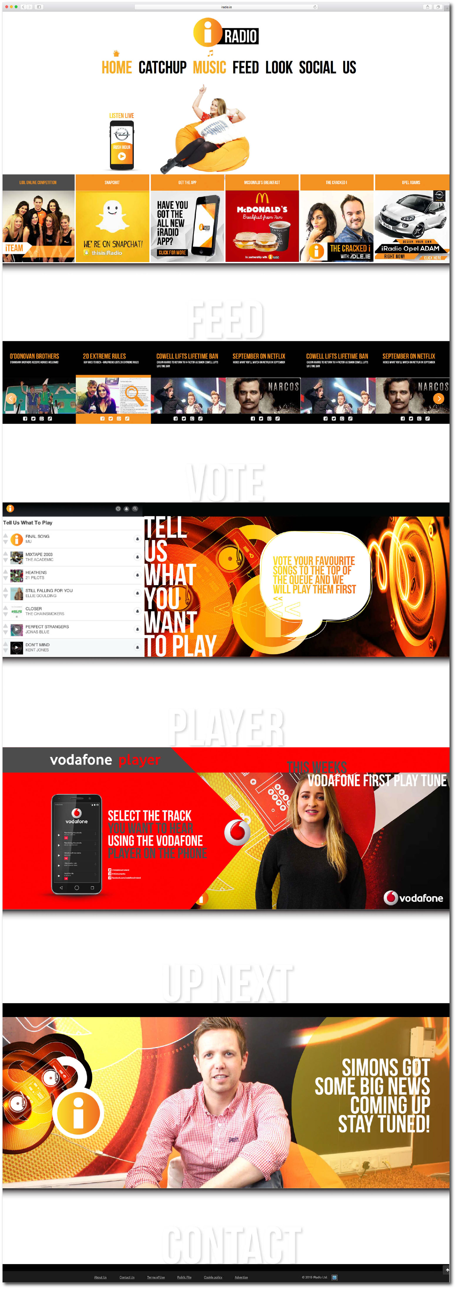
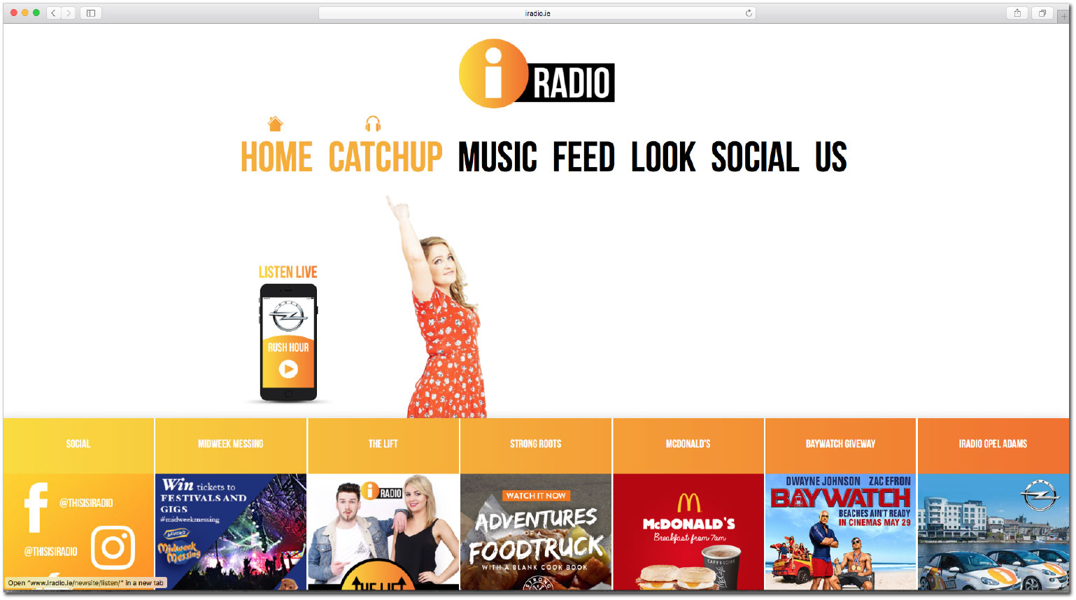
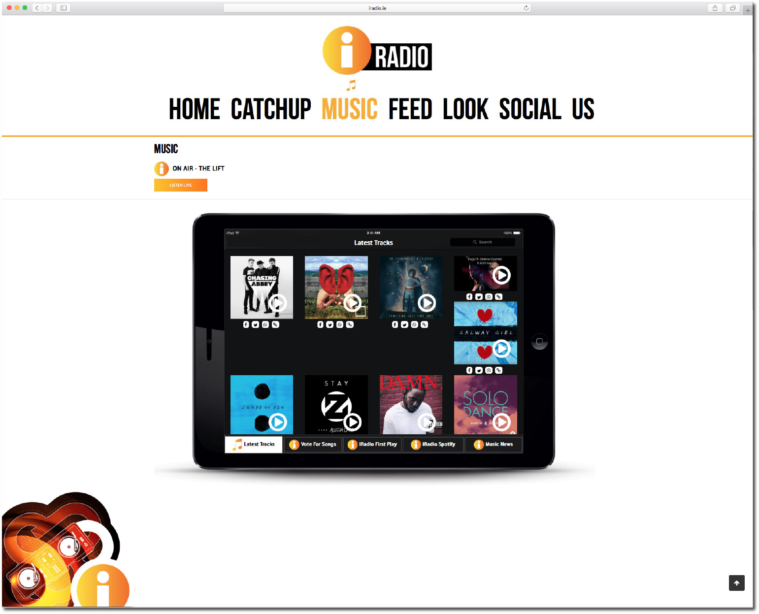
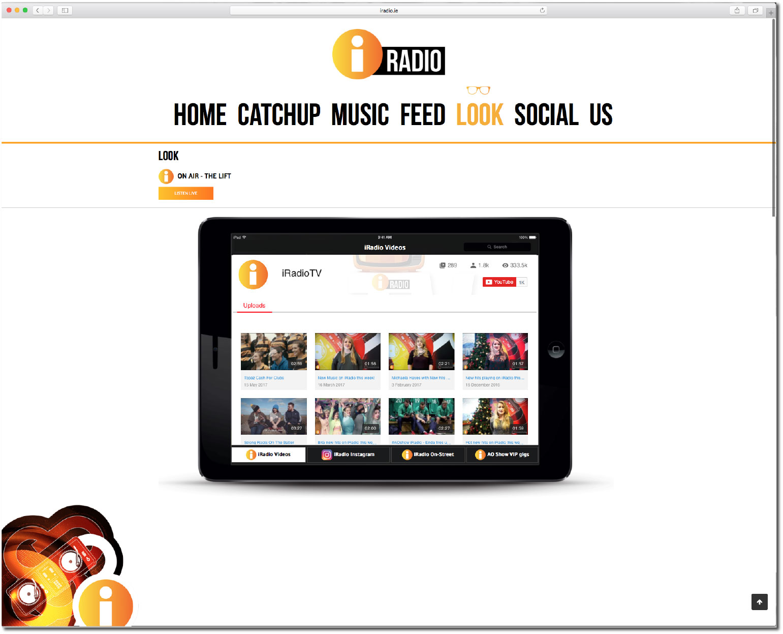
iRadio Web
Tasked with building a brand new website for iRadio, which, like all other radio stations in recent years, has found itself growing from a broadcaster to a multi platform content provider.
I built a unique website, which gives the user the best possible way to consume iRadio’s online entertainment
and viral news while also providing a platform to seamlessly listen back to the station’s programming.
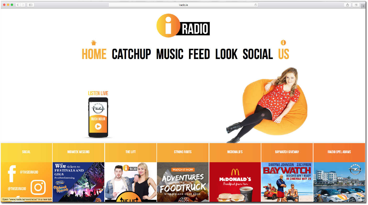
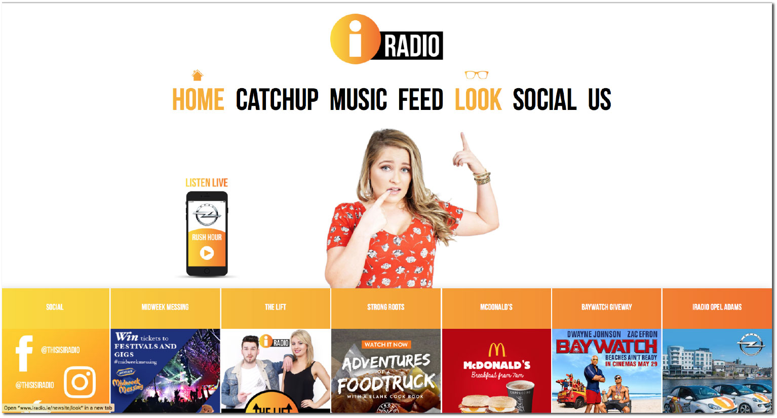
For this site I put the s tation, its presenters and their shows at the centre of everything. iRadio’s playful
attitude is obvious from the moment users land on the site, where the presenter currently on air appears
above the fold, pointing to whatever tab is highlighted.
Delivering everything with innovative web design was the real fun part, with sub tabs appearing as pushable
buttons on a tablet. Naturally, the site needed to be completely mobile responsive and mobile was firmly in our minds
at every stage of planning.
With some expert coding, the site’s fundamental features carry across seamlessly whether you’re viewing the
site at your desk or on the bus.

My role in this project included design, layout, video, photography creative direction
and brand control delivering a final honest, clean and professional video for Budweiser
housed on a web micro-site.
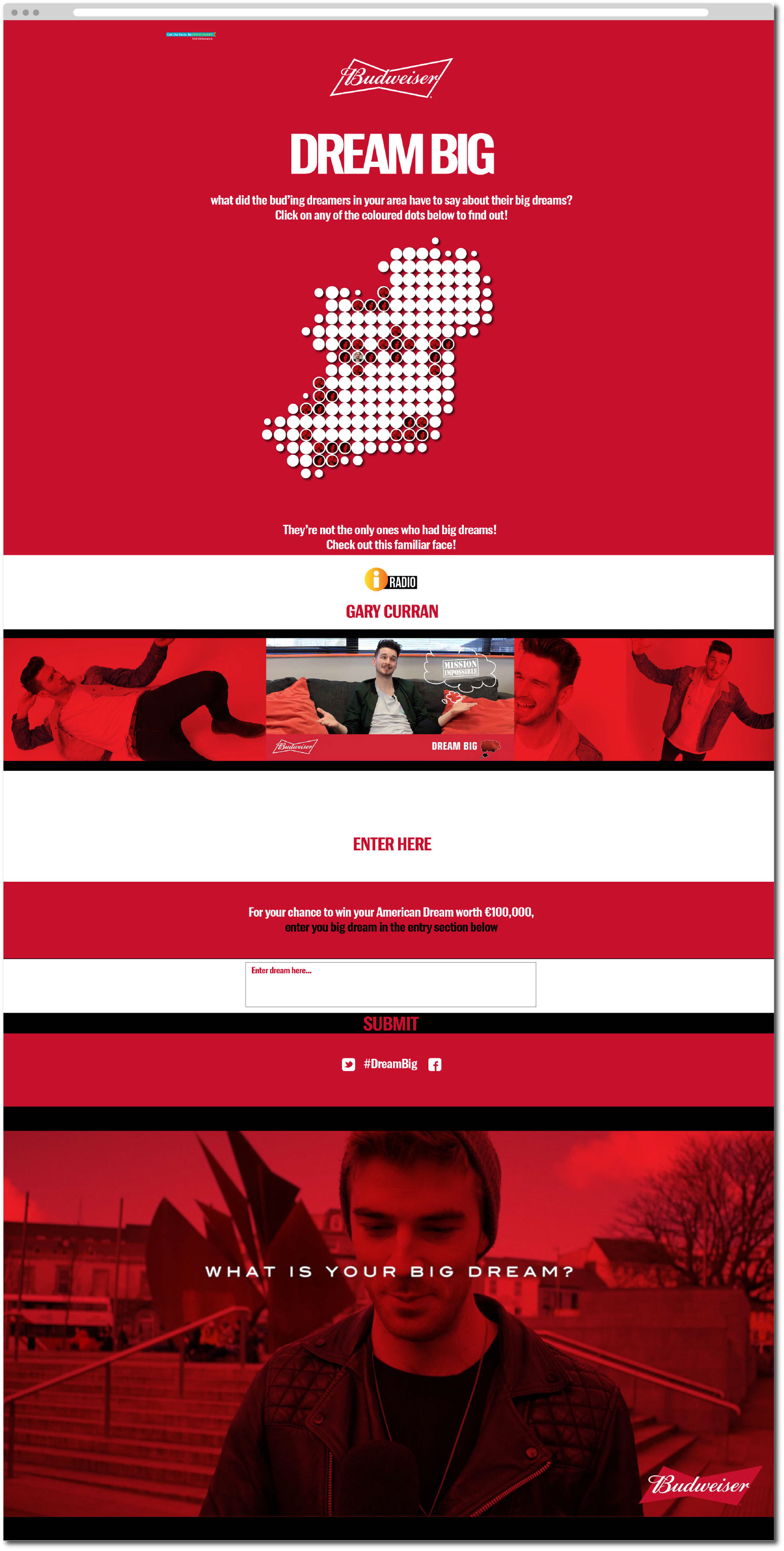
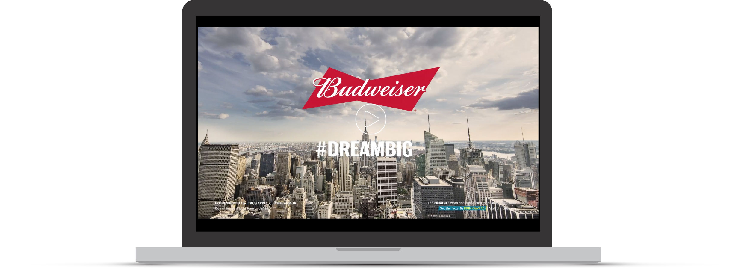
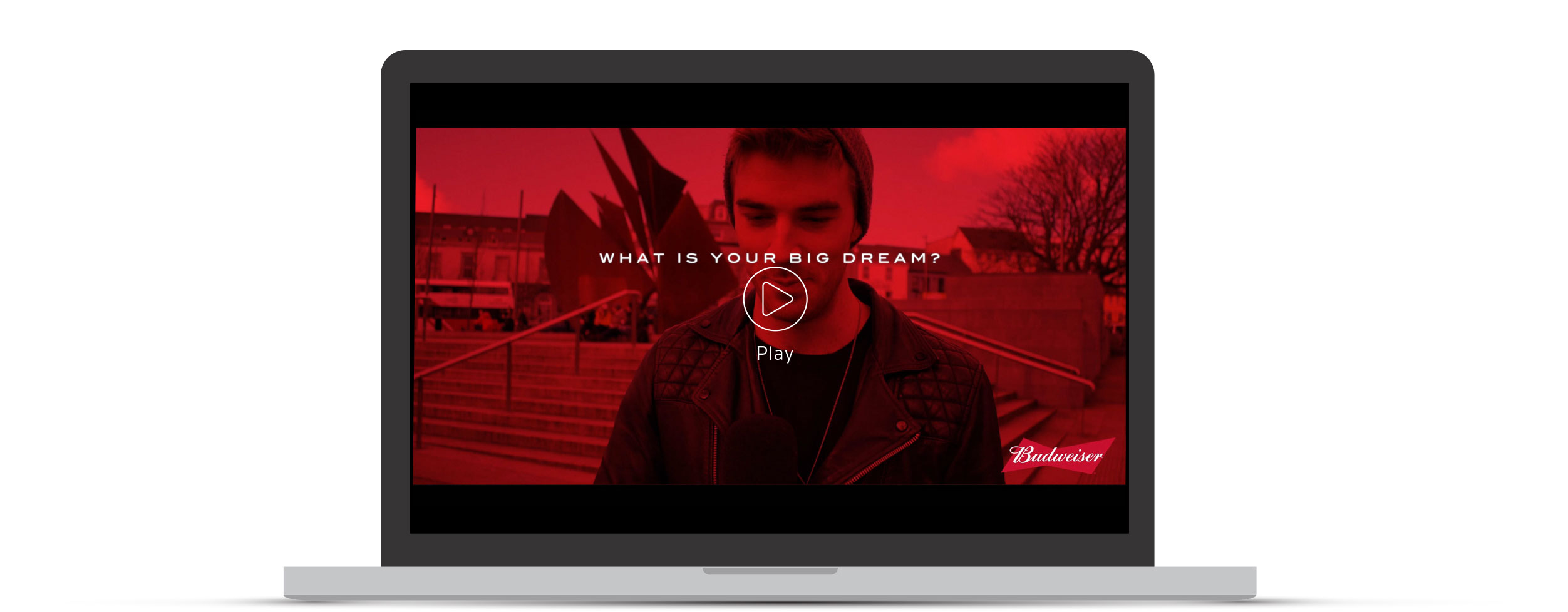
Budweiser Dream Big Social campaign
Delivering this campaign through radio solutions social media was an exciting project. I wanted to convey Budweiser as the hero, but still remain true to the dreams and genuine personal message from the Irish public demographic we featured.
wanted to create a fine balance between Budweiser branding, and the raw
on street feeling I wanted the videos to have in order to encourage viewers
to make their own submissions. I didn’t want the viewer to think they couldn’t
be part of what they were viewing, so it had to feel familiar using familiar locations.
I also wanted to represent all of Ireland on the web but more importantly to make the videos
and dreams of the Irish public accessible and visually engaging without ha ving to scroll through
tens of videos on a web page. To do this I had our w eb coders build a digital map of Ireland
that could represent each person interviewed using a place-marker of where they were interviewed,
hovering over the area would throw up the place marker, and clicking on that marker would reveal
the video for that interview. I felt this was the simplest, most engaging novel approach to delivering
mulitple versions of the same video in a brand respective manner.


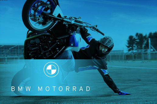
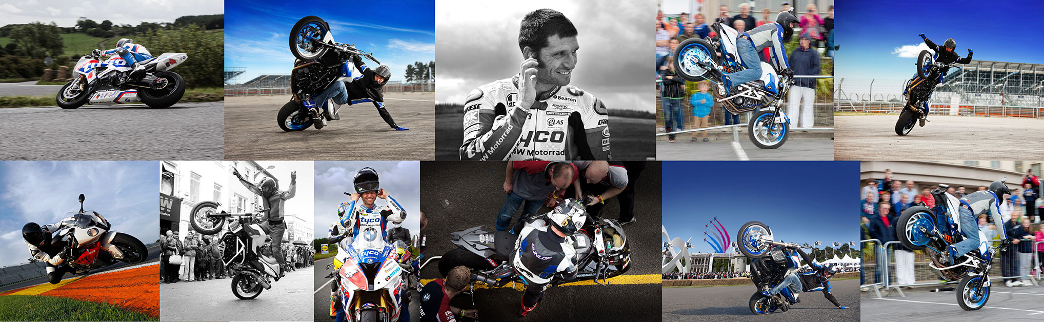
I have been tasked with much of BMW Motorrads motorsport creative for the Irish market.
While the work can be very structured in terms of creative, carefully focusing on retaining
BMW Motorrads look and feel, the nature of the skills involved in the sports I cover makes
for some incredibly engaging content for creative! My main focus for BMW Motorrad in the
Irish market is International BMW Motorrad stunt rider Mattie Griffin, and the extent of road
and short circuit motorsports.
My role in these projects mainly include producing strong, on brand creative for
print, web and social media. As previously stated, the context of the creative
makes for some incredibly interesting content, but working around the complexities
of capturing these incredible stunts and riding skills has proved a more than worth
while experience, the creative speaks for itself!
Short Circuit Motorsport creative support
Below is an example of many short circuit creatives I was tasked with in 2014. Predominately the creative for BMW Motorrad is minimalist, clean and neutral, so imagery must be powerful and engaging to create enough visual intrigue for the consumer. I loved the challenge of balancing these creative's to ensure that the BMW brand was never confused but always complimented by my imagery and creative.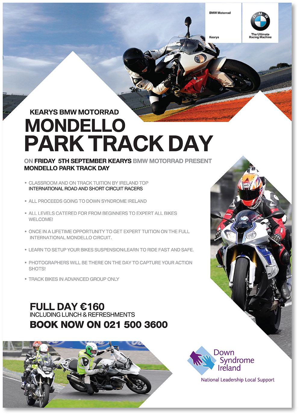
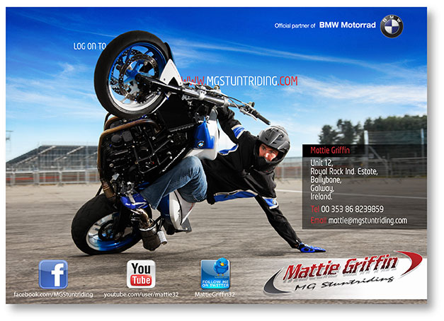
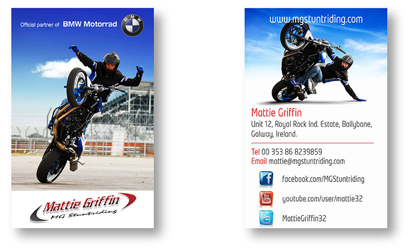
Mattie Griffin - BMW Motorrad Professional Stuntrider
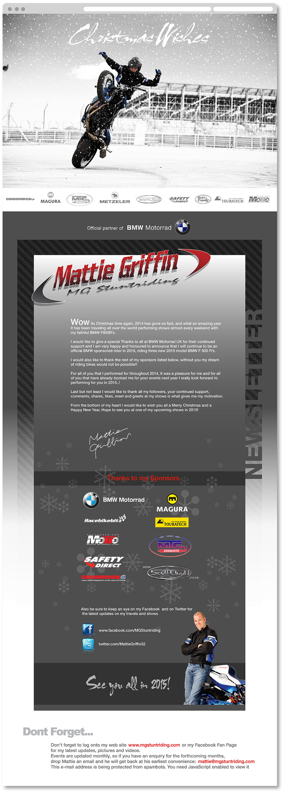
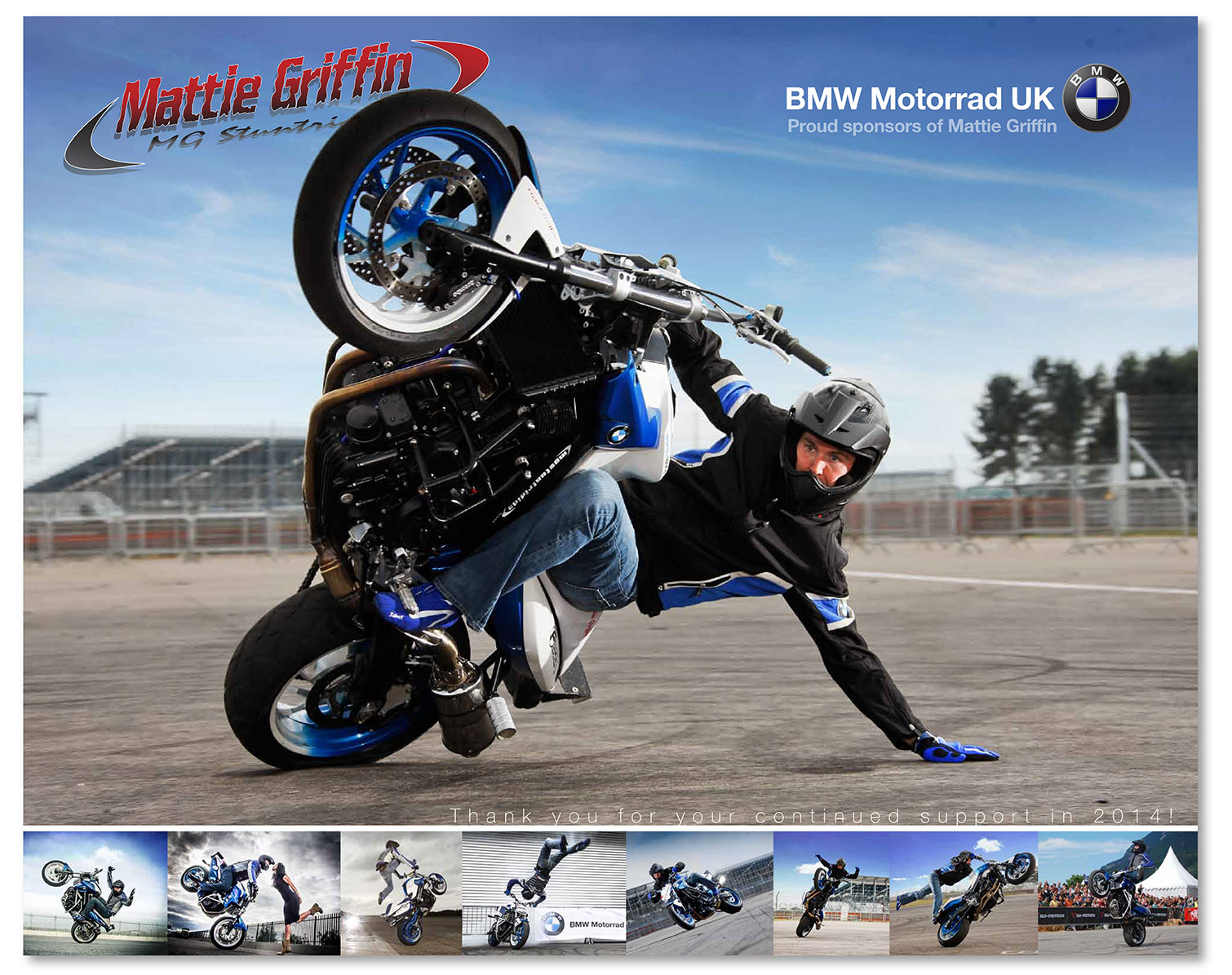
I work with Mattie for a lot of his BMW creative. Below is just a selection of BMW Motorrad creative I was tasked with for the late 2014 Christmas period and 2015 term, including Stationary and Calendars. Again the main focus is to strike a nice balance between the BMW Motorrad brand and Mattie's Branding. This focus is not only evident in the treatment of both logo’s but in every aspect of the design, colour palettes, bike branding, clothing branding and imagery colour treatments in line with the BMW Motorrad brand.2014 Christmas Newsletter
2015 Calendar
2015 Flyers
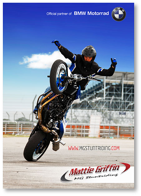
2015 Business Cards
Photography
Below is a selection of some of the photography I created for BMW Motorrad UK and its representatives.Click to enlarge any of the thumbnails.

My role in this project included design, layout, video, photography creative direction
and brand control delivering a final clean, modern easy to use e-commerce website for
COCOA BROWN’s Canadian, UK, and European markets, and a passive website for
their Irish market.
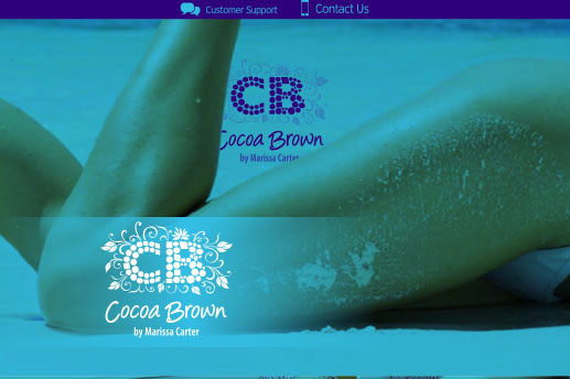
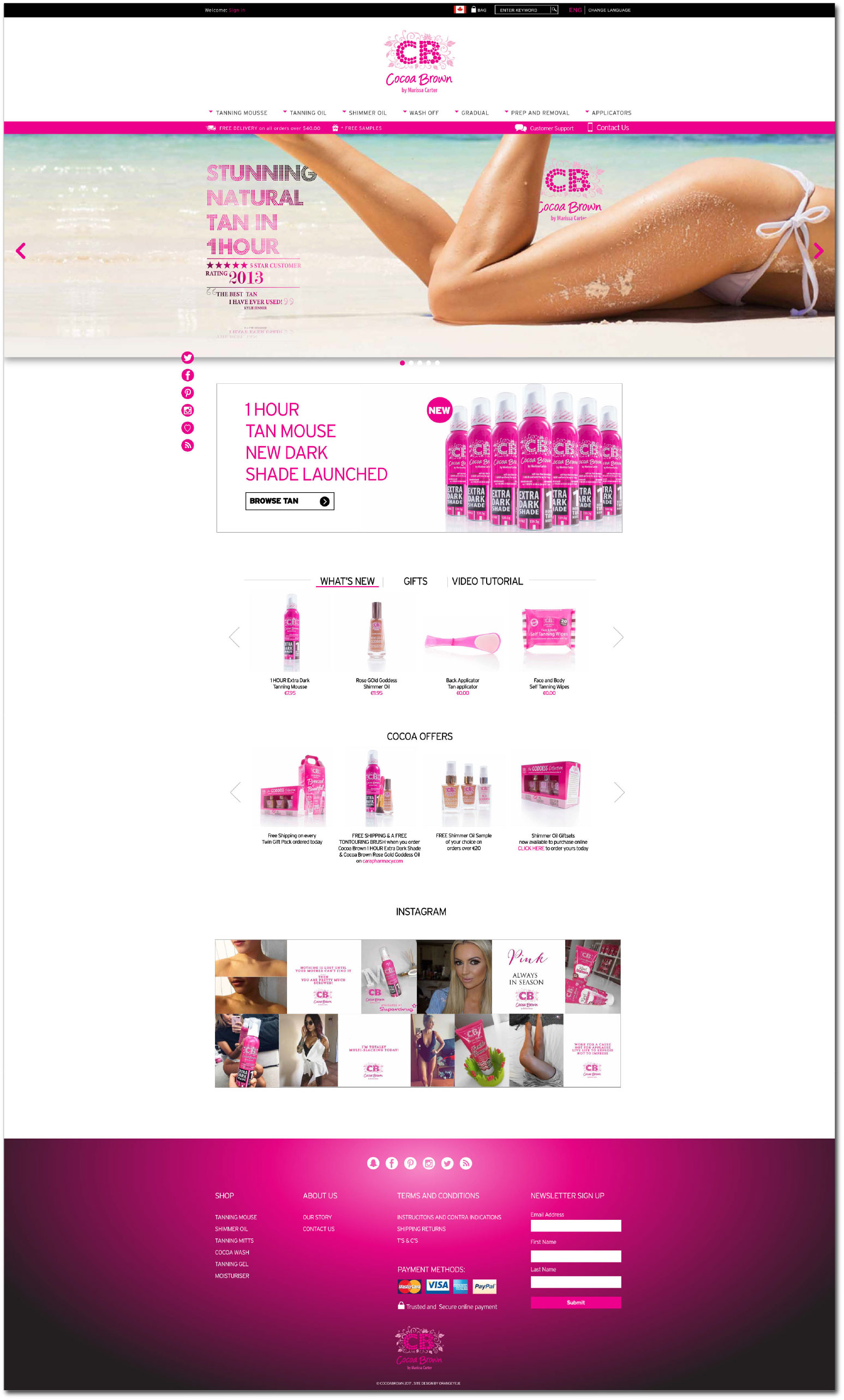
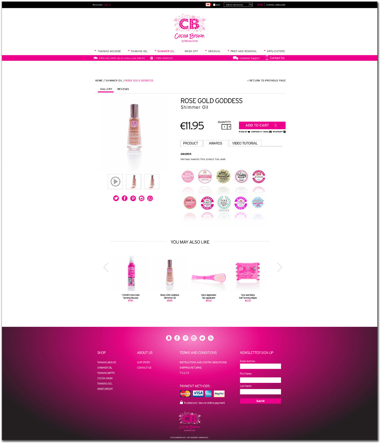
COCOA BROWN E-commerce website
I was delighted to get the opportunity to work with such an exciting brand that had grown so much in such a shor t space of time. COCOA BROWNS development as a business required a real investment in web from both an e-commerce perspective and an online consistency in general.
I quickly cited the need for a complete range product shoot in order to ensure
that everything on the new site would look unified and had a sense of brand continuity.
Once the shoot was done, using a clean, reflective clinical setting for product placement in shots,
I set about creating an e-commerce site that was both visually pleasing and easily navigated from
a user experience perspective.
I wanted to keep the layout and design clean to utilise the user experience, but still retain all
the brand qualities of COCOA BROWN and its ‘tone of voice’.
The result was a beautiful, streamlined site that serviced the full product range seamlessly,
while still introducing many new features and elements in a subtle, un-intrusive manner,
helping to increase COCOA BROWN’S dwell time, sales and engagement.

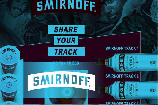
My role in this project included creative direction, design, layout and
brand control delivering a final, engaging on brand concept that recruited
new Smirnoff custom in an interactive, unique and exciting way.
Smirnoff Remix
As with anything that has a high gamif ication element, the Smirnoff Remix micro site was hugely entertaining to work on.
Working with two very edgy brands such as Smirnoff and Global Radio/Capital XTRA
afforded me great creativity in design and development, which really shows in the end product.
The brief was to create awareness off the new Smirnoff ‘Red Cup’ promotion in a new way
that would engage the target market.
Creating pre mixed ‘remix’ songs to build a bank of tracks that the user would generate and
coded them into two selection lines of Smirnoff bottles and red cups, with a deck in the centre of the site.
Once users selected both a track from the cup line, and the bottle line, a remixed track was created
and placed on the decks with a visual of the Smirnoff bottle pouring into the red cup to create the ‘mix’.
Impressions on this particular site were incredible and the user engagement
was our best to date, which shows just how successful the project delivery was.


I have covered many different elements of creative during my career,
below you will find a very small selection of some recent and some not so
recent work that has not been featured anywhere else on this site, some
structured work and some work that was what we in the industry call a
happy accident! happy browsing.
My role in these projects below ranges from branding, creative direction, web and social
media creative, CRM support creative and some local business support.


Emjoi is a brand of health and beauty specialist ‘Life’s 2 Good’ based in Galway.
Tasked to create a brand name for a new nail polishing product being released to
market by Life’s 2 Good under the Emjoi brand, I set about researching the existing
market and benchmarking competitors. The brief was to create a premium brand
that was easily recogniseable within the marketplace but that held it's own clear
identity amongst competitor products.
My role in this project included branding, Brand guidelines, package design, web design,
POS design and photography. Competitors within the market place were heavily backed
by large marketing budgets so I needed to be clever with brand creation, ensuring that
the brand was clear and memorable and that all creative material was both striking and
unique, making the best use of any investment in marketing spend.
Branding and logo creation
Having researched market leaders such as OPI, Nails inc , L’Oreal, Clarisonic, Lancome, Models own, WAH, Sally Hansen, essie, Nina Ricci and GHD I established a clear demographic and socio economic group of ABC1 among the marketplace. I wanted to create a clean, clear, elegant, intuitive and opulent brand that consumers of this socio economic group could easily relate to.
I quickly established that the most successful brands in the beauty sector led
with a Female ‘hero’, a leading role to aspire too, with no group trends. This involves
the creation of a leading lady that the marketing draws us to, sometimes subtly,
sometimes forcefully, in turn, repositioning the brand as they key to what gives the
hero its appeal.
Using these learnings as inspiration, I proposed two brand names for the product;
Lucaa, and Fabulous Nails.
Lucaa - the Queen of Nature and beauty (taken from the Great Almanac of the Gods)
was the proposed leading lady, The queen of Natural beautiful nails.
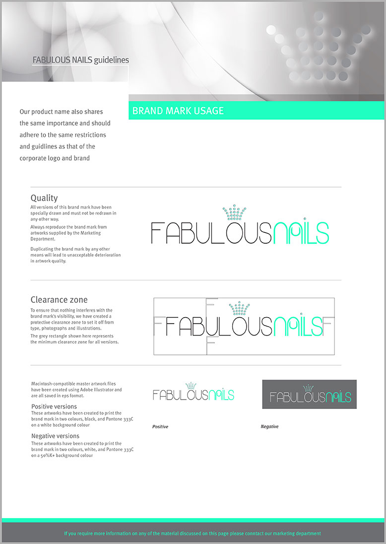
Fabulous Nails - being a more descriptive brand requiring a logo that would reflect
a feeling of hero or leading lady.
After consultation with the client, a decision was made to progress with ‘Fabulous Nails’
as the official brand name, using an opulent crown graphic to communicate its ‘Queen’
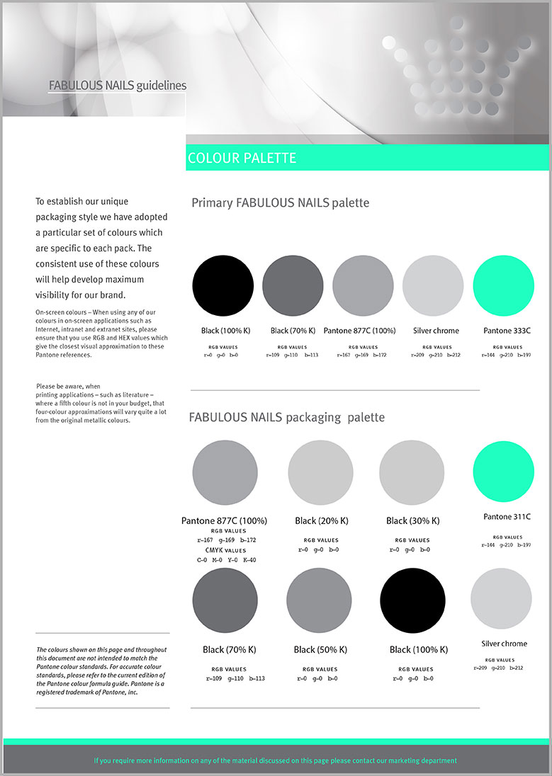
nature, and utilising an ‘in trend’ mint green as the feature brand colour.
The ’A’ in Nails has been used to create a vector nail graphic while the same has been
done with the ‘U’ in Lucaa.
Brand Guidelines
Full brand guidelines developed for this product, including logo versions, safe areas, social media usage, colour palettes, tone of voice, photography treatment, do’s and don’ts and typography.Click to enlarge any of the thumbnails.

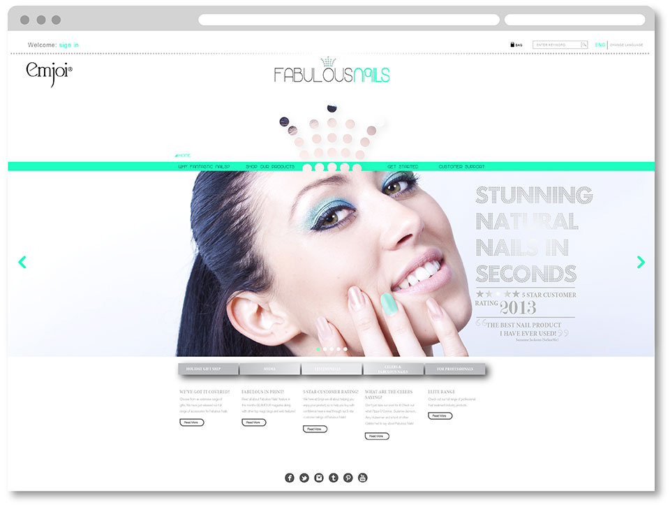
Web Design
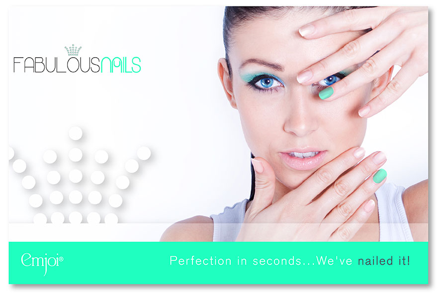
Again researching the market place, I wanted the website design to be very clean, fresh and elegant looking, while still carrying through the ‘Queen of Nails’ theme. Imagery had to be engaging and unique, creating particular focus on the nails by painting only a ‘feature nail’. Type faces had to have an atmosphere of opulence and glamour while the colour palette had to be subtle yet glamorous allowing the feature mint green to highlight areas of importance to facilitate an easy and positive user navigation.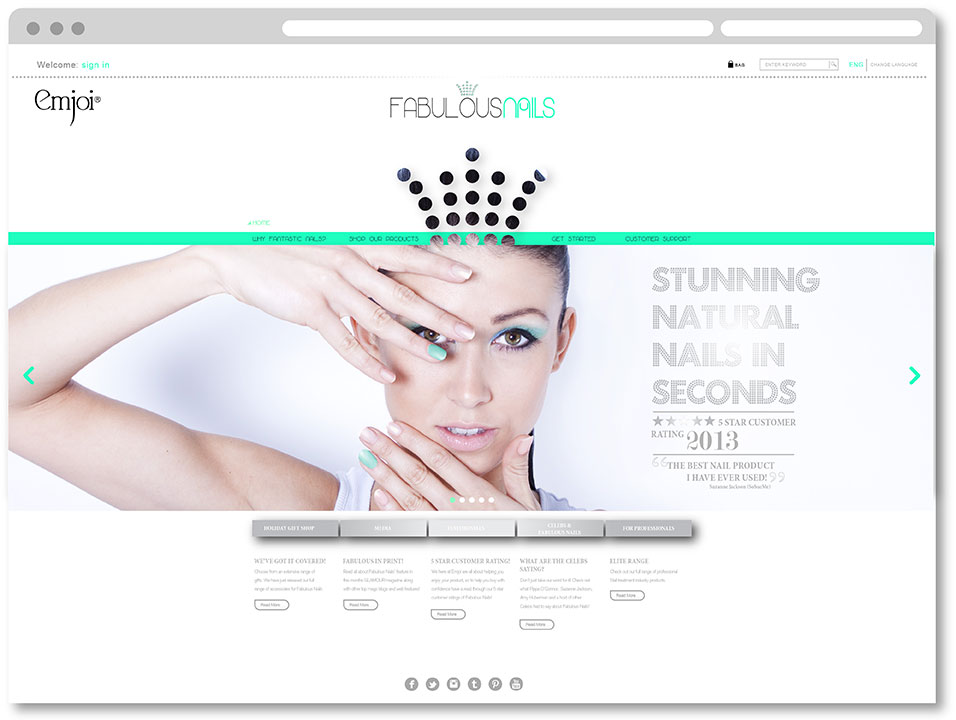
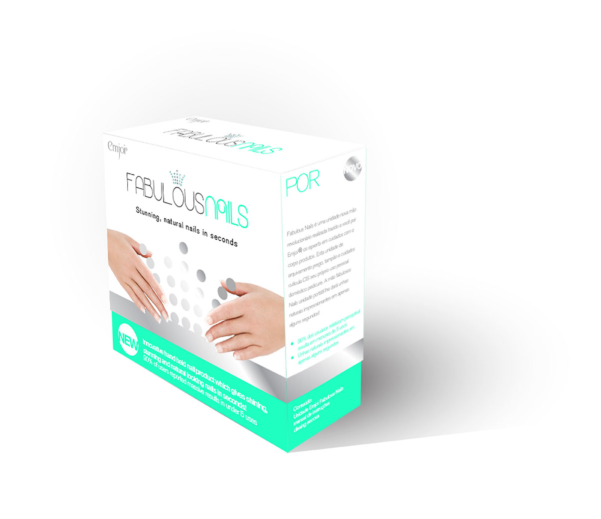
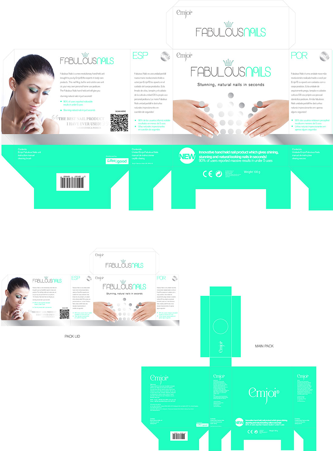
Commercial package design
As this was a budget pack design, I was faced with many challenges. The goal was to ensure that the pack ultimately felt premium despite the cost restraints, but also to help communicate some of the key aspects of the product. To do this, I decided to split the design into two, the bottom inside box, and the top outside box lid. There were two reasons for doing this, firstly, it allowed me to invest more budget into the top, leaving the bottom as a two colour low cost material, and secondly, it allowed me to create a tactile feel to the pack, using a course material for the bottom inside box, and a smooth gloss material for the top, outer box lid, creating a metaphor for the action of polishing the nail from course to smooth gloss.
While retaining the brand look and feel, tone of voice and colour palette, my main focus in the design was to give
a clear message for the key product indicator. I used the crown graphic, finished in a silver hot stamping to add
opulence, framed by two beautifully polished hands, to give a clear message for what was inside the box.
Messaging was clear and concise on the bottom of the box, allowing for a clean upper box to facilitate appropriate
space for the brand logo. Key messaging remained on the rear of the pack, with a QR code bringing the consumer
to an information page on the website, while both sides were used for multilingual translations of key messaging.
Print creative
Again, for print creative, all of the characteristics were maintained to establish continuity across all channels. Typefaces are consistent, as is the imagery and colour palette. The tone of voice is also maintained to ensure a ‘Fabulous Nails’ feel to all creative. Finish on the creative includes spot UV in the top right hand corner text and the bottom green band and dotted crown.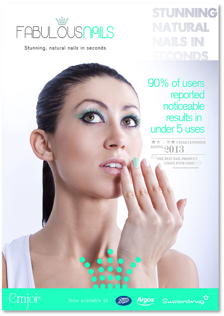
POS design
Again, similar to print creative, for POS design all of the characteristics were maintained to establish continuity across all channels. Typefaces are consistent, as is the imagery, colour palette and tone of voice. Finish includes spot UV on the bottom green band and dotted crown.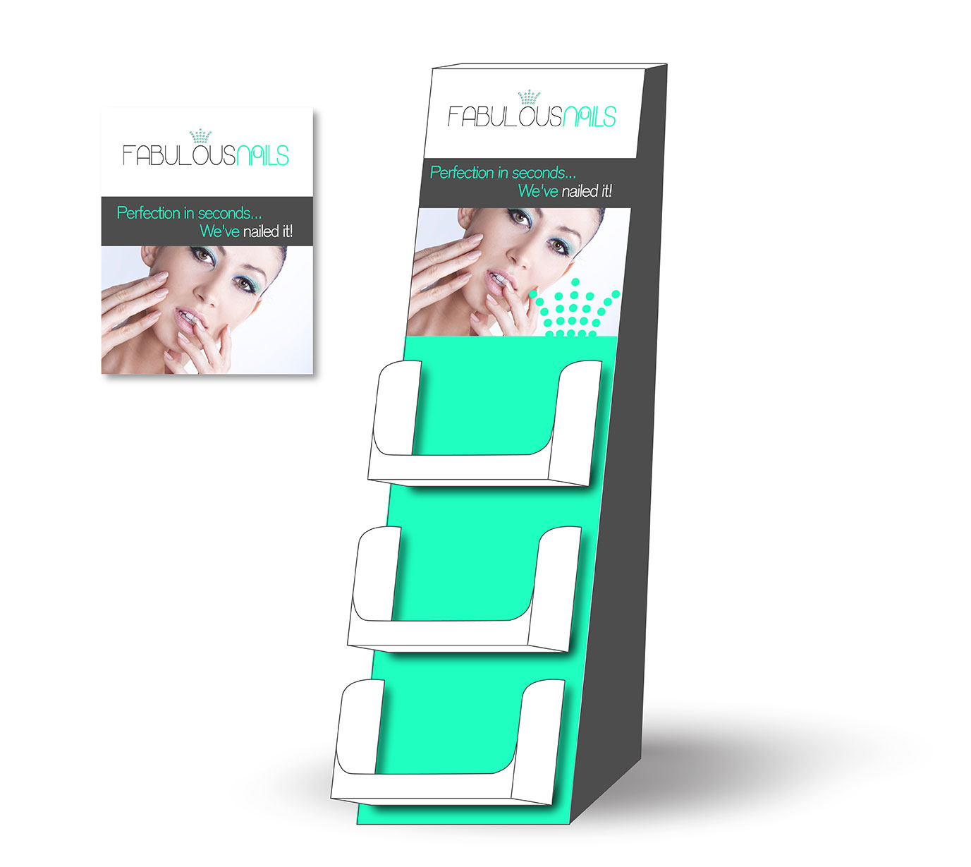
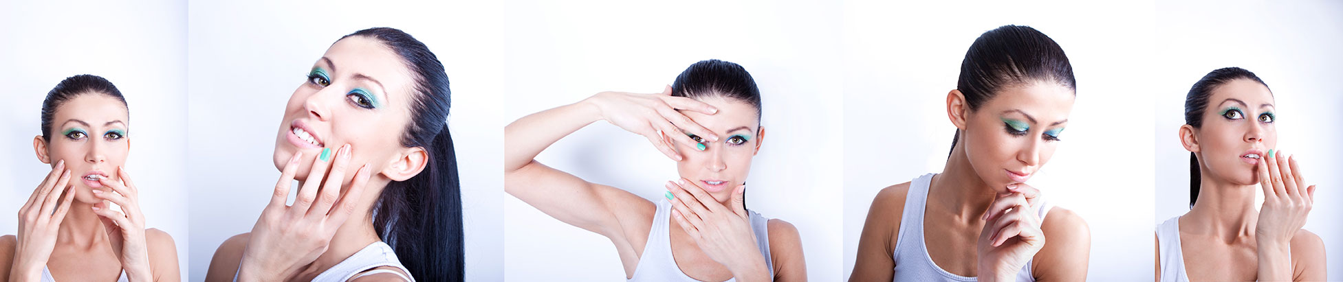
Photography
Below is a selection of some of the photography I created for Emjoi Fabulous Nails.Click to enlarge any of the thumbnails.


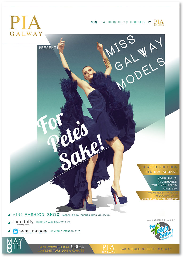
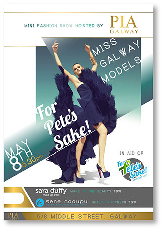
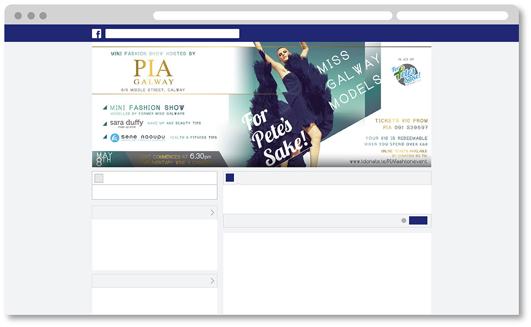
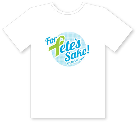
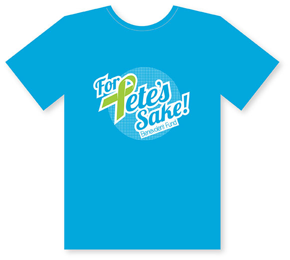
“For Pete’s Sake” is a trust created to raise funds towards specialist cancer treatment in
New York for Pete McLachlin, a 40 year old loving husband and father of 3 young children,
who was suddenly struck by an aggressive form of cancer. The aim, to plan a series of events
to raise the €200,000 needed to fund the treatment Pete urgently needed. While the sole purpose
of “For Pete’s Sake” was to raise funds for treatment, the aim was also to raise awareness of the
possibilities available to other cancer patients and longer term, to support medical practitioners’
efforts to make this type of treatment more accessible to others in Ireland.
My role in this project included branding, production, web design, print creative,
event planning and photography. This was a hugely passionate project that involved
a committee of 12 extremely energetic professionals, so it was hard not to feel energised
to create the best possible brand and product to facilitate this organisations needs.
While the initial goal was to raise €100,000 for Pete, this project evolved into a global effort
that raised well in excess of €200,000, which clearly signifies the success rate of all aspects of
this project.
Branding and logo creation
I wanted to create a brand that had strength, positivity, and relevance, yet retained a memorable distinctiveness. The key for this brand was to create intrigue and engagement with the public, while still clearly displaying the attributes of its cause. We decided to use the well known phrase “For Pete’s Sake” as the name for our charity for obvious reasons. Having a brand with Pete’s name in it, allowed us to create a personal connection without publicising Pete’s full name.
I wanted to use a type face that was Jovial, yet diverse enough to facilitate the different
types of media it would live in. I chose the colour palette for this brand based on the two
types of cancer Pete had, in a bid to help communicate the nature of the charity, using
a graphic of a green ribbon, as the ‘P’ in Pete, to help further reaffirm the cause.
Finally, I felt the typeface, angled and skewed to help convey a sense of lightness,
needed a circular backdrop to help create a ‘stamp’ style graphic for the logo.
For Pete’s Sake Christmas Viral
I knew that exposure was key for the ‘For Pete’s Sake’ brand, as well as exploring new ways to create a conduit for the subliminal message of ‘For Pete’s Sake’. I decided to create a viral to help public reach and exposure, using the story of family and friend appreciation at Christmas, under the guise of a clip of the City of Galway in Ireland on Christmas day. I wanted the message to be one of appreciation, as I knew it would connect most strongly with the emotion of the viewer, and ultimately create a relationship between the brand and the viewer, resulting in charitable commitment.
Web design
I wanted to keep a clean, fresh aesthetic for the web design as I wanted to leverage the bright colours of the brand as much as possible. I also wanted the site to be visual and engaging to keep the mood of the site very upbeat and friendly. I used monochrome imagery using spot colour to highlight the brand for feature images, allowing the content images to gain balanced exposure from full colour images.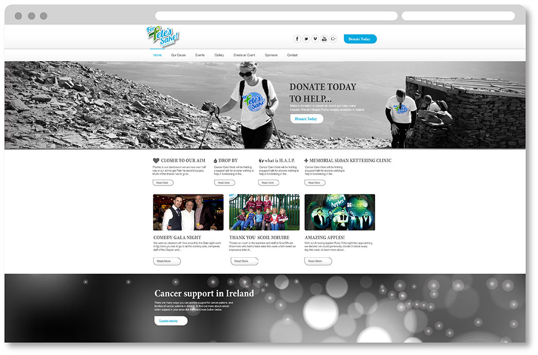
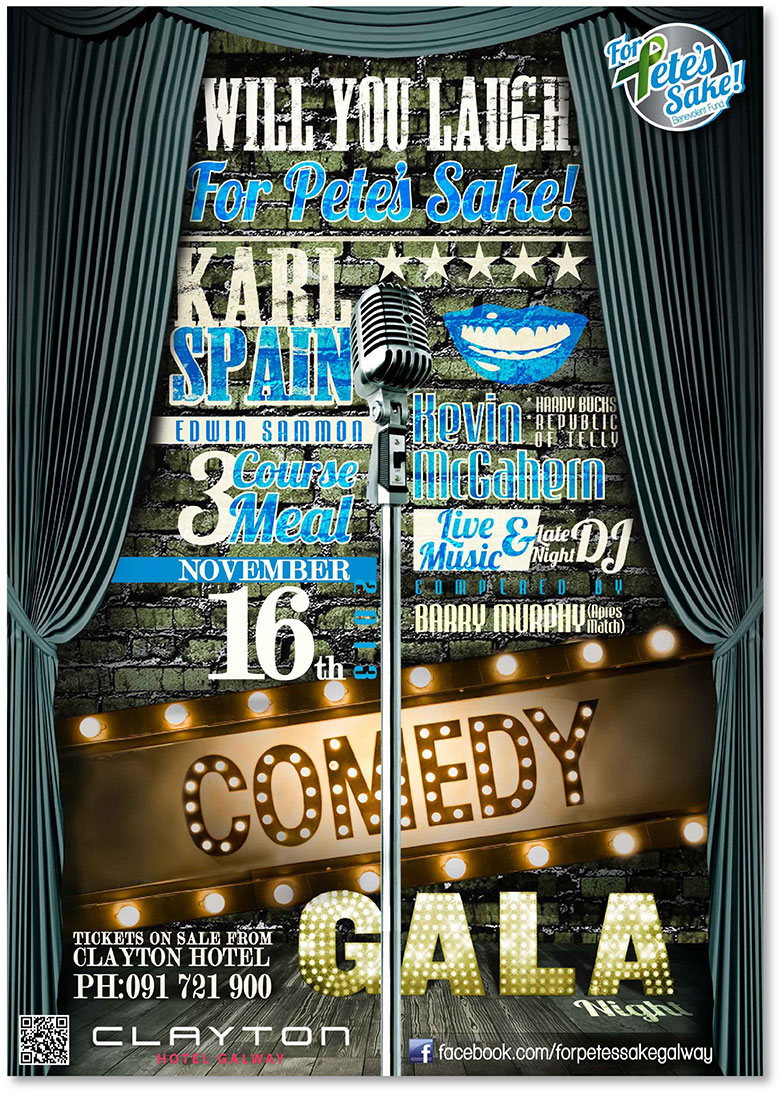
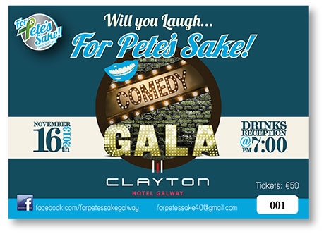
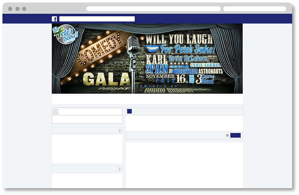
Event print creative’s
Many of the fund raising events were entertainment events such as comedy acts and band performances, so I wanted to create a nice balance between the rustic creative style of these types of events with the colourful jovial style of the FPS (For Pete’s Sake) brand. I used the FPS colour palette not just in typeface and graphic features, but also used it to dictate colorisation in imagery, while typefaces were kept to the FPS brand where possible without looking repetitive.For Pete’s Sake Comedy Gala Night
Poster
Ticket
Social Media
Miss Galway Models For Pete's Sake
Poster
Ticket
Social Media
For Pete’s Sake Golf fund raiser
There were many fund raisers under the FPS brand, from Mountain Hikes to table quizzes, school uniform days, to marathons, cycles, and walks. Below is an example of the FPS fund raiser poster template.Support material
Below is an example of just some of the support materia created for the FPS brand.
FPS t-shirts used for charity runs, walks, mountain hikes, cycles etc.
Slendertone behind the scenes viral
While on set shooting a TV commercial for Slendertone, we decided to film some of the crews reactions from using the Slendertone Ab toning belt. The result was a series of natural, comedic reactions and expressions that formed together to make an excellent ‘First time face’ Slendertone viral.
Logo creation
Logo created for PJ Gallagher, Ray Darcy and the Today FM team for a charity cycle on BMX’s.Print creative / Social Media
Print creative and social media support and design for an Irish midlands chamber of commerce
Slendertone Connect Launch Party E-mail invite
Design Creative for the Connect internal staff launch party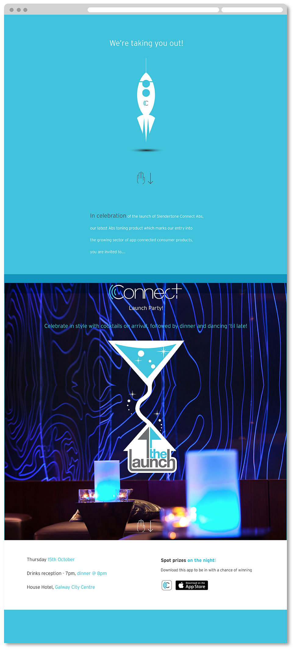
Slendertone Connect mood visuals
a range of visuals created for the Slendertone Connect product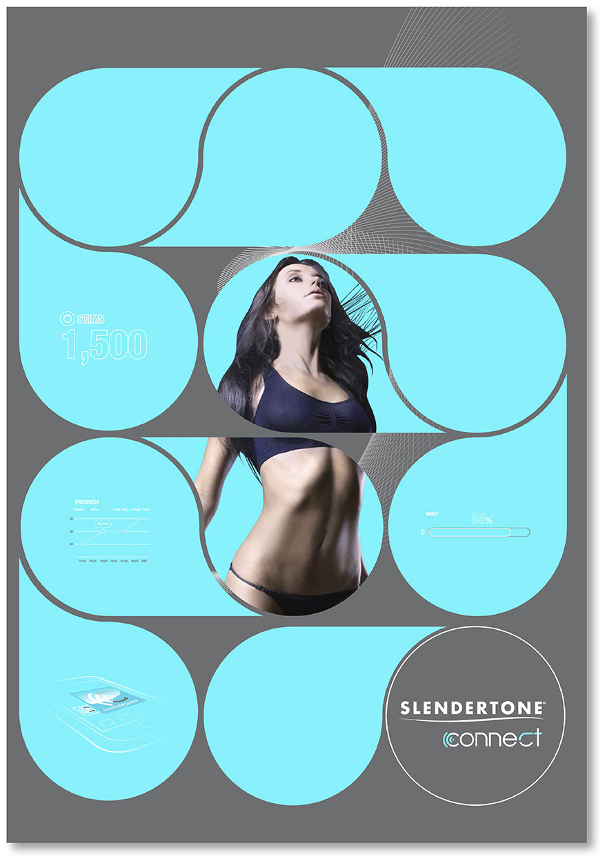


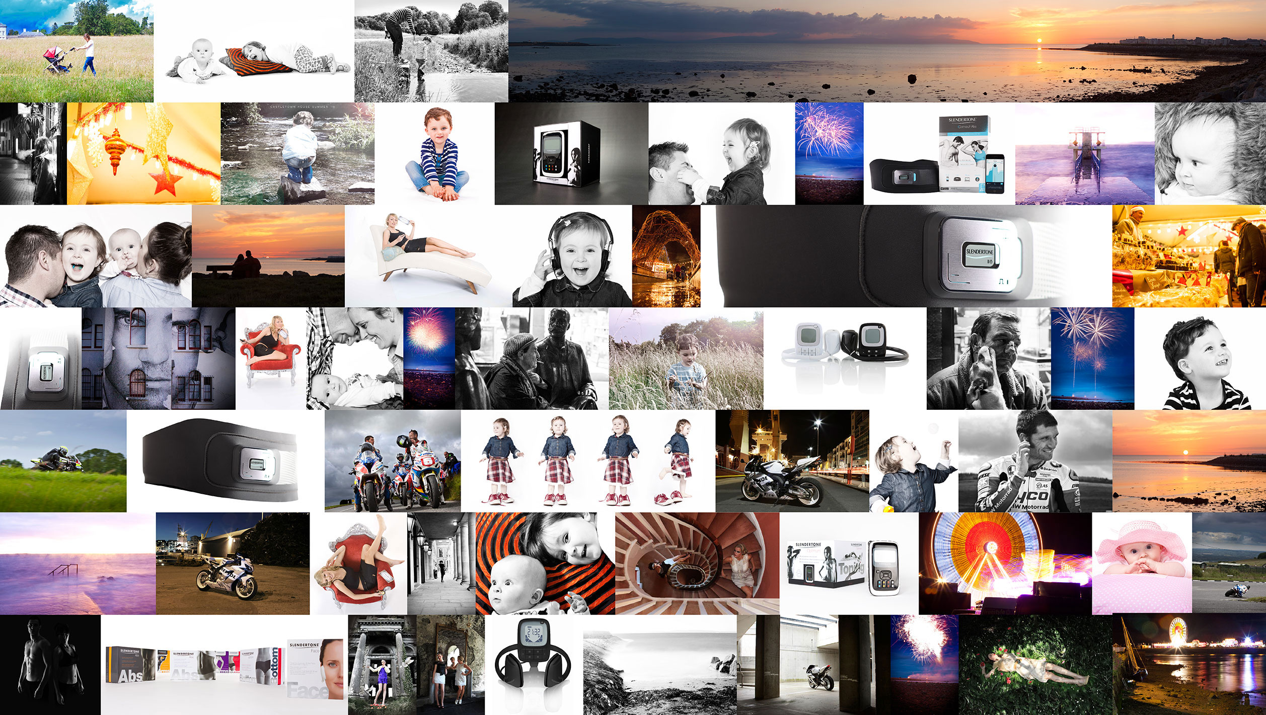
Photography has not only been a large part of my career, but also my
personal life. I would like to share a selection of my photography from
various locations both in studio for work situations, and at various
other out door locations and events throughout Ireland.
Click to enlarge any of the thumbnails.
Check out the wide range of video work I have shot in some cases and directed in others.
All video’s were directed creatively by myself including concept creation and art direction.

As technology has advanced, my experience with UI and my knowledge of UX has
followed, beginning with simple LCD UI, and evolving with technology into more detailed
smart phone User Interface supply and project management. Below you can see a small
selection of some of the UI/UX product projects I have worked on. I have done numerous
studies and research on information design, the psychology of user experience and
navigation based on colour, iconography and layout. All of my UI/UX creations were
subject to user group testing and subject to change, which I found incredibly beneficial
in terms of UI and UX learnings and development.
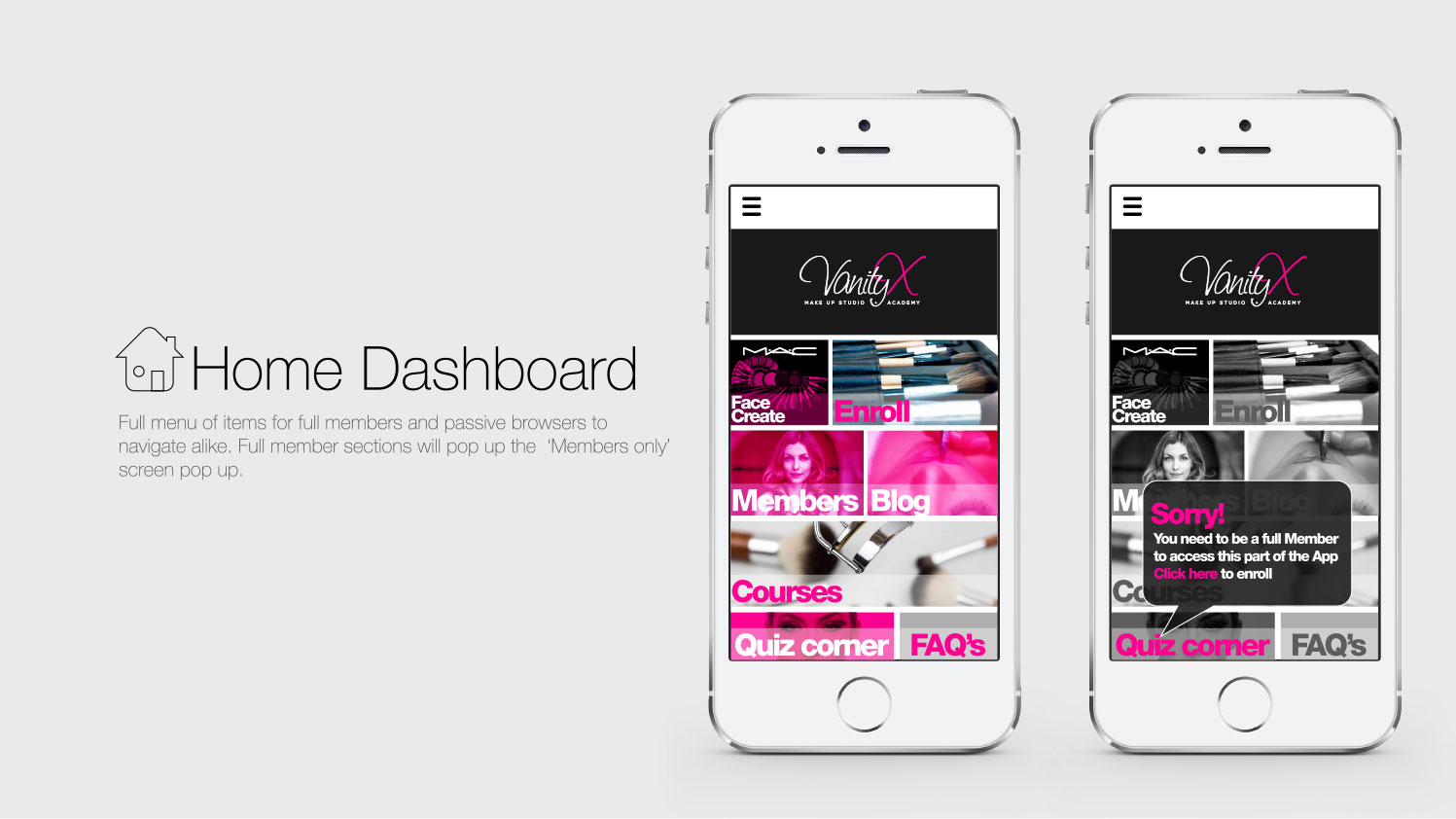
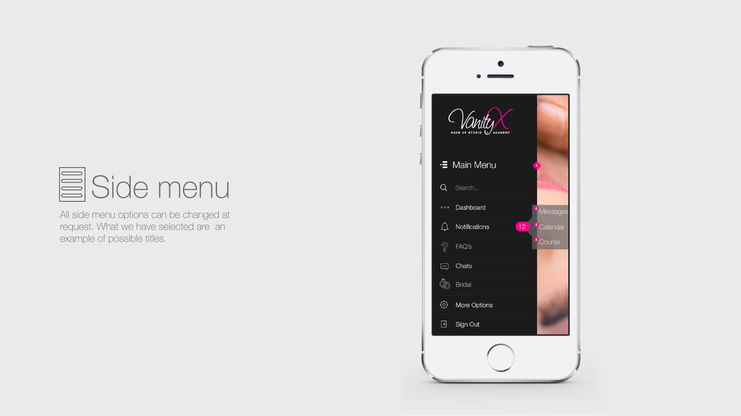
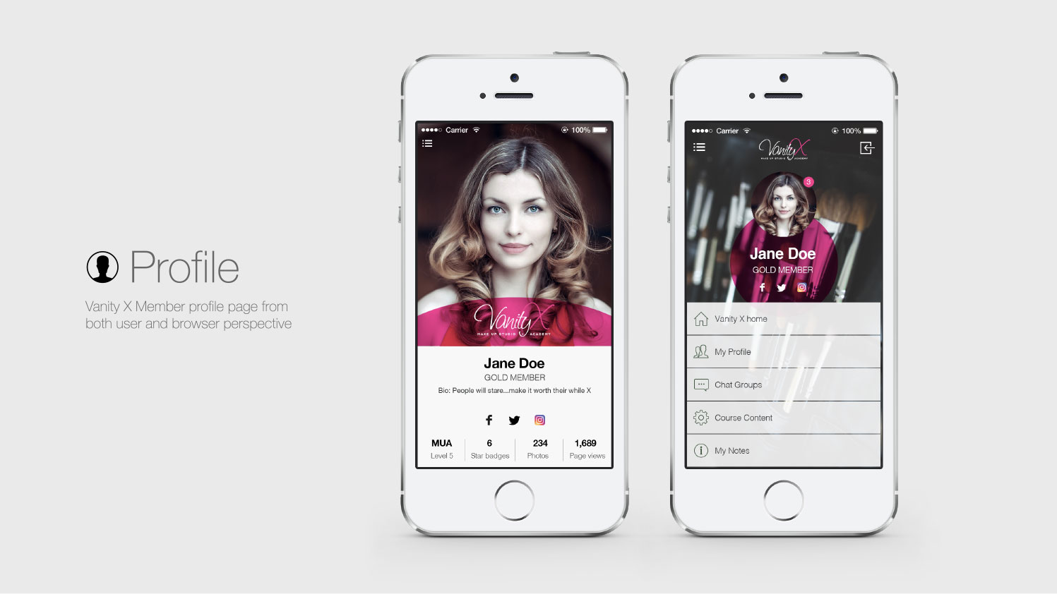
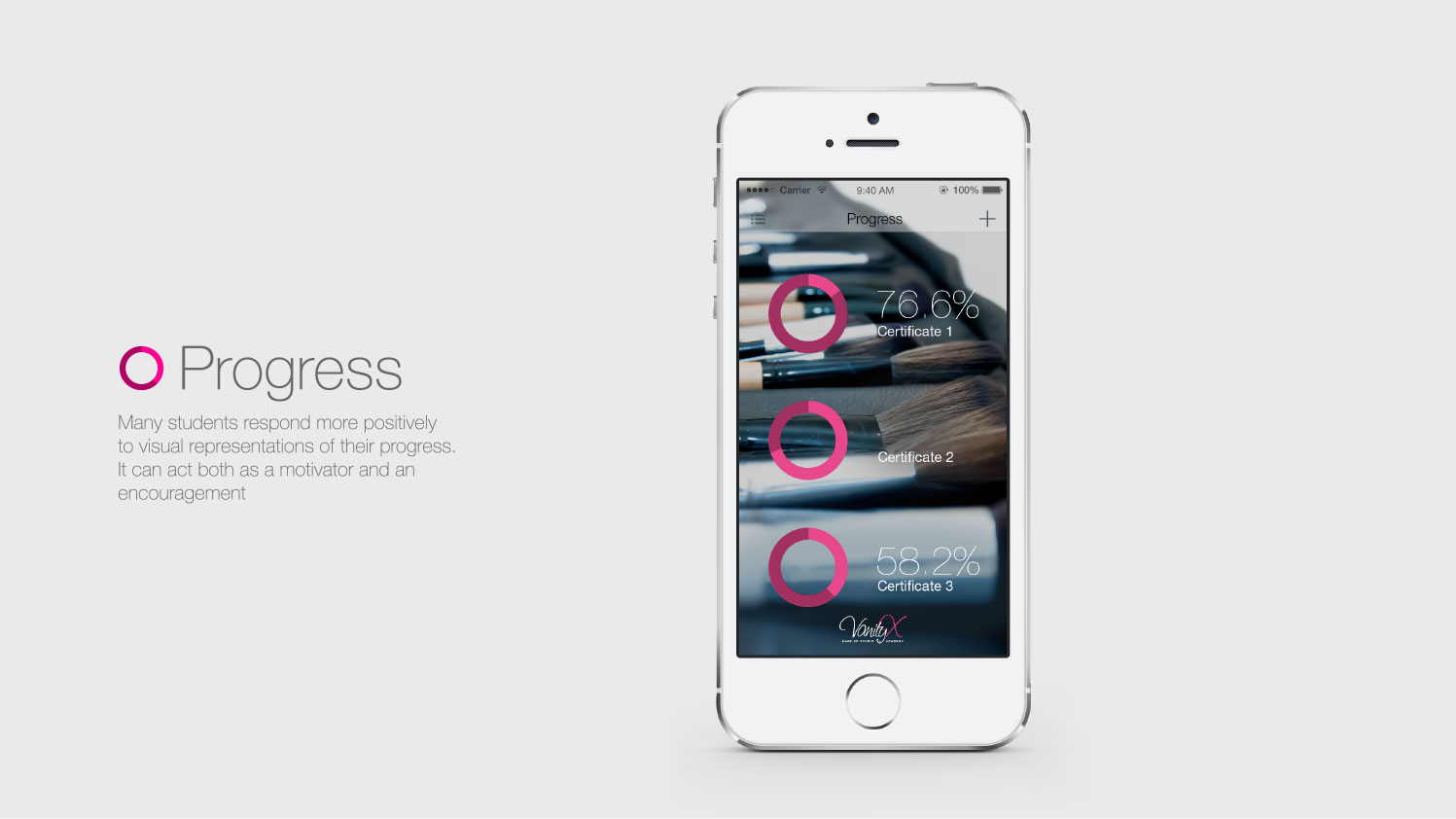
Vanity X Website and Mobile App design
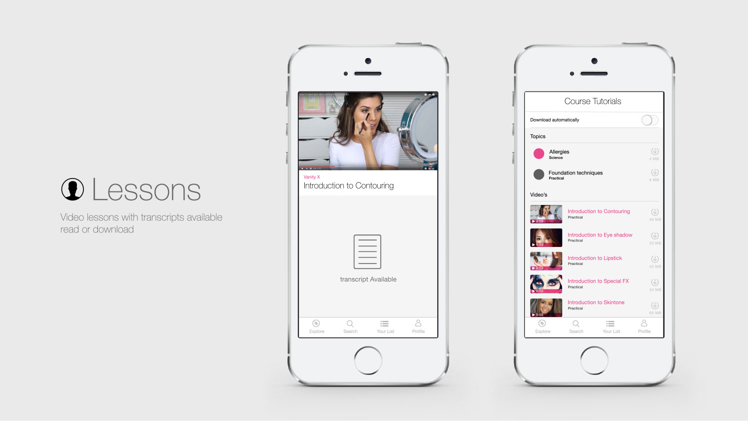
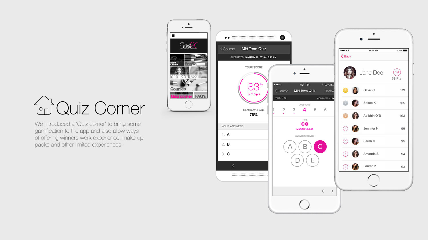
Full website design incorporating course tutorials andmember login Vanity X also required a full course App that users could download and use as their VAnity-X course portal for video tutorials, course notes, updates, quizes and a variety of other Vanity-X offers and features.
Slendertone Connect
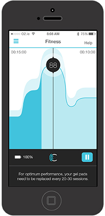
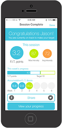
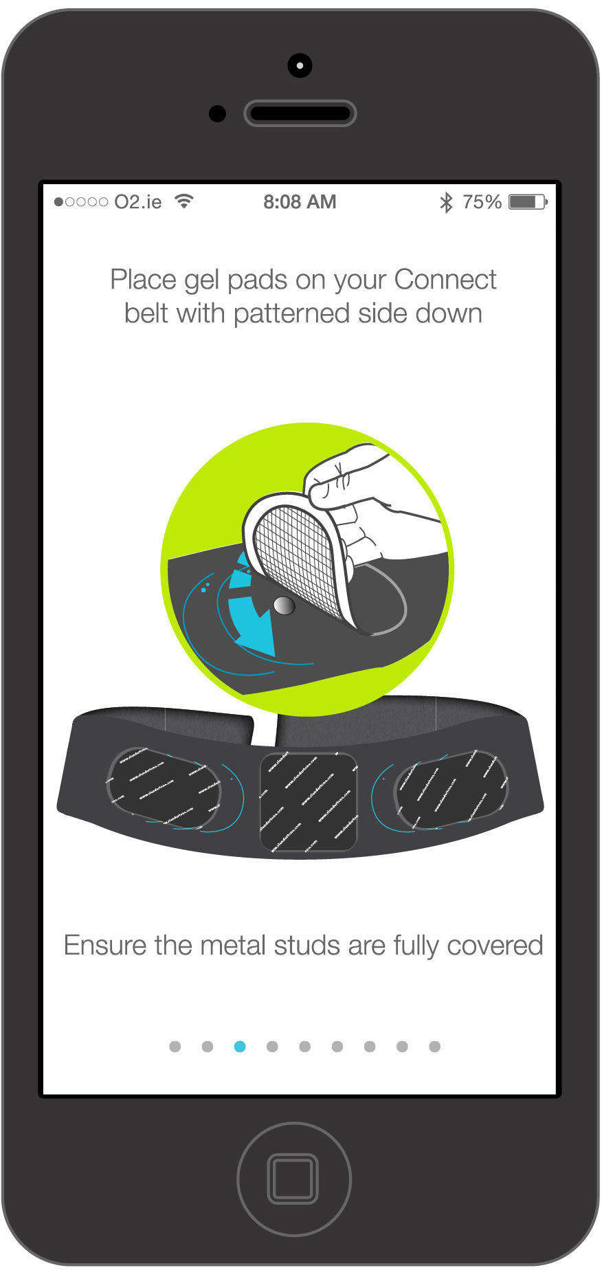
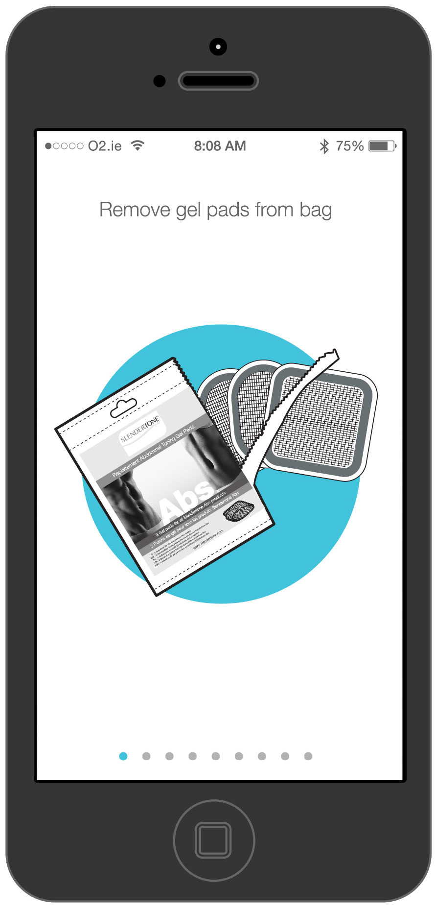
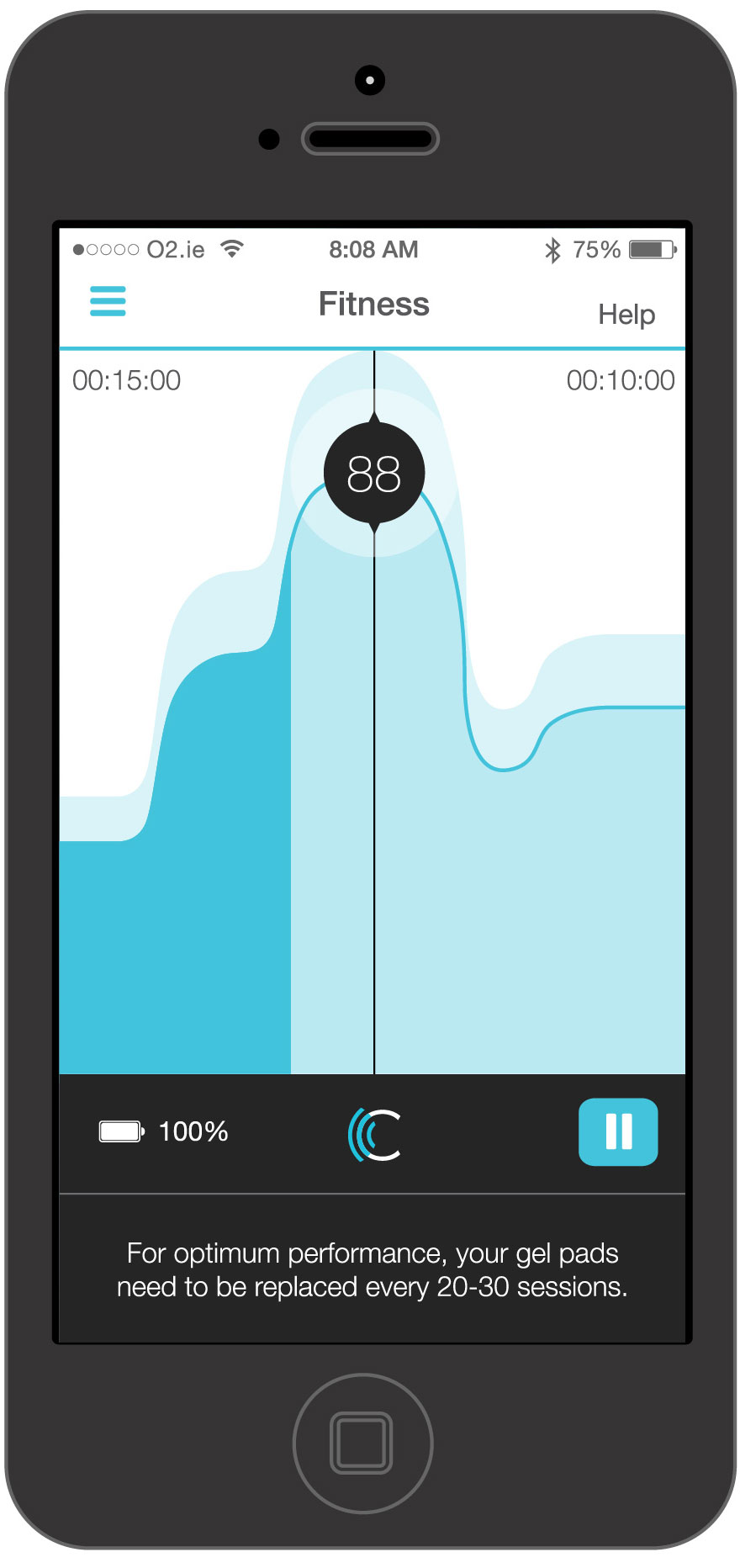
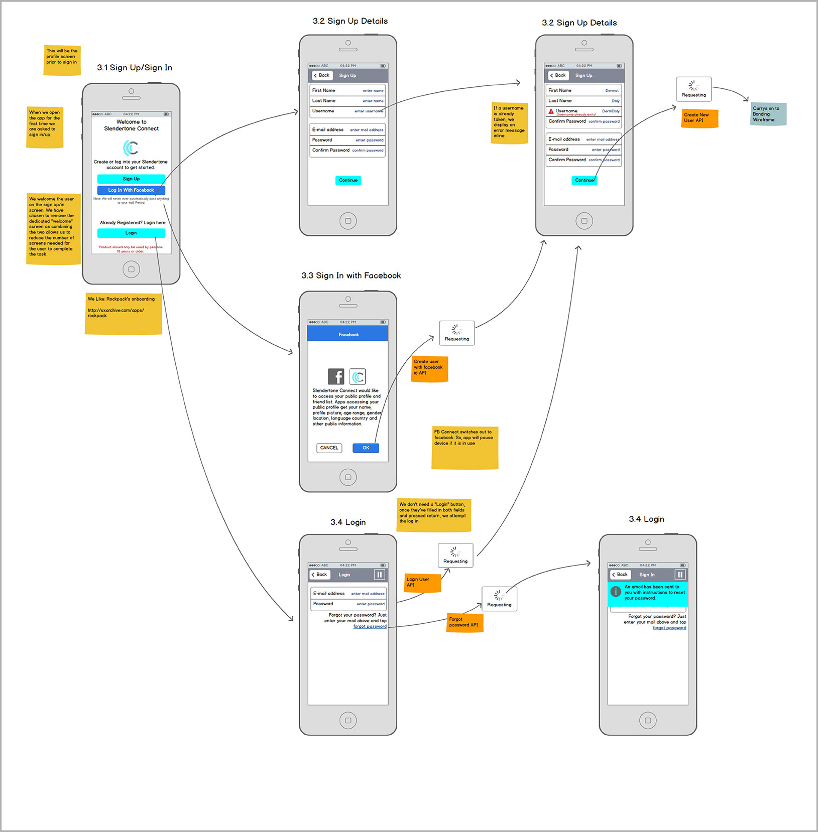
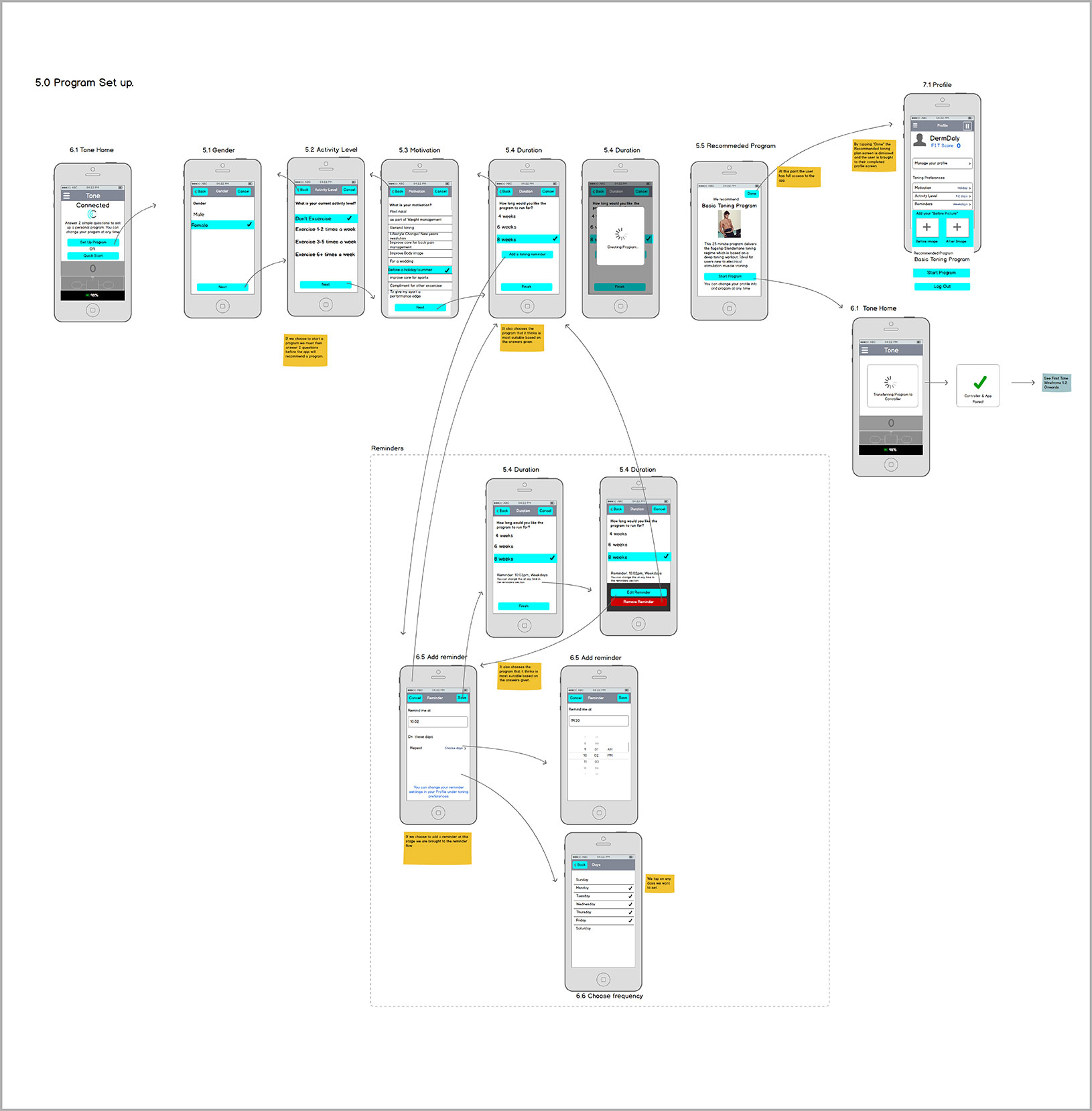
Slendertone Connect was an App we created to control an Ab toning belt via bluetooth LE. The App was part of an eco system including a web portal and CRM system, feeding info to and from the app to generate user data. My role included brand direction, creative direction, wireframe direction and User interface design and supply. Below you can see some of the User interface screens I generated, as well as some of the wireframes generated for the App.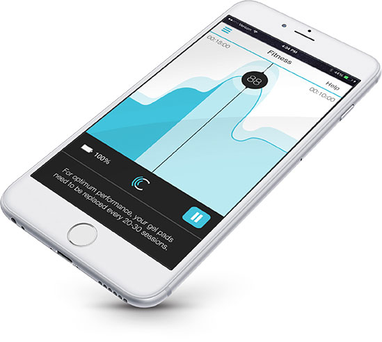
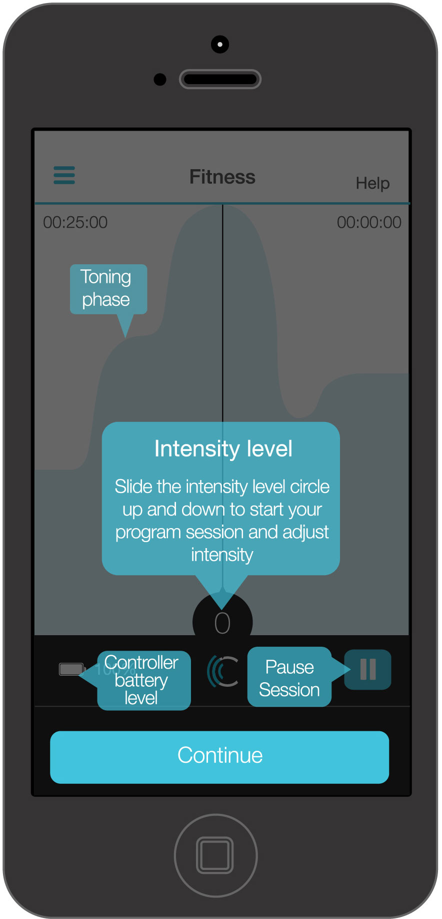
Connect App wireframe navigation
Click to enlarge any of the thumbnails.
Sign up/ Sign in
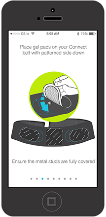
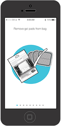
Program set up
Social
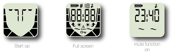
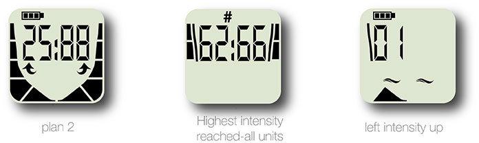
Slendertone Face UI
selection of LCD screens I created for Slendertone Face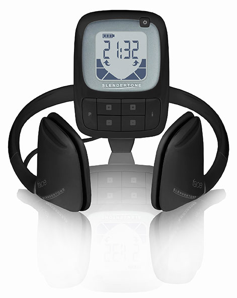
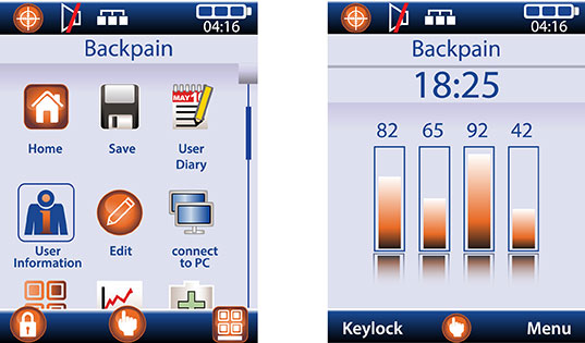
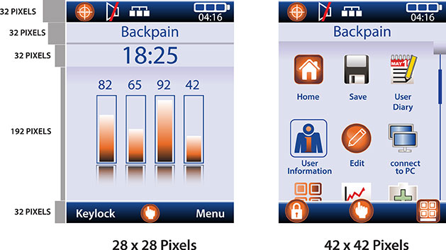
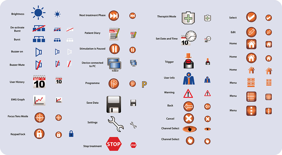
Neurotech Vital
a selection of colour LCD screens I created for Neurotech Vital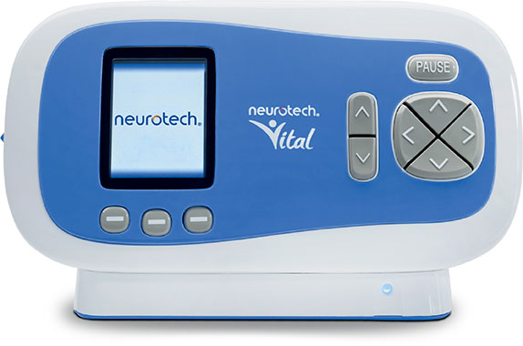

As part of my Creative Director role, I have been heavily integrated in product development
and have provided both creative direction and concept design for many products throughout
my career. Below are just a couple of examples of my work, and process when developing a
product for a commercial market.
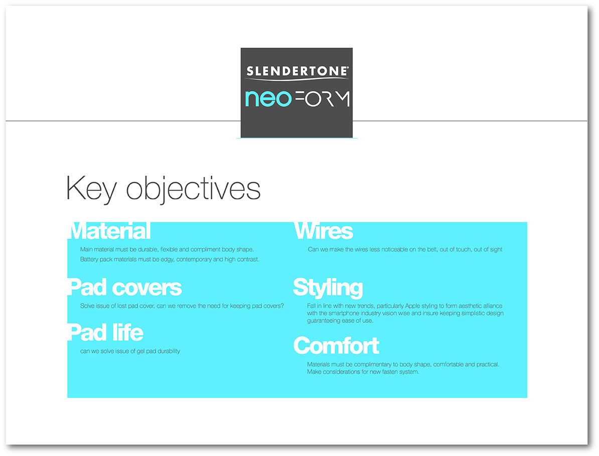
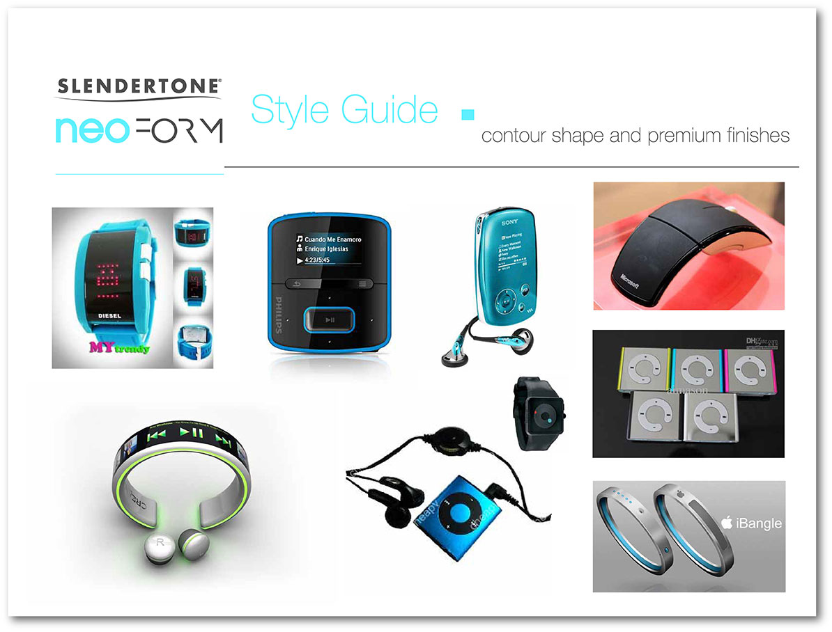
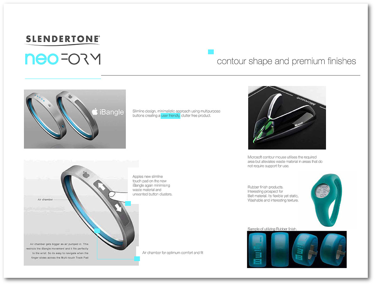
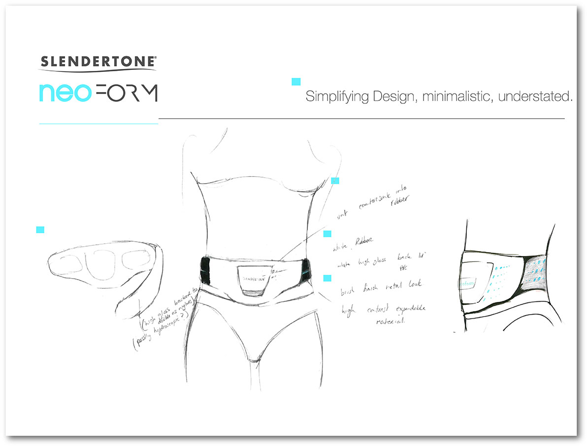
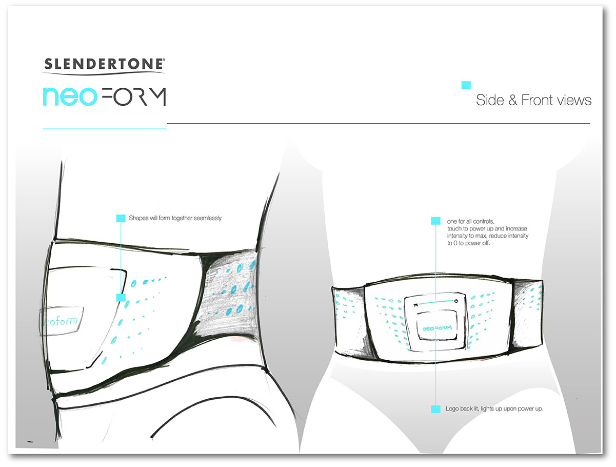
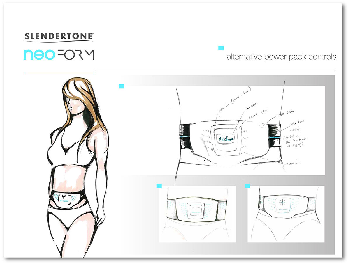
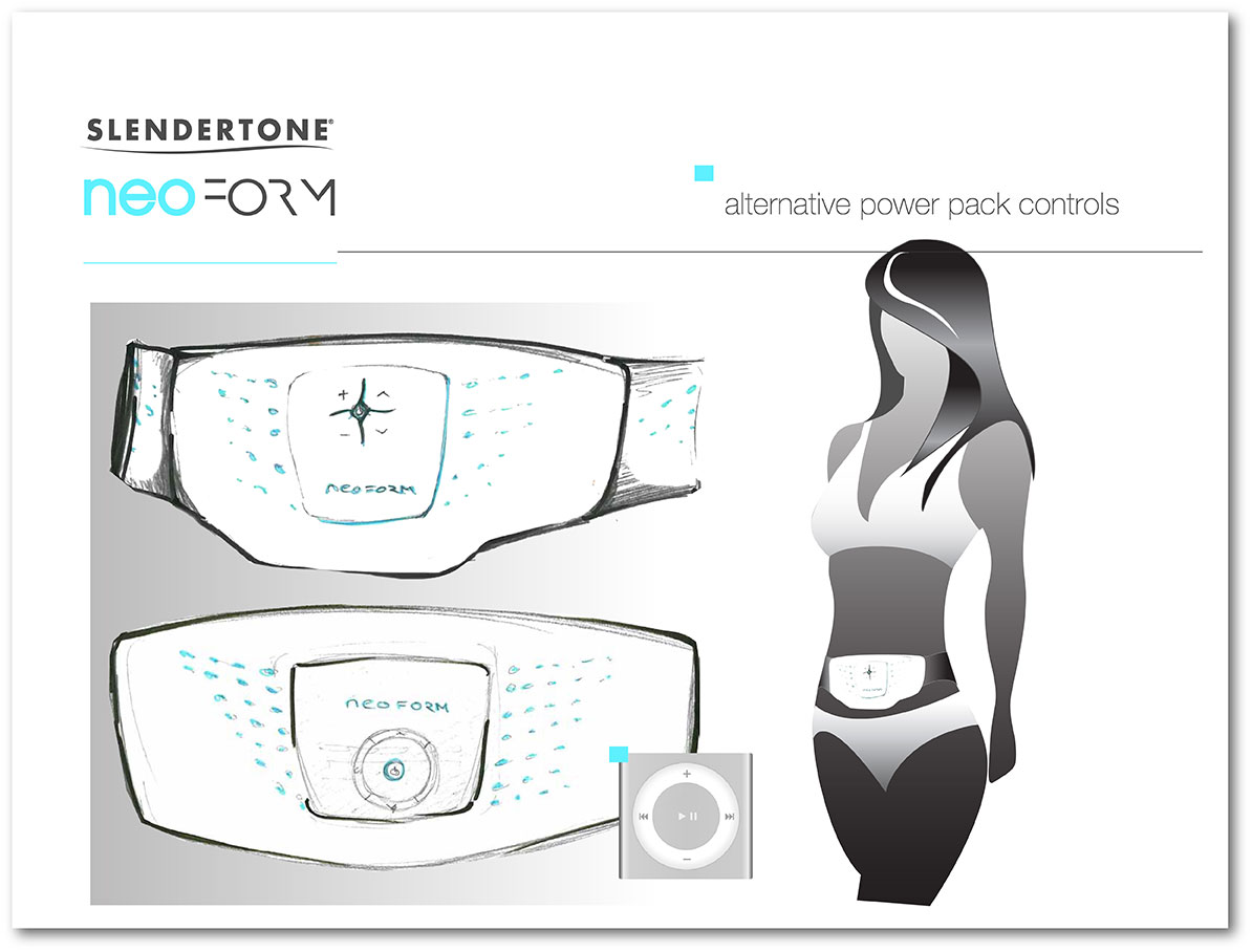
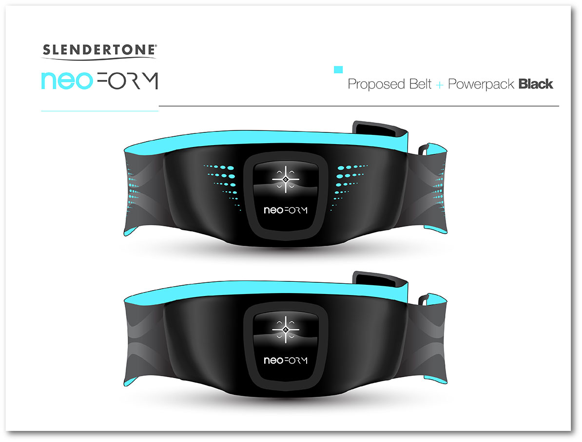
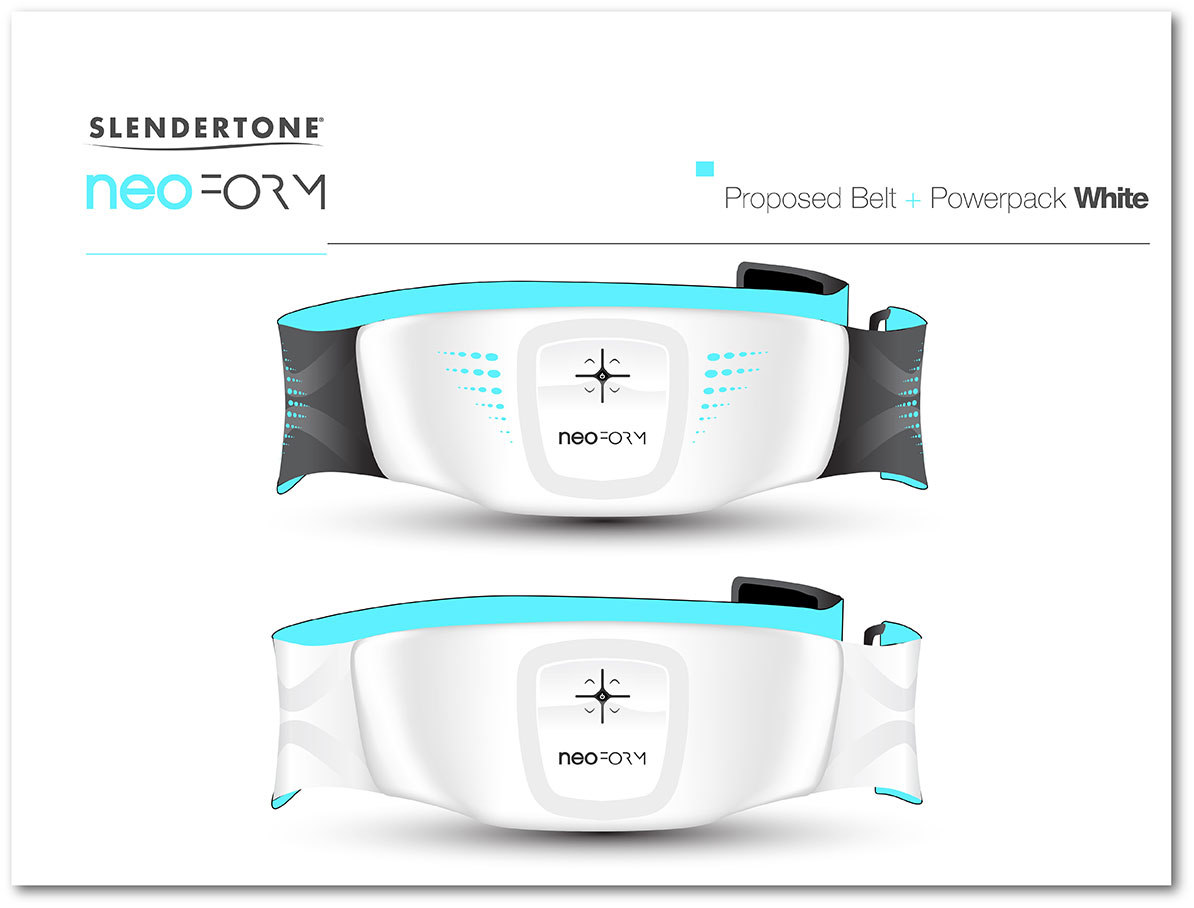
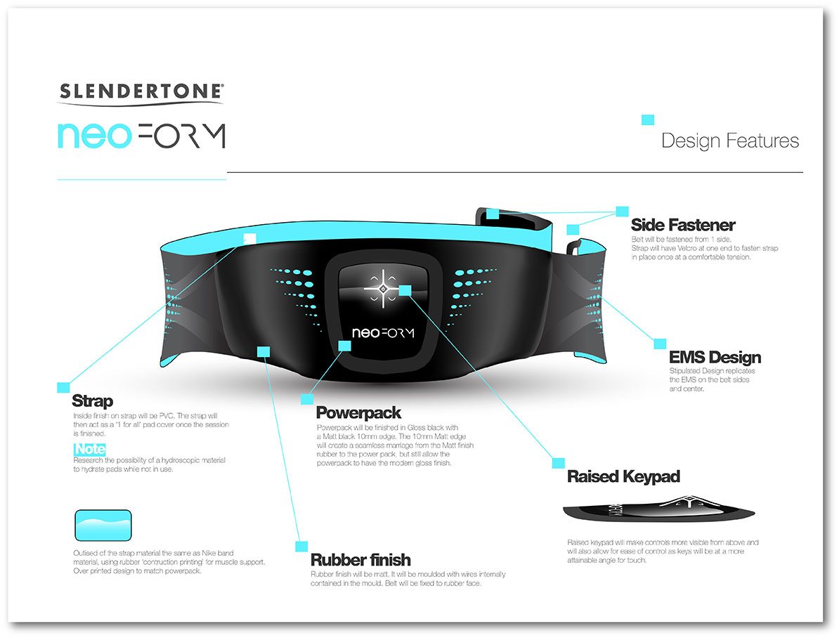
Slendertone Neo Form
Slendertone Neo Form was the inception of the Slendertone Connect product design. I named it Neo Form meaning ‘new form’ for the purpose of the project in the interim of a long term brand creation. While the belt shape we elected to use for the final connect project was different, many of the materials and elements designed in this concept were integrated into the final Connect belt design. Below is the process I went through in my creation of the belt and unit concept, including material specs and function outlines.
Evodisk
I played a key role in the ID of the Evodisk product. I wanted the unit to reflect the ethos and characteristics of the brand, including colour palette and finish in order to maintain continuity between elements.


Download CV
